Become a MacRumors Supporter for $50/year with no ads, ability to filter front page stories, and private forums.

JasonDawg18

macrumors regular
Original poster
Jul 30, 2005
109
0
Hello.

I'm needing to design a logo for a church/ministry that I will be starting soon. The logo I'm needing has to be geared at Young Adults (18-35 years old).

The name is: Access.

I'm a graphic designer, but cannot make myself happy with a logo design, so I'd like to get some help...

I'm certianly willing to pay, but I'd like to see a design comp first...

Here are three examples of logos that I really like...


Picture1.png


Picture2.png


Picture3.png


Thanks for getting back to me!

Jason
 

R.Youden

macrumors 68020
Apr 1, 2005
2,093
40
I am no designer (well not graphic anyway!) but I do like to have a play around with things like this.

Do you have any printing restrictions (ie does it have to be black and white or can it have multiple colours?).

Also how much of a church reference does it need or do you just want the word Access?

Thanks.
 

JasonDawg18

macrumors regular
Original poster
Jul 30, 2005
109
0
Thanks for your reply...

This will be a very unchurchy church, so the logo can just say Access. Please play with fonts, colors, etc... There are no restrictions - just something that would be cool for young adults...

Thank you!

Jason
 

eyup

macrumors regular
Aug 21, 2006
182
3
UK
Hiya,

Since you're a graphic designer have you had a bash at it - let's see some ideas, they may be better than you think. Then we can help out maybe... :)
 

eyup

macrumors regular
Aug 21, 2006
182
3
UK
Here's a quick idea...
 

Attachments

  • access.jpg
    access.jpg
    1.8 KB · Views: 523

Jasonbot

macrumors 68020
Aug 15, 2006
2,467
0
The Rainbow Nation RSA
Here you go. It's preliminary so don't shout about the symmetry but I thought it was sexy.

//I'm a "young adult" and this appeals to me in a dark sort of way.
//Nice name:D
 

Attachments

  • access.png
    access.png
    41.6 KB · Views: 75

JasonDawg18

macrumors regular
Original poster
Jul 30, 2005
109
0
Hiya,

Since you're a graphic designer have you had a bash at it - let's see some ideas, they may be better than you think. Then we can help out maybe... :)

Thanks for your help guys... I think I'm looking for a "Logo" that is more about the word/font, than an image. I like your suggestions though...

I have toyed around with it some, but am not happy... I made this one:

Access-Logo-Design.jpg


but it's too similiar to the "status" logo from above...

Let me know if you have any other thoughts - or maybe suggest a great font to buy...

Thanks!
Jason
 

martyviola

macrumors newbie
Dec 5, 2006
7
0
RE: Need Logo Help

Here's my idea. The font is "Fortuna Dot". I'd be happy to help if you like the logo.
 

Attachments

  • access.pdf
    92.1 KB · Views: 190

fowler.

macrumors 6502a
Apr 18, 2004
585
0
Pasadena
I don't have much time to mess with a logo, but if you draw a symetrical door opening (with a perspective from above), it appears to shape an "A"...

that might help.
 

dogbone

macrumors 68020
Here's a quick idea...

That's an excellent concept. Very clever the way it exploits the churchy stained glass look as well the the idea of 'access' through a doorway.


Too bad Jason didn't notice. Mind you seeing as he is rather smitten with samples 2 and 3 in his first post, I suppose I shouldn't be surprised. But it does fit in with sample one.
 

JasonDawg18

macrumors regular
Original poster
Jul 30, 2005
109
0
That's an excellent concept. Very clever the way it exploits the churchy stained glass look as well the the idea of 'access' through a doorway.


Too bad Jason didn't notice. Mind you seeing as he is rather smitten with samples 2 and 3 in his first post, I suppose I shouldn't be surprised. But it does fit in with sample one.


I really do like that one. Actually, that's my favorite so far. I just should've been more specific before. I'm looking for the logo to actually be the word. I like the look and feel of that design, though...

Thank you all for your ideas!
Jason
 

JasonDawg18

macrumors regular
Original poster
Jul 30, 2005
109
0
315784819_739ed86e7c.jpg


this is pretty rough , but let me know if you like the idea .

I like the look a LOT. How would it look if you made the one C and one S solid? You might need to move the one S over to the right just a touch, if you make it solid... I like the look a lot... What program did you design it in?

Thank you for your help!
 

dogbone

macrumors 68020
I really do like that one. Actually, that's my favorite so far.

Jason, I seem to be missing something here. You say it's your favourite and you say you are a graphic designer and you say you want the logo to be a word and you also post a "vine" logo where the "V" looks very similar to the "A" in the logo that you say you like the best... are you getting my drift?

btw the logo with the arrows looks like the arrow on the end of the "A" is pointing to hell.
 

thevessels

macrumors regular
Apr 6, 2004
216
0
I like the look a LOT. How would it look if you made the one C and one S solid? You might need to move the one S over to the right just a touch, if you make it solid... I like the look a lot... What program did you design it in?

Thank you for your help!

glad ya like it !
i just use illustrator ,
if you want you can email me info@chrismeisner.com , id really love to follow through on this for ya :)
-chris

heres a quick b/w rendition , i think it looks awesome

315933344_85e39a1db7.jpg
 

dizastor

macrumors 6502a
Dec 27, 2001
625
26
Los Angeles
btw the logo with the arrows looks like the arrow on the end of the "A" is pointing to hell.

Also, the "e" looks like a male symbol that is having sex with the 'c'. Maybe that's why the A is going to hell? :rolleyes:

Good logo, but not for something churchy no matter how unchuchy it claims to be. Unless it's diabolically unchurchy. ;)
 

JasonDawg18

macrumors regular
Original poster
Jul 30, 2005
109
0
Also, the "e" looks like a male symbol that is having sex with the 'c'. Maybe that's why the A is going to hell? :rolleyes:

Good logo, but not for something churchy no matter how unchuchy it claims to be. Unless it's diabolically unchurchy. ;)

Those awful "E's"... They're always trying to hook up with the C's... LOL... I like the look and feel a lot... I want to think about it for a little bit...

If anyone has any other thoughts, please holler at me!

Jason
 

dizastor

macrumors 6502a
Dec 27, 2001
625
26
Los Angeles
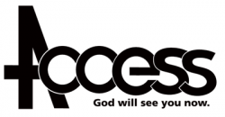
my two cents.

The A and the first C build a subtle cross.
No arrows, no implication up or down.

Tagline free of charge. :eek:

The s's are bad because I just ripped off frutiger and didn't spend enough time making them pretty. My apologies to Adrian Frutiger.
 

Attachments

  • access.png
    access.png
    8.2 KB · Views: 62

eyup

macrumors regular
Aug 21, 2006
182
3
UK
As a word...

Red one's more churchy me thinks (tho I believe you were trying to avoid that).
 

Attachments

  • access2.jpg
    access2.jpg
    8.1 KB · Views: 369
  • access3.jpg
    access3.jpg
    12.6 KB · Views: 367

shecky

Guest
May 24, 2003
2,580
5
Obviously you're not a golfer.
c's are o's with chunks missing

thats extremely inaccurate for typefaces other than this one, which is why it is hard to read.

O and C are two different glyphs and (in most properly designed typefaces) are drawn differently to reflect differences in counter-form, shape, angle, thrust, as well as thinning or thickening of stem/bowl as they become serifs.

EDIT: added some examples, top to bottom Futura, Gil Sans, and Avenir
 

Attachments

  • Picture 1.png
    Picture 1.png
    21.2 KB · Views: 53
  • Picture 2.png
    Picture 2.png
    19.7 KB · Views: 63
  • Picture 3.png
    Picture 3.png
    21.9 KB · Views: 59
Register on MacRumors! This sidebar will go away, and you'll see fewer ads.