Become a MacRumors Supporter for $50/year with no ads, ability to filter front page stories, and private forums.

cosmokanga2

macrumors 6502a
Original poster
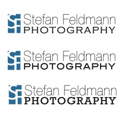
I'm coming up with a new logo and banner for my photography site and am down to three fonts. I was wondering if the pros could give me some feed back on my three choices.

I'm looking for a clean professional, modern look and I read that it is a good idea to have different fonts for the name and subject. I like the Stefan Feldmann part, yet am having troubles with the font choice for Photography. I personally prefer the first example, however my parents liked the second. I think the font used in the second one is too much like the font used on the Stefan Feldmann hence why I like the first example.

What are your opinions?

Second, the SF blue logo is something I've been working on to go with the text, not necessarily in the current position though. I think it works, but I'm just a guy with PS.

Any suggestion, comments would be greatly appreciated.
 

Attachments

  • SF P Logo Trio.jpg
    SF P Logo Trio.jpg
    166.9 KB · Views: 118

Designer Dale

macrumors 68040
Mar 25, 2009
3,950
100
Folding space
Hi.

Strictly in terms of typography, I have never liked mixing serif and san serif fonts in a logo, so the middle one is my only option.

Dale
 

mikey.f

macrumors regular
Aug 18, 2006
125
0
Slovakia
Nice job. However, I do not think No. 1 is your best choice. I am trying to decide between No.2 and 3, I am liking 2 better I think - but on the other hand, 3 has something to it...

I think, even though they're both sans-serif fonts, in No. 2 you have enough contrast between the name and the title, since one is light and one is strong.

Well, have luck deciding. Perhaps try a little more options? Or did you already pick these 3 from a bunch?
 

bluetooth

macrumors 6502a
May 1, 2007
662
1
Toronto
I'm coming up with a new logo and banner for my photography site and am down to three fonts. I was wondering if the pros could give me some feed back on my three choices.

I'm looking for a clean professional, modern look and I read that it is a good idea to have different fonts for the name and subject. I like the Stefan Feldmann part, yet am having troubles with the font choice for Photography. I personally prefer the first example, however my parents liked the second. I think the font used in the second one is too much like the font used on the Stefan Feldmann hence why I like the first example.

What are your opinions?

Second, the SF blue logo is something I've been working on to go with the text, not necessarily in the current position though. I think it works, but I'm just a guy with PS.

Any suggestion, comments would be greatly appreciated.

Good start. However, I tend to agree with Dale. Your use of typeface, colour and form should give your logo the desired appearance of it's business. Not sure I am seeing that clearly in your choices of type with the exception of number 2 (which is the one I like the best for his reason as well).

Ask youself what your logotype is tying to acheive or portray ie. modern, trendy, possibly web/internet photography based company that would likely work well with a Sans font or a traditional, classic appeal that would warrant more of a serif font.

I would advise you to keep the type families together (as you did in number 2), this will help to portray a stonger, clearer message in terms of your brand/name/business.
 

cosmokanga2

macrumors 6502a
Original poster
Thanks for the comments. These three were narrowed down from about 20 combinations that ranged all over the place.

My photography I would like to gear toward photojournalism, travel, people's stories and to some part architecture and commercial photography. Therefor I want the logo to reflect this which was why I was playing around with the serif as I felt it might give the logo a more old, traditional feel reflecting my work.

Thank you for you're comments on option 2. I'll go fiddle with some similar fonts and see what comes up.
 

vaguely-clear

macrumors newbie
Aug 15, 2008
14
0
#2 Definitely has the most potential in my opinion. The biggest issue with it I think is the blue box. In some cases the "type touches edge, bleeds into backround" thing works quite nice. In this instance it really bothers my eyes. Pay close attention to the small blue speck that is cut off in the upper left, using both your direct and peripheral vision. It's very awkward, and it's a problem you might consider as you rework what you have.
 

a cat *miaow*

macrumors regular
Jun 12, 2007
217
0
Hi, I really think you need to rethink this a lot. The options have three typefaces in one logo. I don't mean this in a harsh way but they are very poor logos. If creating a logo is not something you do day to day then i'd stick with keeping it simple.
If you want to play around with what you've got take a look at the two lines of text. You'll see the top line is stretched vertically and the bottom line stretched horizontally. This make the whole design look like it's pulling apart.

My personal recomendation would be to drop the 'SF'. Make the whole thing white text on a nicely toned blue box and chose a single typeface. Put the name in roman/regular and the 'photography' in bold. And if you need to stretch the word 'photography' use letter spacing – don't stretch the whole thing.
 

DesignerGenes

macrumors member
May 4, 2009
35
0
Omaha, NE
Good start and concept. Funny enough, for 4 years I worked for a marketing company that specifically tailored to professional photographers. I've done more photography logos than imaginable!

My main issue is "photography" being bolder that the name. I see the word photography first, when I should be seeing your name. And all the text does seem a little crunched up.

See these examples of very simple logos using type.
Allison Rodgers
Geoff White
Sarah Petty

Very simple and so effective.

The icon idea is neat and it gives versatility to the logo. I would like to see it be square and a little less Adobe-looking. Make sure the icon can stand on its own and it can be used by itself as an even cleaner/modern mark. Maybe even make some good ol sketches with a pencil and paper to come up with some more options.

Good job and keep at it. Coming up with your own logo is tough.
 

synth3tik

macrumors 68040
Oct 11, 2006
3,951
2
Minneapolis, MN
Only one piece of critique. Just say no to sans. Especially when used with other fonts it just hurts.

Honestly I would stick to one font. Utilize bold and semi-bold to give the words some separation.
 
Register on MacRumors! This sidebar will go away, and you'll see fewer ads.