Honestly I was praising the Moto 360 all over the internet. But after seeing it in person at college, and other reviews, it looks like a plain round block of aluminum. Don't get me wrong the screen is beautiful when its off and looking at it from a distance. But once you get to the body, it doesn't grow on you.
My first look experience (pictures). I actually kept taking quick 5 sec glances on each and noted what I did.
Watch Design:
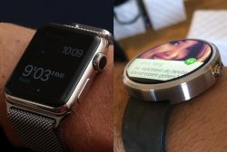
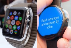
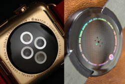
At first glance it forces you to analyze the whole watch. I look at the screen, then the curved bezel, then the Digital Crown, then the band insert. It makes me want to keep looking at it and examine it, and as I do, it keeps growing on me because it has so much cool little designs. Same with a back picture and with every angle picture I look at. The whole watch screams fluent and seamless design to me. There are no noticeable bezels, just one nice curve that's from the top of the curved screen to the polished curved stainless steel bottom. The Watch OS is also really nice with eye candy. I love transparency overlays!
Moto 360 Design:
At first glance all my attention is on the screen. It looks so cool since its circular. Then I notice some content is cut off and distorted on the bottom. Then I look at the bezel which looks actually cumbersome with a total of 4 chamfered edges including the glass. The side view just looks unfinished, boring, and thick. It is like 3 different company's worked on it. 1 for the aluminum body, 1 for the lcd/cover glass, and 1 for the bands then slapped it all together!
Conclusion:
The moto 360 at a glance from far away and only looking at the screen it looks really cool. But after quick inspection it lowers you expectation and I grow to hate it more and more. It is more like an early prototype since it is not a seamless design. It is too simple and boring with nothing that screams different. But it is still a beautiful watch compared to other Android Wear watches, don't get me wrong. The Watch makes me want to keep starring at it and it actually keeps growing on me and I'm loving more every time I see it.
These are my 100% honest feelings. I am trying to be very unbiased here. And these are "my" feelings so don't troll please, I'm just giving my perspective on it. I would love your opinions as well to help me visualize them a different way. Just look at them closely at quick intervals and note what you feel.
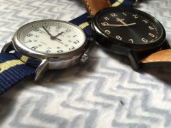
Band Insert View:
![attachment.php]()
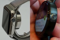
Side View:
![attachment.php]()
![attachment.php]()
![attachment.php]()
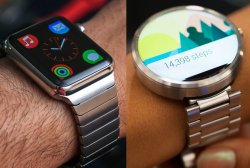
Back View:
![attachment.php]()
.
My first look experience (pictures). I actually kept taking quick 5 sec glances on each and noted what I did.
Watch Design:
At first glance it forces you to analyze the whole watch. I look at the screen, then the curved bezel, then the Digital Crown, then the band insert. It makes me want to keep looking at it and examine it, and as I do, it keeps growing on me because it has so much cool little designs. Same with a back picture and with every angle picture I look at. The whole watch screams fluent and seamless design to me. There are no noticeable bezels, just one nice curve that's from the top of the curved screen to the polished curved stainless steel bottom. The Watch OS is also really nice with eye candy. I love transparency overlays!
Moto 360 Design:
At first glance all my attention is on the screen. It looks so cool since its circular. Then I notice some content is cut off and distorted on the bottom. Then I look at the bezel which looks actually cumbersome with a total of 4 chamfered edges including the glass. The side view just looks unfinished, boring, and thick. It is like 3 different company's worked on it. 1 for the aluminum body, 1 for the lcd/cover glass, and 1 for the bands then slapped it all together!
Conclusion:
The moto 360 at a glance from far away and only looking at the screen it looks really cool. But after quick inspection it lowers you expectation and I grow to hate it more and more. It is more like an early prototype since it is not a seamless design. It is too simple and boring with nothing that screams different. But it is still a beautiful watch compared to other Android Wear watches, don't get me wrong. The Watch makes me want to keep starring at it and it actually keeps growing on me and I'm loving more every time I see it.
These are my 100% honest feelings. I am trying to be very unbiased here. And these are "my" feelings so don't troll please, I'm just giving my perspective on it. I would love your opinions as well to help me visualize them a different way. Just look at them closely at quick intervals and note what you feel.
Band Insert View:
Side View:
Back View:
.
Attachments
Last edited:


 Watch isn't exactly real yet, right? Little premature to call it better than anything. Not defending the 360, just trying to inject a little reality that seems to escape many members of this subforum.