Become a MacRumors Supporter for $50/year with no ads, ability to filter front page stories, and private forums.
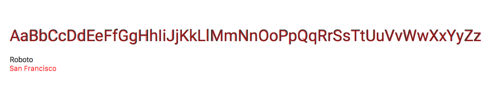
Apple San Francisco font is the same as Google's Roboto font?
- Thread starter djtech42
- Start date
- Sort by reaction score
You are using an out of date browser. It may not display this or other websites correctly.
You should upgrade or use an alternative browser.
You should upgrade or use an alternative browser.
I got that impression when I first saw it, but I don't think it's quite a blatant rip-off. I do think both fonts are absolutely ugly, however. A bit ironic, considering how hard Apple is pushing the 'fashion' angle when promoting it.
Maybe they should have gone with the 1980s variant")
Maybe they should have gone with the 1980s variant
Hard to judge
San Fransisco is actually much more similar to Helvetica (except for the R and G).
When I first saw the San Francisco font, I was also noticed that it's pretty much similar as Roboto font and doubt so Apple copied it with just some cocktail. Roboto font looks more robotic and freedom. San Francisco font looks a bit curly and closed. Sometime I feel like I'm using android when I look at my iphone cos I also do have moto g and used to with Roboto font.
Hard to judge
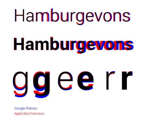
How is that hard to judge? Sans serif have largely the same overall design characteristics, but you can clearly see the differences in the design of individual characters. Font design nowadays is about the fine details and it’s clear from the outset that Apple has had a different starting point.
How is that hard to judge? Sans serif have largely the same overall design characteristics, but you can clearly see the differences in the design of individual characters. Font design nowadays is about the fine details and it’s clear from the outset that Apple has had a different starting point.
It's normal that some people will think that they are very similar. The differences only start getting obvious when the letters are bigger.
It's normal that some people will think that they are very similar. The differences only start getting obvious when the letters are bigger.
But the question is whether Apple copied Google. That’s not just a matter of opinion and as such it requires a closer look and then it becomes clear that they are not the same. Moreover, San Francisco is just the collective name for a whole list of fonts that include both the cuts for the Watch and iOS/OS X (with different shapes), the two optical sizes for each (with varying spacing and kerning) and of course the widths and italics.
There enough difference to my eye.Hard to judge
I said this the moment San Francisco (not the old goofy Mac OS 7 font) came out. I'm glad someone else noticed how similar the two fonts are.
But the question is whether Apple copied Google. That’s not just a matter of opinion and as such it requires a closer look and then it becomes clear that they are not the same. Moreover, San Francisco is just the collective name for a whole list of fonts that include both the cuts for the Watch and iOS/OS X (with different shapes), the two optical sizes for each (with varying spacing and kerning) and of course the widths and italics.
At the end, it doesn't matter if they copied or not. There is enough difference and both are just changes needed for our higher res screens.
Both Roboto and San Francisco are hybrid fonts, pulling together elements from a handful of different typefaces instead of having a consistent design language. Both are "frankenfaces" stitched together from a variety of sources. This makes them look both familiar, and derivative (which they are). Don't consider them original typefaces, think of them as mashups.
Technology has always shaped our letterforms. Both these fonts were designed for pixel-based legibility rather than beauty, which is another reason they look similar. The requirements of the technology force the designers hand, resulting in similar forms.
Finally, it is important to note that in the United States the shapes of letters in a typeface cannot be copyrighted. One can legally protect a font as software, and you can protect a typeface name, but you cannot protect the shapes. If you open a font in an editor, change a single point on a single glyph and export it under a different name, you are legally in the clear. Luckily, this is not true in Europe.
So you need to define "copy" very carefully. Most of those who work in the typeface industry do not feel that San Francisco is a copy of Roboto, and more than Roboto is a copy of any one other typeface.
Besides, unless you are designing for iOS/iWatch or Android, why would you choose either? Outside of their very specific context they don't work very well and there are often far better options.
Apple’s San Francisco is the most elegant, and the most beautiful sans-serif typeface ever designed.
It is important to remember that the SF PRO system font (that is used on iPhone and iPad) is not the original version of San Francisco font — the original is called SF COMPACT (the version that is used on Apple Watch). A demo version of this font — the original root of all SF typefaces — The Galviji font — still lives as a built-in font on Apple’s platform today.
The SF COMPACT and SF PRO (system fonts), alongside SF CASH (Apple Card Balance), SF CAMERA (iPhone 11 and up camera font), SF HELLO (Physical print and manuals), and SF ROUNDED are the most beautiful sans-serif typefaces ever. San Francisco is an EVOLUTION of Helvetica — Helvetica’s utterly bad kerning, low legibility, ugly tails — like on the letter «a», and questionable proportions just look ugly. There was an attempted fix at many of these issues with a revised, modernized version of Helvetica — called Helvetica Now, but underneath it all — it’s still Helvetica.
The soft, bubbly and cohesive curves of every letter in the SF font family just look beautiful. The curves remind me of the Apple Watch, and I thought I was the only one — until Jony Ive himself pointed out the purposeful resemblance of the typeface to the Apple Watch. remember that it was designed specifically for the watch.
It’s just a better Helvetica. And Helvetica is the most popular and respected font of all time. What is San Francisco, then…
Roboto is just plain ugly unbalanced uncohesive uncontrolled peace of typographic cr@p that could only accompany such an ugly design system as MATERIAL DESIGN. No wonder why Google already replaced Roboto in most of their apps with their PRODUCT SANS font…
Quote:
Alan Dye later described to me the “pivotal moment” when he and Ive decided “to avoid the edge of the screen as much as possible.” This was part of an overarching ambition to blur boundaries between software and hardware. (It’s no coincidence, Dye noted, that the “rounded squareness” of the watch’s custom typeface mirrors the watch’s body.)
Yeah. Font bashing was certainly a great reason to necro a 5 year old thread.
Yes, it was.Yeah. Font bashing was certainly a great reason to necro a 5 year old thread.
Register on MacRumors! This sidebar will go away, and you'll see fewer ads.