Become a MacRumors Supporter for $50/year with no ads, ability to filter front page stories, and private forums.

klymr

macrumors 65816
Original poster
May 16, 2007
1,451
103
Utah
I'm redesigning the logo at work (see attached image for old logo) and I'm looking for recommendations for a typeface. The business is 115 years old, and we want something elegant, yet modern. I showed a former professor some concepts, and he said the typeface I was using (Arno Pro) made the design look like it had cobwebs on it, i.e., outdated.

Does anyone have any recommendations for a decent face that doesn't look too dated?
 

Attachments

  • logo.png
    logo.png
    14.5 KB · Views: 1,071

Blue Velvet

Moderator emeritus
Jul 4, 2004
21,929
265
Sans, serif or display? What new or existing elements does it have to work with? Show us what you have so far.
 

usclaneyj

macrumors regular
May 1, 2005
184
0
I think what you want to do here is go with a typeface that is more geometric, and also something relatively light in weight. Something like Century Gothic or Futura, maybe.

To me, a heavier typeface would begin to feel a little cheap. Open up the tracking between the letters and see if that tickles your fancy.

Personally, I like Arno Pro for this application. I think if you mixed it with a nice, classy, open san-serif, it may have potential.
 

ezekielrage_99

macrumors 68040
Oct 12, 2005
3,336
19
Adobe Caslon, HF&J Verlag, HF&J Mercury, HF&J Sentinal or HK&J Topaz would be the best options IMHO. Hoefler-Frere & Jones

To really showcase quality and style for an established company you will need to pay top dollar for a quality font otherwise it will look cheap, you need to buy a classic fontpack thus the suggestions they will look awesome 20years + from the time you've designed it.

Trust me on this, you can use a free or cheap font but it will date very quickly and never look right.
 

THX1139

macrumors 68000
Mar 4, 2006
1,928
0
Logo then typeface. Otherwise it's like picking your furniture before the house is built.
 

klymr

macrumors 65816
Original poster
May 16, 2007
1,451
103
Utah
Sans, serif or display? What new or existing elements does it have to work with? Show us what you have so far.

This is a concept (and nothing more) that I came up with a few weeks ago. After drawing it out on paper I had to see what it would look like digital. I recognize that it's not easily reproduced across a variety of mediums. Just had to get it out of my system so I could work on the next concept. http://pxls2prnt.com/concept2.4.png


I think what you want to do here is go with a typeface that is more geometric, and also something relatively light in weight. Something like Century Gothic or Futura, maybe.

To me, a heavier typeface would begin to feel a little cheap. Open up the tracking between the letters and see if that tickles your fancy.

Personally, I like Arno Pro for this application. I think if you mixed it with a nice, classy, open san-serif, it may have potential.

I've been working with Arno Pro, and played around with a lot of other typefaces, but I'd agree with you, lighter is better.


Adobe Caslon, HF&J Verlag, HF&J Mercury, HF&J Sentinal or HK&J Topaz would be the best options IMHO. Hoefler-Frere & Jones

To really showcase quality and style for an established company you will need to pay top dollar for a quality font otherwise it will look cheap, you need to buy a classic fontpack thus the suggestions they will look awesome 20years + from the time you've designed it.

Trust me on this, you can use a free or cheap font but it will date very quickly and never look right.

Oh, I trust you! It'll be near impossible to convince my boss to pay for a new typeface (or two). I've been using Adobe Caslon for nearly all our print work that we've been doing the past couple years, but the more I see it and use it, the more I feel that it's "old." It's the typeface that I used on our billboards. If you are interested in seeing that, it's the first couple images at http://pxls2prnt.com under the "PRINT" section (I hope this isn't breaking forum policy).


Logo then typeface. Otherwise it's like picking your furniture before the house is built.

What if the primary focus is to have a wordmark? There has been recent talk to have something just set in text.


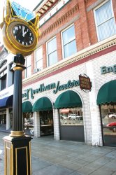
Anyway, I want to avoid the cliché diamond in the logo. A lot of our customers know us by our long time slogan, "Middle of the block, at the sign of the clock" because of our old street clock. I'm still playing around with some concepts using the street clock in the logo, but even that is pretty hard as the clock is quite busy. Anyway, this is where I am at.

*Also, the current logo is an early '90s redesign of VERY similar logo that was designed and used from 1929 to 1939. The one that you can see on the front of the building in the image below (The Jetsons/Star Trek looking logo) was put up in the late '60s–early '70s. They want to remodel the front of the building in the next year or so and want something ready to go up (and will also fit more horizontally than vertically). And there is your condensed history lesson of our logo.
 

Attachments

  • clock.jpg
    clock.jpg
    301.4 KB · Views: 106

spiritlevel

macrumors 6502
Nov 5, 2007
378
60
Based on the visual you posted, I think your professor was right.

I would ditch the diamond graphic and keep it purely typographic. Jewelery is a luxury item and the logo should be sophisticated and classy. The classiest logos generally don't have graphics. Get a copy of Vogue and look at the major luxury fashion brand logos and jewellers like Tiffany's and Graf Diamonds for example - you won't find many with graphics.

Stay away from serifed italics for the lettering - almost certain to make it look old fashioned. Elegantly spaced serifed capitals or thinnish sans would probably work much better. Don't over space the "jewelers" lettering and force it to be the same width as the name - not necessary. If the difference in width bothers you, you could try short light rules either side of the jewelers, but there's really nothing wrong with them having different widths.

Serifed Caps for the SE NEEDHAM and small sans caps for the "jewelers" centred underneath might work well.

With regards to the typeface, you really need to try a few out to see what works best and has the right feel with those particular letters. Go on to myfonts.com, search for things like "luxury" and "elegant", put in your SE NEEDHAM text and see what looks good. Also, as it's a jewellery brand, you could do a lot worse than try these out which seem to be designed for the task at hand.

http://www.houseind.com/fonts/luxuryfonts/viewfonts

Good luck, let us know how you get on.
 

klymr

macrumors 65816
Original poster
May 16, 2007
1,451
103
Utah
Thanks spiritlevel

Sometimes—as I'm sure you are aware—we tend to look at something so much that we can't quite discover the errors we have created. Nearly everything you've mentioned I've been playing around with. I've looked at a few fashion magazines (as my former professor suggest also), played with the idea of a serifed caps, sans serif lowercase, etc. The width was adjusted to fit at the suggestion of someone else who was looking it over. Originally it wasn't as wide. The more I have played with the italic serifs, the more I hate it. Funny how over time you just start to pick up these subtle things and not even realize it. Thanks for pointing me in a better direction.

That goes to everyone. Thanks for the help!
 

THX1139

macrumors 68000
Mar 4, 2006
1,928
0
What if the primary focus is to have a wordmark? There has been recent talk to have something just set in text.

Okay, but you said you were designing a logo. ;) A wordmark is another thing entirely. If you're in a hurry, you could base it off an existing type face - but to make something memorable, you still need to come up with a solid concept and possibly a custom type face if you go the that route.

My approach would be to base several concepts off research and see where that takes my design. I would keep logo and wordmark both on the table and co-develop at least through the first round of sketches.
 

ezekielrage_99

macrumors 68040
Oct 12, 2005
3,336
19
I rebranded a jeweler's a few years ago, I understand where you're coming from with the font. But the thing I would ask them is how long do they intend using a quality wordmark for? 1 year? 5 years? 10 years?

The answer being the longer they have a quality wordmark the more cost effective and the more recognisable it will be, thus the overall cost of the purchased fonts will be much lower (ROI in action is a wonderful thing).

Also good design creates value, they should know this... Ask them what would make a better engagement ring, white gold (mix of nickel and yellow 24K gold) or platinum? Which would make the better quality end product and cost more?

It's the same principal with a quality fontpack compared to a standard pack, it will be one of the factors to craft the brand to a different bracketing thus establishing value within brand theatre. This will create a much better and easily identifiable brand promise which means it will be easier to sell their story to potential clients (more $$$).
 

ezekielrage_99

macrumors 68040
Oct 12, 2005
3,336
19
I've also noticed that the logo needs to fall into the "signage rule", Reis states the best signage logos fall into a ratio of 2.25X1.00 I used to be skeptical about this one until I saw the stats on companies that use this ratio... I've attached a quick concept using my fonts to really display the idea.
 

Attachments

  • needham.png
    needham.png
    5.6 KB · Views: 96

klymr

macrumors 65816
Original poster
May 16, 2007
1,451
103
Utah
Okay, but you said you were designing a logo. ;) A wordmark is another thing entirely.

I'll have to respectfully disagree. Five types of logos:

1. Wordmarks
2. Letterform marks
3. Pictorial marks
4. Abstract marks
5. Emblems


A great example of a company, jeweler even, that uses a wordmark for their logo is Tiffany & Co.

tiffany-and-co.jpeg


Another example, also a jeweler, is Simon G.

sg-white-logo.jpg

simon-g-logo.gif


For what it's worth, they told us to use the first of those two marks on the billboard we designed for them. It's the mark they use on their website, and on most all of their stuff. I think the other one is an old mark.

So I'd say that, yes, I am designing a logo, even if it's a wordmark.
 
Register on MacRumors! This sidebar will go away, and you'll see fewer ads.