Become a MacRumors Supporter for $50/year with no ads, ability to filter front page stories, and private forums.

MacRumors

macrumors bot
Original poster
Apr 12, 2001
63,481
30,716


Apple today posted the OS X Yosemite video shown during its Worldwide Developers Keynote, which gives a look at some of the new features and design changes introduced with the operating system.

Covering the changes to the dock and icons along with showing off Yosemite's translucency, the video also highlights AirDrop, Finder, Messages, and Notification Center, giving an overall view of the revamped OS.

We reconsidered every element of the Mac interface, large and small. The result is something that feels fresh, but still inherently familiar. Completely new, yet completely Mac.
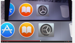
First introduced last week, Yosemite includes significant design changes that focus on translucency and a flatter, more modern look, along with a push towards deeper integration with iOS 8. Yosemite introduces several new features that work with iOS 8, including Handoff, Instant Hotspot, and the ability to make and receive phone calls and SMS messages.

Multiple apps and features have also been updated, including Spotlight, Mail, Notification Center, and Safari, and there's a new focus on iCloud with iCloud Drive. More information on Yosemite's major changes can be found in our OS X Yosemite Roundup, while details on smaller tweaks can be found in the "OS X Yosemite: All The Little Things" forum thread, created and maintained by MacRumors forum users.

Article Link: Apple Shares WWDC OS X Yosemite Video Highlighting Design Changes
 

BillyMatt87

macrumors 6502a
Dec 23, 2013
636
823
Yosemite's design looks better than iOS 7/8. If iOS 9 or 10 looks more like Yosemite, I will gladly welcome it.
 

DoctorKrabs

macrumors 6502a
Jul 12, 2013
689
882
It took them a week to upload it because they realized at WWDC that the gears spun impossibly
 

Attachments

  • Screenshot (157).png
    Screenshot (157).png
    823.6 KB · Views: 690

myrtlebee

macrumors 68030
Jul 9, 2011
2,677
2,242
Maryland
The mail and preview icons are totally out of place. They should have went with an iOS-like mail icon and made the contacts icon gray to match the app in iOS. Also, the current iOS iBooks icon should look like the one in Yosemite. Currently it is the same icon as the bookmarks icon in Safari, which makes no sense.
 

arkmannj

macrumors 68000
Oct 1, 2003
1,728
513
UT
Using Yosemite right now and loving the new design!

How's the stability in the DP? (more specifically related to any kind of data corruption, etc...)

I've loaded up Xcode 6, and iOS 8 from our dev account but haven't had the nerve to try OS X 10.10 yet.

I keep half expecting Jonny Ive to start talking over the top of the music.
I missed seeing Sr Ive speak at the WWDC keynote (at least in a video)
 

Millah

macrumors 6502a
Aug 6, 2008
866
515
If you look on the Apple website for the Yosemite preview, the Finder icon is slightly different from the one in the DP or in this video. The smile is more like the old Finder icon, not as happy as this new icon. I know the Finder icon has been the one icon causing the most contention, so I'm curious if the marketing material on Apple is a more recent design, or if this one is the latest. Also there's some other tweaks, like it doesn't seem the menu bar on Apples site has as much shadow as the menu bar in DP1.
 

BillyMatt87

macrumors 6502a
Dec 23, 2013
636
823
The mail and preview icons are totally out of place. They should have went with an iOS-like mail icon and made the contacts icon gray to match the app in iOS. Also, the current iOS iBooks icon should look like the one in Yosemite. Currently it is the same icon as the bookmarks icon in Safari, which makes no sense.

Maybe they realized that the iOS 7 icons were ugly and have started to design better icons that still fit within the new design philosophy.

iOS 8 was an 's' update and I fully expect the next version of iOS to have a design refresh but not anywhere near as radical as going from iOS 6 to 7.
 

DavidBlack

macrumors 6502a
Jan 27, 2013
606
239
Somewhere In Apple's HQ ;)
I am trying to see if I can get the old Dock back, I don't favour the new 2D dock. I might have to copy the old Mavericks dock files and images and replace it with those in OS X Yosemite .
 

Porco

macrumors 68040
Mar 28, 2005
3,315
6,909
I still think 10.5.8 was the best-looking OS X. I guess I'll get used to Yosemite eventually.
 
Register on MacRumors! This sidebar will go away, and you'll see fewer ads.