Become a MacRumors Supporter for $50/year with no ads, ability to filter front page stories, and private forums.

glossywhite

macrumors 65816
Original poster
Feb 28, 2008
1,120
2
Hi folks. Okay, my friend has just re-designed the website for his shop, and is looking for opinions on the layout and design. The reason I am asking @ MR, is because this site is full of respected and paid designers, from whom he would very much appreciate feedback.

Is the layout aesthetically appealing, too brash, too busy? Any aspects of the design which you deem as in need of review or change, he'd like your opinion.

Okay, the site is: http://www.easy2pc.co.uk/home.html

Thank you for your time :)

Have a great weekend!
 

elppa

macrumors 68040
Nov 26, 2003
3,233
151
What was the reasoning behind the choice of Comic Sans typeface?
 

Blue Velvet

Moderator emeritus
Jul 4, 2004
21,929
265
Is the layout aesthetically appealing


No. Frankly, it's terrible. Web designers still need to be informed by graphic designers. Just because something is viewed through a browser doesn't mean that the fundamentals of design can be thrown out the window.

Before you even look at hierarchy and navigation, the first impression is one of utter amateurism. I count over five different typefaces on there over different sizes and weights including Comic Sans used in the body copy, a font completely unsuitable for business communications... the copy also includes typos, the whole thing completely undermining the message of competence and professionalism.

The static banner with the logo, phone number and the graphics looks awful. I wouldn't even know where to start in improving the whole thing, because if you pull at one thread, the whole lot would unravel... except to say the orange/dark teal combo, the curved frames and the black background are extremely ugly.

To me, this is a design that potentially damages a brand. I'd click away from it pretty damned quickly.

Sorry. You asked. :eek:
 

Apple OC

macrumors 68040
Oct 14, 2010
3,667
4,328
Hogtown
BV has nailed it down perfect ... The site does not come across as professional.

It needs "Graphic Design" work ... this is a common problem for many websites, this one included.

As BV stated ... where to begin? as you stated this is a redesign.

I am also sorry about my critique ... he should start from scratch with some design help.

good luck
 

Blue Velvet

Moderator emeritus
Jul 4, 2004
21,929
265
And there's way too much copy with the wrong things said in the wrong places... nobody reads all that stuff. Some quick subbing:


PC & Laptop Repair

We know how much you depend on your computer, in addition to regular business hours we provide 24/7 emergency service and remote computer repair. You can drop off your computer or we can pick it up. We are your one stop shop for computer repair services; let us solve your computer problem today.

We repair all makes and models of desktop and laptop pc computers regardless of where they were originally purchased. This includes Dell, Toshiba, Compaq, IBM, Lenovo, Acer, Sony, Gateway, and HP (Hewlett Packard) computers to name but a few.


One stop PC and laptop repair

• Mon-Sat business hours
• 24/7 emergency and remote repair
• Drop off and onsite collection
• Any brand, any model

You depend on your computer, depend on us to fix your PC problems today.
 

glossywhite

macrumors 65816
Original poster
Feb 28, 2008
1,120
2
Honest opinions are extremely valuable, thank you guys. Keep 'em coming... within socially acceptable limits :D
 

Hermes Monster

macrumors 65816
May 4, 2010
1,204
552
UK
I'm not sure why there is navigation options across the top and left hand side, I would usually expect one or the other.

As well as the things mentioned above, the main text box has some, what I assume, are margin grid lines on, which are odd and in the "coverage" text it's all underlined, it may just be my browser but cross browser compliant code is a must.

Also the images fir the company logo and general pc help image leave a lot to be desired

Sorry!
 

besler3035

macrumors 6502a
Oct 29, 2004
561
110
Grand Rapids, MI
Comic Sans, really?!?

There's absolutely nothing appealing about that site, sorry to say. No consistent styles, ugly color scheme, and way too much text in the wrong places, especially on the homepage.

There's also nothing that sets the homepage apart from the other pages. BORING.
 

miknos

Suspended
Mar 14, 2008
940
793
Like they said, you need a complete redesign.

When I entered the website I didn't knew what it was about it. I had to read all the Welcome statement before I saw the "One stop PC and laptop repair" to realize it was a repair shop.

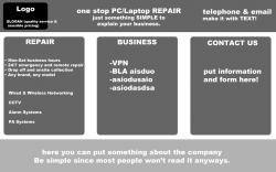
Why you need a website? To promote a service (repair). People will look the website to:
- See if you can fix their problem (repair). Explain what yo do (fix).
- Contact you (call). Make it easy for them to contact you.
- Ask prices (I liked the "quality service with sensible prices". Clients will think you're not a ripper.).
- Ask to pick up (or bring) the computer. Job done.

My advice: Make it simple. You can put ALL the information in a single page.

I made a sketch for you. Any criticism is okay.
 

Attachments

  • sketch.png
    sketch.png
    61.9 KB · Views: 88
Last edited:
Register on MacRumors! This sidebar will go away, and you'll see fewer ads.