Become a MacRumors Supporter for $50/year with no ads, ability to filter front page stories, and private forums.
iPhone Apple Home Pages 2007-2012
- Thread starter Agent OrangeZ
- Start date
- Sort by reaction score
You are using an out of date browser. It may not display this or other websites correctly.
You should upgrade or use an alternative browser.
You should upgrade or use an alternative browser.
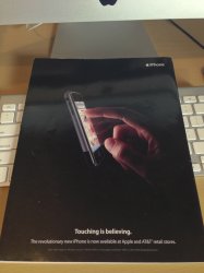
The original iPhone and the iPhone 4 pages are my favourite. I think it may be due to the black background, but it makes the iPhones look pretty slick. Especially the page showing the iPhone 4.
Fascinating! Can't find this timeline easily on the internet
Yep, I believe this was taken from TechnoBuffalo.
Yep, I believe this was taken from TechnoBuffalo.
You can get them gem them from The Wayback Machine.
That's awesome! I love how bold the original ad was, it's nice. The progression to a more understated approach is cool too, though.
Yep, and than the more grey ones. Last place: all white.The original iPhone and the iPhone 4 pages are my favourite. I think it may be due to the black background, but it makes the iPhones look pretty slick. Especially the page showing the iPhone 4.
![iphone-2009.png]()
2009
Kinda funny that the '09 homepage chose the Compass.app as something to highlight.
Sweet thread, though. Fun to look at those images. Immediately makes me think of the EveryAppleAds YouTube channel.
Nice thread ! I remember the days of 2008 watching iphone 3g unboxing videos and dreaming to own iphone one day... 

Neat! It's kinda fun and nostalgic looking at the original iPhone marketing stuff.
It does make me think of one small issue about iOS that has been bothering me lately. Here we are, 5.5-6 years later, and some of those icons still look the exact same and are starting to look dated. I know, some have been updated and some still stand the test of time. It's a small issue, and I'm really nitpicking here, but it'd be nice to see some of those icons get a facelift...particularly the "Photos" app icon. I find it completely dated and hideous at this point. The Safari icon is pretty bland and ugly to look at as well. A lot of people are complaining about iOS starting to look/feel boring and "blah" and "same old same old"...maybe doing something small like refreshing/updating the icon set entirely would add a fresh little twist on the OS. Just a thought. And like I said, I'm really nitpicking here.
It does make me think of one small issue about iOS that has been bothering me lately. Here we are, 5.5-6 years later, and some of those icons still look the exact same and are starting to look dated. I know, some have been updated and some still stand the test of time. It's a small issue, and I'm really nitpicking here, but it'd be nice to see some of those icons get a facelift...particularly the "Photos" app icon. I find it completely dated and hideous at this point. The Safari icon is pretty bland and ugly to look at as well. A lot of people are complaining about iOS starting to look/feel boring and "blah" and "same old same old"...maybe doing something small like refreshing/updating the icon set entirely would add a fresh little twist on the OS. Just a thought. And like I said, I'm really nitpicking here.
For those looking for other Apple homepages, the best place I've found is this guy who saves them on Flickr:
http://www.flickr.com/photos/kernelpanic/sets/283374/
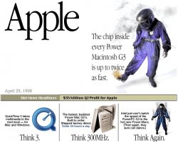
Check it out, Intel chips sure do suck, huh?
http://www.flickr.com/photos/kernelpanic/sets/283374/
Check it out, Intel chips sure do suck, huh?
Attachments
For those looking for other Apple homepages, the best place I've found is this guy who saves them on Flickr:
http://www.flickr.com/photos/kernelpanic/sets/283374/
Check it out, Intel chips sure do suck, huh?
Q2 1998: profit of $55 million
Q2 2012: profit of $11 billion
Crazy.
Is this a good thing or a bad thing?
Last edited:
I wonder how much business Frank's Pizza got after the iPhone was introduced. I'm curious to know if there was a marked increase in sales or not.
I wonder how much business Frank's Pizza got after the iPhone was introduced. I'm curious to know if there was a marked increase in sales or not.
Totally had a similar thought when I first opened this thread.
Also, having not searched around, does anyone know the significance of the original iPhone, iPhone 3G, and iPhone 3GS having the displayed time in ads as 9:42 AM and then the iPhone 4, 4S, and 5 showing 9:41 AM?
Register on MacRumors! This sidebar will go away, and you'll see fewer ads.


