You gotta be kidding
Differentiate from these. When your icon doesn't look like everyone else's (ie. text in icon), than more people are likely to notice your icon.
")
You gotta be kidding
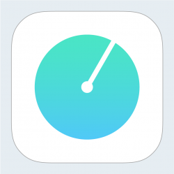
took a couple of mins to re create in Illustrator. The quality of your icon needs to be as high as poss otherwise it shouts cheap app if you know what I mean.
D
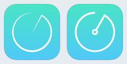
The edges on those shapes are pretty rough.
Looks good but I think proportionally your elements should be something like this?
D