Become a MacRumors Supporter for $50/year with no ads, ability to filter front page stories, and private forums.

JenovaStark

macrumors newbie
Original poster
Sep 20, 2013
6
0
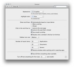
I just picked up my first Mac ever, one of the new 27 inch iMacs, but already I I've discovered what will likely be a deal breaker for me in regards to keeping it. I've noticed that the font rendering on web pages both in Safari and Chrome is strikingly different than how things look on PC. In fact, if this is how things are supposed to be I wonder how any professional develops websites on a Mac. Here's a look at what I'm talking about:

Screen%20Shot%202013-10-16%20at%206.26.21%20PM.png

https://yfxcpw.blu.livefilestore.co...reen Shot 2013-10-16 at 6.26.21 PM.png?psid=1

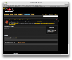
Now compare the same page to this PC version:

ss1.png

https://yfxcpw.blu.livefilestore.co...4sATrr3zuAeB8SI-oKU1if27AQHQ4o/ss1.png?psid=1

The PC version to me looks way better, and seems to be a better reflection of the designers intentions. Look at the text that says "We've got 1500 beta keys". You will notice on the PC version the text is thin but the mac version makes it look semi-bold. Same effect happens all over the place, like the words "This is a test". On the little side blurb with user info like my join date, last visit, ect. Mac makes it look bold again when it shouldn't. Even text that is supposed to be bold looks worse on Mac, such as the word "Related" which is a blurry mess (the "e"s are so blurry it's hard to make out that it is an e). The word Achievement is also far less clear on the Mac.

Please someone tell me this isn't how it is supposed to look. Not trying to hate on Mac I'm just surprised if this is the intended way it renders fonts. I appreciate any help you folks can provide.
 

SrWebDeveloper

macrumors 68000
Dec 7, 2007
1,871
3
Alexandria, VA, USA
Couple of things going on here.

First, let me say I am not here to convince you of anything - nor do I intend to start nor should anyone here start a Mac vs. PC war as it's not only old news and boring but also not the issue at all. Also, we all have different likes and dislikes, even when specs are involved.

Important non-disputable fact #1:

Apple and Microsoft have always disagreed in how to display fonts on computer displays. Today, both companies are using sub-pixel rendering to coax sharper-looking fonts out of typical low resolution screens. Where they differ is in philosophy.

  • Apple generally believes that the goal of the algorithm should be to preserve the design of the typeface as much as possible, even at the cost of a little bit of blurriness.

  • Microsoft generally believes that the shape of each letter should be hammered into pixel boundaries to prevent blur and improve readability, even at the cost of not being true to the typeface.

Fact #2

Web developers cannot control 100% of the font smoothing, anti-aliasing and sub-pixel rendering even with a customizable font. This is controlled by the operating system and can be overridden in the browser via default font, default stylesheets, defining zoom levels and minimum font sizes that all override the developer's intentions.

Fact #3

Professional developers try to follow the best practice of coding independently of platform and browser when possible, accounting for variances due to browser engines and quirks or legacy concerns.

In your test, you used different browsers set to different heights and widths in different operating systems and noticed the variance which is far more obvious that way. But even if you had Chrome on both, same size and default settings for both browsers and OS's, the facts as I listed them above still apply and you'd still see variances. The point in my stating this is that there will always be variances in font rendering and blurriness, and the developer has no control over this.

Good developers also rely less on fonts in graphics to try to level the playing field due to bandwidth constraints and many other W3C best practices involved, so basic font declaration extended by CSS is how things are done these days, including responsive theming which will dynamically resize things to adapt to mobile vs. desktop which is also added into the mix.

This is my professional response to you, and I could care less what platform you use to develop. That choice should be based on IDE's and apps involved to get the job done. The end user does not care how it was created, just that it works.

I might add some followup based on other replies, but I'd like you to absorb what I said and really think about it. Please acknowledge if you feel, as I hope, that I am being fair and balanced?

Cheers.

:cool:
 

JenovaStark

macrumors newbie
Original poster
Sep 20, 2013
6
0
Thank you for that reply it was very informative. I was afraid that was the case though. I think coming from 15 years of using a PC this will be a difficult thing to get used to. It just looks wrong to me and lessens the impression of what I consider an otherwise gorgeous product. I don't think the iPhone helps either with it's exceptionally sharp rendering of text. I was hoping the iMac would look just about the same in this regard.

While you are correct about the differences in width and height I did test this across a couple browsers. IE, as bad as it is in some cases, renders fonts the best to my eyes. It's as you said, very readable. Chrome on PC seems be have less aliasing or something, the fonts seem skinnier and less full. Safari and Chrome on Mac look pretty much identical, and in some cases they actually make fonts look a little curvier and nicer looking like on Facebook, but other times, typically bolded text, you get that blurry effect which reminds me of cheap LCD's.

I'll give it some time to see if I can adjust. Thanks again.
 

SrWebDeveloper

macrumors 68000
Dec 7, 2007
1,871
3
Alexandria, VA, USA
Thanks for keeping an open mind.

One point I wish to stress is that font rendering on a PC might seem less blurry to some "even at the cost of not being true to the typeface". When I was a newbie to the Mac platform it also took some adjustment just like you said. But as a professional web developer since then it took all of 2 seconds to appreciate seeing fonts much closer to the way they created when dealing with browser compatibility issues. Not to sound too glib, but for me and many others it's like I took the right colored pill in the Matrix and suddenly was awakened to reality, for better or worse. I appreciated it being real. Same today when I use my Mac and explore the Internet with it and Chrome as an end user. That's my admittedly biased opinion, but I am speaking honestly.

BTW, one final followup to your last comment:

Maybe take a moment to go through the settings on your iMac and tweak it to your liking with respect to the fonts and basic screen options. Don't buy into the argument "it should look perfect with all default settings if it was designed worth a damn". Just like you adjust mirror or add after market options to a new car so is the same when switching from/to *any* computer OS or even browser.

So... depending on your OSX version and your own needs, explore a little tweaking such as the System Preferences > General and Display options in the screenshot I attached to this reply and see if it makes a difference. That's not developer stuff and far out of scope for this forum, but I felt necessary to mention before I scoot.

I'll let others respond now. Cheers and thanks for listening.

;)
 

Attachments

  • Mac screen settings.jpg
    Mac screen settings.jpg
    97.2 KB · Views: 1,865
Last edited:

Nermal

Moderator
Staff member
Dec 7, 2002
20,636
4,036
New Zealand
Hmm, I use Wowhead regularly on my Macs and it looks much closer to the Windows screenshot on both of my machines. Unfortunately I have to go to a meeting in 1 minute so I can't follow this up yet!
 

JenovaStark

macrumors newbie
Original poster
Sep 20, 2013
6
0
Hmm, I use Wowhead regularly on my Macs and it looks much closer to the Windows screenshot on both of my machines. Unfortunately I have to go to a meeting in 1 minute so I can't follow this up yet!

If you have the time it would be much appreciated if you could provide any additional info on this or maybe a screenshot of what you see. I want to make sure I'm not jumping to conclusions if something is just off on my computer.
 

Nermal

Moderator
Staff member
Dec 7, 2002
20,636
4,036
New Zealand
Now this is interesting. On my Windows PC at work, your Mac screenshot looked awful. At home, it looks great. Since screenshots shouldn't be affected by the OS, I wonder whether this is purely a display issue.

At work I'm using an HP LA2405wg, and at home an AOC 203Vw+ (although it looks nice on my 2011 MacBook Pro's built-in display too).

Here's a screenshot of that same page for reference, but I'm guessing that it'll look the same as your first one.
 

Attachments

  • Screen Shot 2013-10-17 at 5.14.03 PM.png
    Screen Shot 2013-10-17 at 5.14.03 PM.png
    229.4 KB · Views: 1,045
Last edited:

Consultant

macrumors G5
Jun 27, 2007
13,314
34
What you are seeing is this thing called antialias.

Think about it. WHY would high end pc gamers get expensive video cards to enable multiple pass ANTI-ALIAS at high resolution?

None-anti-alias font is a relic of low quality computing. Anti-alias is the way to go.
 

JenovaStark

macrumors newbie
Original poster
Sep 20, 2013
6
0
What you are seeing is this thing called antialias.

Think about it. WHY would high end pc gamers get expensive video cards to enable multiple pass ANTI-ALIAS at high resolution?

None-anti-alias font is a relic of low quality computing. Anti-alias is the way to go.

Anti-aliasing shouldn't be making fonts appear thicker, as though regular text is getting bolded.
 

decksnap

macrumors 68040
Apr 11, 2003
3,075
84
Anti-aliasing shouldn't be making fonts appear thicker, as though regular text is getting bolded.

The fonts in the Mac screengrab look way better to my eyes.

There are separate issues going on here though - it's possible the Mac is displaying Helvetica, and the PC is displaying Arial, and the way the CSS is constructed may mean the Helvetica is displaying a different weight than Arial.

BUT - the issue of antialiasing is a different thing - coming to a Mac, it is something you need to get used to, but I've never met a person who, after allowing themselves to get used to it, preferred the Windows way of fudging the typefaces. Simply put the Mac is more accurate. I would give it a chance.
 

SrWebDeveloper

macrumors 68000
Dec 7, 2007
1,871
3
Alexandria, VA, USA
... and the way the CSS is constructed may mean the Helvetica is displaying a different weight than Arial.

Great point, thanks for noting it.

@OP:

Developers can control which fonts take priority over others, and it depends on what's supported by the end user's platform. Yet another reason why comparing fonts on pages between platforms is sometimes an apples vs. oranges thing. Combine that with the Windows pixel-boundry font-smoothing compared to the the more natural rendering by Mac's and the test is even more unfair. These concepts are not important to end users, it is the job of the developer to be aware of such issues and code accordingly, but sometimes there is no solution for an unsupported font other than the natural fallback to the next in the list. If you want to discuss how developers can setup downloadable fonts to level the playing field, that's a whole different discussion with a whole set of techniques and nasty issues involving W3C proposed standard regarding CSS and how to do it.

I cannot stress how important what decksnap said.
 

fisha

macrumors regular
Mar 10, 2006
174
12
SrWebDeveloper touched on the point that makes a noticeable difference to the appearance of fonts in OSX.

I've recently come from Windows over to Mac, and thought the same about the fonts display, just how you pictured. They seemed too heavy.

In that setting box he displays, what you need to do is un-tick the box that says use LCD smoothing. I think that's a setting meant for retina displays (which the 27" iMac isn't) . When you untick that, the font display appears much better (imho). The fonts look less heavy and blurred, and more like what you are used to.

They will still look slightly different to Windows due to the reasons of anti-aliasing discussed above, but they will look better.
 

jordanm86

macrumors regular
Oct 21, 2011
231
52
The fonts in the Mac screengrab look way better to my eyes.

There are separate issues going on here though - it's possible the Mac is displaying Helvetica, and the PC is displaying Arial, and the way the CSS is constructed may mean the Helvetica is displaying a different weight than Arial.

BUT - the issue of antialiasing is a different thing - coming to a Mac, it is something you need to get used to, but I've never met a person who, after allowing themselves to get used to it, preferred the Windows way of fudging the typefaces. Simply put the Mac is more accurate. I would give it a chance.

OP - I have used windows machines since I was 3-4 years old (my mum said she would bring me back from nursery and I was able to start up in DOS, type in some stuff (she's not a techie but my dad is... she meant change directory, execute files etc) and play games on it! I also used every version of windows throughout the years up to Windows 7 and switch to a Mac as my main machine about 5 and a half years ago (still have to occasionally use Windows for IE testing :mad:).

Yes, there is a few weeks of adjustment time to get used to it, but once you have, you begin to realise how nicer it looks, how smoother things run and just generally how much more intuitive and natural it feels to use.

I'd say stick it out for a couple of weeks, and then go back and try and use a windows machine and you begin to notice how 'clunky' it feels to use.
 

nitromac

macrumors 6502
Jul 29, 2012
282
13
US
I use both my MBP and my desktop PC extensively every week.

I got past the difference within ~2 weeks and don't notice it anymore. It's there and I know it's there but I don't pay attention to it. It becomes natural within a few seconds.

I do prefer the PC rendering when reading things (like this forum) but when I am doing design work I much prefer working with (and showing it to others) on my Mac.
 

blanka

macrumors 68000
Jul 30, 2012
1,551
4
Try design a foreign language different char-set website on Windows. Then you will instantly love the Mac way. Apple has fonts with all UTF characters and let them mix nicely. On a Windows machine this is horrible.
 

Ungibbed

macrumors 6502a
Dec 13, 2010
765
198
USA
Using both platforms on a daily basis, I do admit the Clear Type font display in Windows is less blurry and also be tuned via the Microsoft Clear Type Tuner. With my Mac on the other hand, the way fonts are displayed can be jarring for long time Windows users.

That being said, I wish Apple had a typeface tuning tool despite preferring the way fonts are handled in OS X over the somewhat "over-sharpened" text in Windows despite liking the easier to read typefaces at many times.

I wish Apple and Microsoft would collaborate so typefaces were truly identical on both OS platforms.

I've had similar issues when creating a very complex form in Microsoft Word with many tables and common fonts shared on both platforms (Arial in my case). Upon opening the same document in Word running on Windows, tables were broken and a similar typeface issue.

Compatible? Yes.
Accurate? Far from it.
 

mw360

macrumors 68020
Aug 15, 2010
2,032
2,395
Anti-aliasing shouldn't be making fonts appear thicker, as though regular text is getting bolded.

No it shouldn't, but a lack of antialiasing can reduce font thickness considerably. A 1.5 pixel stroke will appear as only 66% of its true width without AA so when comparing AA and non AA text, it's most likely the non AA text which is the wrong thickness. This is why there is a font rendering dilemma in the first place. If Apple's rendering were blurry AND wrong then the solution would have been obvious years ago.

Also relevant in this thread is that Apple use the individual RGB colour dots for sub-pixel AA, so if the dots aren't arranged the same way (as with some PC screens) then screenshots can look like a mess.
 
Last edited:

7enderbender

macrumors 6502a
May 11, 2012
513
12
North East US
I understand that this thread is about the very technical and web developer side of things. I found this when doing a search on how to make chrome look better on my new Mac.

Can anyone give me some simple consumer level steps to follow what I can do to make chrome look "normal" on the Mac? I prefer it as a browser and I'm using it on multiple machines and has all my stuff where I want it.
But it looks awful on my new computer. There must be a way to fix this, right?
 

hobla

macrumors newbie
Dec 22, 2013
19
10
In that setting box he displays, what you need to do is un-tick the box that says use LCD smoothing. I think that's a setting meant for retina displays (which the 27" iMac isn't) . When you untick that, the font display appears much better (imho). The fonts look less heavy and blurred, and more like what you are used to.

They will still look slightly different to Windows due to the reasons of anti-aliasing discussed above, but they will look better.

This. I can't believe the default setting is "LCD Smoothing" on... it's the first setting that I change on a machine I'm working on, and I'm a long-time Mac user.

And you have to restart your browser (or Mac on the system level) for it to take effect.
 

Consultant

macrumors G5
Jun 27, 2007
13,314
34
I understand that this thread is about the very technical and web developer side of things. I found this when doing a search on how to make chrome look better on my new Mac.

Can anyone give me some simple consumer level steps to follow what I can do to make chrome look "normal" on the Mac? I prefer it as a browser and I'm using it on multiple machines and has all my stuff where I want it.
But it looks awful on my new computer. There must be a way to fix this, right?

Print a document from PC, compare screen to printed copy.

Print a document from Mac, compare screen to printed copy.

You'll see that printed copy is closer Mac display, while the PC displays wrong font rendering (but you are used to it so you think the wrong rendering is "normal").
 

7enderbender

macrumors 6502a
May 11, 2012
513
12
North East US
Print a document from PC, compare screen to printed copy.

Print a document from Mac, compare screen to printed copy.

You'll see that printed copy is closer Mac display, while the PC displays wrong font rendering (but you are used to it so you think the wrong rendering is "normal").


Well, my dad still prints out emails for my mom and reads them to her. I don't do that. All I can say is that on my new Mac and expensive screen anything in Safari looks great and most things in Google Chrome look garish. And I don't like using Safari. So there is that.
 

blanka

macrumors 68000
Jul 30, 2012
1,551
4
I discovered that using Helvetica Neue Light improves sharpness a lot (weight 300 instead of 500). Try it.
Code:
body
{
	font-family: "HelveticaNeue-Light", "Helvetica Neue Light", "Helvetica Neue", Helvetica, Arial, "Lucida Grande", sans-serif; 
	font-weight: 300;
	padding:0px;
	margin:0px;
}

You could add that to a user stylesheet.
 

LV426

macrumors 68000
Jan 22, 2013
1,835
2,262
Spare a thought for poor Windows users using Office 2013. MS appears to have abandoned ClearType in Office and it looks ghastly. The web is awash with complaints.
 
Register on MacRumors! This sidebar will go away, and you'll see fewer ads.