Become a MacRumors Supporter for $50/year with no ads, ability to filter front page stories, and private forums.
HTC One - Front Facing Logo
- Thread starter shenfrey
- Start date
- Sort by reaction score
You are using an out of date browser. It may not display this or other websites correctly.
You should upgrade or use an alternative browser.
You should upgrade or use an alternative browser.
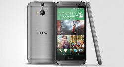
Well technically you could argue that in regards to a bigger screen and the boom sound speakers too")
Bigger screen and speakers give something in return, the logo doesn't. Although I guess all this talk is useless because they can't just get rid of the logo, it's there for a reason.
Yeah, I don't think anyone thinks the phone is hollow underneath that bar.
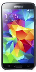
Guess you won't be getting the Galaxy S5 either. It has a horrible logo on the front too.
To me the logo on top is not as in your face. One might argue that it sits closer to the eyes but the bottom of the screen is a much more active area for the user, with the on screen buttons being right there.
I loathed these Samsung logos at first but eventually learned to live with the one on my Note 2... I still prefer none at all of course - if Google makes a 6 inch Nexus, my life will be complete.
Well yeah, it's a design choice. I'd have taken that extra bit of thickness any day if it meant getting rid of that bezel and logo.
And sorry everyone for being so pissy about this, I know a freaking logo isn't the end of the world obviously, it just rubs my OCD the wrong way
And sorry everyone for being so pissy about this, I know a freaking logo isn't the end of the world obviously, it just rubs my OCD the wrong way
And what do you do about all of he logos on other things you own like cars, tvs, washer/dryer, refrigerators, etc.?
I don't like that it's the black bar and then your touch buttons are another bar on top of a bar. Which to ME made the screen feel smaller and it felt wasteful.
But at the same time I understand it was necessary for internals etc etc. Just boils down to personal preference and what you find aesthetically pleasing.
But at the same time I understand it was necessary for internals etc etc. Just boils down to personal preference and what you find aesthetically pleasing.
Register on MacRumors! This sidebar will go away, and you'll see fewer ads.