Thanks!!!
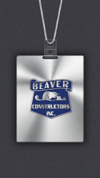
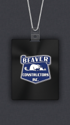
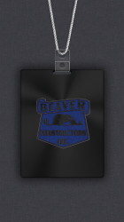
So let me explain what I have done. I tried to do both with the backgrounds coming through. The silver looked great as you will see.
The problem with the black background, is that as soon as you remove all the white, there really is nothing to differentiate the deep blue in the logo from the black background, thus making it impossible to read the logo. I tried to put white strokes around the black to see if that would help, but that looked terrible as you will see below.
So I just added an outer glow to the logo and think that was what looked best on the black. Hope you like. Let me know.


")