Become a MacRumors Supporter for $50/year with no ads, ability to filter front page stories, and private forums.
Weekly Photo Contest: January 21st to 28th - Lines
- Thread starter Goftrey
- Start date
- Sort by reaction score
You are using an out of date browser. It may not display this or other websites correctly.
You should upgrade or use an alternative browser.
You should upgrade or use an alternative browser.


Content CLOSED.
Before I begin Id just like to mention all of this feedback is purely subjective and is all simply my humble opinion. Im pretty confident every single one of you guys has more experience than me, so it feels sorta weird critiquing you. But anyway, here goes:
MacRy
Awesome shot. Brilliant mix of verticals and horizontals. The only thing that bugged me is the fact the photo is ever so slightly on the conk. Half a degree of clockwise rotation straightens it out. Regardless, still a great shot.
Obibob
I like the way the photo draws your eyes from the two sides down and then up through the centre. Its just a shame the two walls arent of equal height!
stillcrazyman
I really like the angle this is taken at. It reminded me of Monzas old Oval Banking (Image). Personally, given the prominence of the shadows, Id go black and white, and try to bring out the dark tones as much as possible. Theres some nice texture in the ground too which would become more visible. All in all though, a really cool shot. (Quick 30 second edit, for reference.)
Nielsenius
I absolutely love the shades of grey, green and purple going on here. It looks like you were going for a symmetrical shot, but those darn buildings prevented it from happening. In this case Id mirror & flip the left side of the shot to get that really nice abstract, symmetrical look. (Quick 30 second edit, for reference.)
anotherscotsman
The concept here is absolutely awesome. Its a massive shame about the two trees that poke their heads in to the shot. Now obviously I dont know what your surroundings were like when you took the shot, but I wouldve perhaps gone at it from a lower angle with a wider focal length, to get as much of the cityscape in as possible.
thebro20
This is a great shot. The misty clouds create a lovely surreal blanket for the bright, boldly lit city below. The lines themselves are great, but upon closer inspection I found the buildings in the background to be pretty fuzzy. Not a biggie when looking at them at 20/30%, but at 100% its pretty visible. Aside from that this is again, an epic shot.
imac wannabe
I really like this one. The way the picture draws your eyes in to the bustling town at the centre, and then draws you up and out in to the sky is really cool. Good job.
pukifloyd
Guitars make awesome subjects, and the colours in the sky compliment the colours in the wood nicely here. Its a shame about the random object in the lower left though!
needfx
This is a real brain teaser. I was looking at it for a good few minutes thinking it's an abstract piece of whatever that you find in airports/train stations sometimes. Then I went to get up, I found my head to be orientated horizontally, and then it hit me. Its an escalator! Clever work.
Indydenny
A nice mixture of blacks, white and yellows here. I love how the smoke is illuminated on top of the dark background. Perhaps focusing more on a smaller number of fireworks wouldve given the picture a cleaner look? Personally I think its a very lively, but quite busy picture - but this is coming from a raging minimalist so dont listen to me
R3ALSHOTZ
This location has so much potential! The building is stunning and the fact theres an identical one behind it makes it even better. Unfortunately all of these possibilities didnt quite come to fruition here. Why didnt you stand in front of the building from the centre? This way you get a head on reflection with the building behind you, and get a nice symmetrical shot with bold, clean lines.
840quadra
An awesome action shot. The square, boxy rafters provide a really nice backdrop and make the contrasting subject pop out. The two lights at the bottom of the frame are a bit of a shame though. Nevertheless, still a great shot!
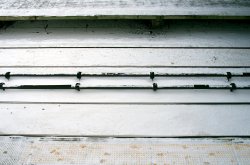
someoldguy
This shot has that classic eerie feel about it. The two sets of girders frame the shot brilliantly, and the tiled flooring just helps guide the eye down the corridor. Given the off-centre lighting, maybe taking the shot from a lower angle (and making the floor the main leading line wouldve been a better option?
Apple fanboy
A lovely, crisp shot with strong colours. It translates the feel of a cold, bright winters day really nicely. And of course theres that awesome sweeping line that guides the eye up the hill and in to the shadows. Good job!
HantaYo
Theres a really refreshing use of colours here. Too many desert photos are pure yellow. This uses darker browns and blacks really nicely. And there are so many twisting, turning lines that I found my eye dancing around the picture for a good while.
psou
This is absolutely brilliant. I have nothing to say. 100% nailed it.
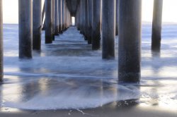
rx7dude
Ahh, a good ol bridge shot. Theres not much I can say really. I think given the fact its clearly winter there B&W was a wise choice, and the composition is nice and central. Maybe edit out the little sign on the right-hand post? I found myself a little distracted by it when first looking.
DirtySocks85
Certainly a unique take on this weeks theme! Nice, vibrant colours and a really cool technique. Good job.
Razeus
This is a superb photo. So many varying patterns coming from the different buildings. Every time I look at it I find a new detail. And the fog just rounds it all off. Brilliant.
JDDavis
This photo wouldve easily won last weeks sunset contest! Wonderful colours and a beautiful, dream-like reflection being cast off the lake. Can I ask what on earth that white(?) object is at 3 oclock? I still cant figure out if its a natural object or a man-made structure.
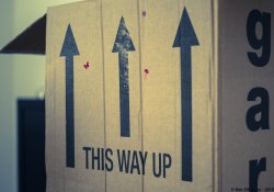
kenoh
Another interesting take on this weeks theme! Honestly theres not a massive amount I can talk about given the fact its just a box, but nevertheless - a unique addition that fits in perfectly with the theme.
koilvr
Again, I feel this shot has so much potential. The purposely over-exposed sky, along with the gorgeous mix of colours (not sure if it was intentional or not) make this photo one of the most surreal Ive ever seen. All you had to do here was stand central and youd be on to a winner!
HaroldC
I think the idea here is a good one, perhaps getting down low and level with the tracks and taking a photo across wouldve given the viewer more context than just simply taking the pic top-down.
NeGRit0
Another great long-exposure cityscape. I think this shot doesnt quite fit in to this weeks theme as well as thebro20s does, but regardless, its still a great shot.
3rd: Razeus
2nd: MacRy
1st: psou
Congratulations winners! Some incredible entries this week.
Before I begin Id just like to mention all of this feedback is purely subjective and is all simply my humble opinion. Im pretty confident every single one of you guys has more experience than me, so it feels sorta weird critiquing you. But anyway, here goes:
MacRy
Awesome shot. Brilliant mix of verticals and horizontals. The only thing that bugged me is the fact the photo is ever so slightly on the conk. Half a degree of clockwise rotation straightens it out. Regardless, still a great shot.
Obibob
I like the way the photo draws your eyes from the two sides down and then up through the centre. Its just a shame the two walls arent of equal height!
stillcrazyman
I really like the angle this is taken at. It reminded me of Monzas old Oval Banking (Image). Personally, given the prominence of the shadows, Id go black and white, and try to bring out the dark tones as much as possible. Theres some nice texture in the ground too which would become more visible. All in all though, a really cool shot. (Quick 30 second edit, for reference.)
Nielsenius
I absolutely love the shades of grey, green and purple going on here. It looks like you were going for a symmetrical shot, but those darn buildings prevented it from happening. In this case Id mirror & flip the left side of the shot to get that really nice abstract, symmetrical look. (Quick 30 second edit, for reference.)
anotherscotsman
The concept here is absolutely awesome. Its a massive shame about the two trees that poke their heads in to the shot. Now obviously I dont know what your surroundings were like when you took the shot, but I wouldve perhaps gone at it from a lower angle with a wider focal length, to get as much of the cityscape in as possible.
thebro20
This is a great shot. The misty clouds create a lovely surreal blanket for the bright, boldly lit city below. The lines themselves are great, but upon closer inspection I found the buildings in the background to be pretty fuzzy. Not a biggie when looking at them at 20/30%, but at 100% its pretty visible. Aside from that this is again, an epic shot.
imac wannabe
I really like this one. The way the picture draws your eyes in to the bustling town at the centre, and then draws you up and out in to the sky is really cool. Good job.
pukifloyd
Guitars make awesome subjects, and the colours in the sky compliment the colours in the wood nicely here. Its a shame about the random object in the lower left though!
needfx
This is a real brain teaser. I was looking at it for a good few minutes thinking it's an abstract piece of whatever that you find in airports/train stations sometimes. Then I went to get up, I found my head to be orientated horizontally, and then it hit me. Its an escalator! Clever work.
Indydenny
A nice mixture of blacks, white and yellows here. I love how the smoke is illuminated on top of the dark background. Perhaps focusing more on a smaller number of fireworks wouldve given the picture a cleaner look? Personally I think its a very lively, but quite busy picture - but this is coming from a raging minimalist so dont listen to me
R3ALSHOTZ
This location has so much potential! The building is stunning and the fact theres an identical one behind it makes it even better. Unfortunately all of these possibilities didnt quite come to fruition here. Why didnt you stand in front of the building from the centre? This way you get a head on reflection with the building behind you, and get a nice symmetrical shot with bold, clean lines.
840quadra
An awesome action shot. The square, boxy rafters provide a really nice backdrop and make the contrasting subject pop out. The two lights at the bottom of the frame are a bit of a shame though. Nevertheless, still a great shot!
someoldguy
This shot has that classic eerie feel about it. The two sets of girders frame the shot brilliantly, and the tiled flooring just helps guide the eye down the corridor. Given the off-centre lighting, maybe taking the shot from a lower angle (and making the floor the main leading line wouldve been a better option?
Apple fanboy
A lovely, crisp shot with strong colours. It translates the feel of a cold, bright winters day really nicely. And of course theres that awesome sweeping line that guides the eye up the hill and in to the shadows. Good job!
HantaYo
Theres a really refreshing use of colours here. Too many desert photos are pure yellow. This uses darker browns and blacks really nicely. And there are so many twisting, turning lines that I found my eye dancing around the picture for a good while.
psou
This is absolutely brilliant. I have nothing to say. 100% nailed it.
rx7dude
Ahh, a good ol bridge shot. Theres not much I can say really. I think given the fact its clearly winter there B&W was a wise choice, and the composition is nice and central. Maybe edit out the little sign on the right-hand post? I found myself a little distracted by it when first looking.
DirtySocks85
Certainly a unique take on this weeks theme! Nice, vibrant colours and a really cool technique. Good job.
Razeus
This is a superb photo. So many varying patterns coming from the different buildings. Every time I look at it I find a new detail. And the fog just rounds it all off. Brilliant.
JDDavis
This photo wouldve easily won last weeks sunset contest! Wonderful colours and a beautiful, dream-like reflection being cast off the lake. Can I ask what on earth that white(?) object is at 3 oclock? I still cant figure out if its a natural object or a man-made structure.
kenoh
Another interesting take on this weeks theme! Honestly theres not a massive amount I can talk about given the fact its just a box, but nevertheless - a unique addition that fits in perfectly with the theme.
koilvr
Again, I feel this shot has so much potential. The purposely over-exposed sky, along with the gorgeous mix of colours (not sure if it was intentional or not) make this photo one of the most surreal Ive ever seen. All you had to do here was stand central and youd be on to a winner!
HaroldC
I think the idea here is a good one, perhaps getting down low and level with the tracks and taking a photo across wouldve given the viewer more context than just simply taking the pic top-down.
NeGRit0
Another great long-exposure cityscape. I think this shot doesnt quite fit in to this weeks theme as well as thebro20s does, but regardless, its still a great shot.
3rd: Razeus
2nd: MacRy
1st: psou
Congratulations winners! Some incredible entries this week.
Congratulations to the very worthy winners and thanks to Goftrey for the useful and informative feedback.
Last edited:
Thanks for the prompt , and appreciated, feedback . Congrats to the winners , nice work .
Just as a FYI , my image was taken in the mezzanine level of the W.4th St. Subway in NYC . I pass through there once or twice a month , and it always gives me the feeling that there should be an ax murderer lurking in there somewhere (Maybe there is and he's downstairs on the BDFM platform buying a Daily News when I pass through ) .
Just as a FYI , my image was taken in the mezzanine level of the W.4th St. Subway in NYC . I pass through there once or twice a month , and it always gives me the feeling that there should be an ax murderer lurking in there somewhere (Maybe there is and he's downstairs on the BDFM platform buying a Daily News when I pass through ) .
Thanks for taking the time to give feedback for everyone. You're right, mine is ever so slightly wonky, didn't spot that editing it on my iPad. Should've took the time in Lightroom instead.
I was sure that Psou or Razeus would take it this week - awesome shots.
I was sure that Psou or Razeus would take it this week - awesome shots.
Well done to the winners, and good critique and judging. I think it's always good when people give feedback to all participants.
Looking forward to the next.
Looking forward to the next.
pukifloyd
Guitars make awesome subjects, and the colours in the sky compliment the colours in the wood nicely here. Its a shame about the random object in the lower left though!
Thanks for the feedback! The random object on the lower left is not random at all! It's the body of the guitar. It's just that the cut on the right side is lower than the one on the left, that's why you can't see it on the right. Maybe I could have cropped it out? But I thought it gave a nice edge to the picture.
Congratulations to all the winners!
JDDavis
This photo wouldve easily won last weeks sunset contest! Wonderful colours and a beautiful, dream-like reflection being cast off the lake. Can I ask what on earth that white(?) object is at 3 oclock? I still cant figure out if its a natural object or a man-made structure.
LOL, yeah it's a man made object. It's the top of the dam. I'm not sure the technical term for the type of dam but it basically uses a large cantilever type arm to lift the two dam doors (not the damn doors
).Thanks for the critiques, great job and a great set of photos. You nailed it with the winner. It was hard to resist cheering online for psou's shot the first time I saw it.
Some wonderful shots this week; for myself, I love shots of buildings and the theme for the week's competition was one that I found really interesting.
Over exposed
I did do it all on purpose. the over exposure and the off center up to the left. I wanted to gain something from it. I never did any post processing of this picture at all. I do have another picture where it is centered and done in light room.
I did do it all on purpose. the over exposure and the off center up to the left. I wanted to gain something from it. I never did any post processing of this picture at all. I do have another picture where it is centered and done in light room.
NeGRit0
Another great long-exposure cityscape. I think this shot doesnt quite fit in to this weeks theme as well as thebro20s does, but regardless, its still a great shot.
Fair enough, and thank you for the kind word. I knew it was going to be tough to beat psou & Razeus. Kudos to all great bunch of images, and congrats to the top 3.
Register on MacRumors! This sidebar will go away, and you'll see fewer ads.