Become a MacRumors Supporter for $50/year with no ads, ability to filter front page stories, and private forums.

Aztec

macrumors regular
Original poster
May 12, 2008
110
0
Hey Macrumors,

I just recently launched my first website, http://www.thecurrency.org and I'd love to get some feedback from y'all. I also take care of the writing — so if you have comments on that too, don't hesitate to let it all out. I mostly cover Apple stuff, as well and tech and mobile.

Thanks in advance!
 

dan1eln1el5en

macrumors 6502
Jan 3, 2012
380
23
Copenhagen, Denmark
I don't look at design and content, just the HTML and errors etc. looks good, no errors or warnings.
only thing that you might want to declare the page as HTML5 instead of trasitional, but it all checks out well, nicely structured.
 

Aztec

macrumors regular
Original poster
May 12, 2008
110
0
I don't look at design and content, just the HTML and errors etc. looks good, no errors or warnings.
only thing that you might want to declare the page as HTML5 instead of trasitional, but it all checks out well, nicely structured.

Thanks! Didn't even think to check that...good thing you did for me.
 

NutsNGum

macrumors 68030
Jul 30, 2010
2,856
367
Glasgow, Scotland
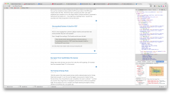
Hey Aztec, looking good, but I'd maybe consider doing something like this to clarify where your posts are beginning and ending. At the moment, I don't think it's quite clear enough.

I've attached an image to suggest what I'd maybe do to make the articles more distinct. I just did it in Chrome dev tools.
 

Attachments

  • Screen Shot 2015-03-23 at 13.00.43.png
    Screen Shot 2015-03-23 at 13.00.43.png
    595.5 KB · Views: 350

Aztec

macrumors regular
Original poster
May 12, 2008
110
0
Hey Aztec, looking good, but I'd maybe consider doing something like this to clarify where your posts are beginning and ending. At the moment, I don't think it's quite clear enough.

I've attached an image to suggest what I'd maybe do to make the articles more distinct. I just did it in Chrome dev tools.

Wow thanks. I also thought the differentiation was a bit difficult to make, but couldn't quite find the right way to do it. Your suggestion looks great. Mind if I take inspiration from it?
 

SwiftLives

macrumors 65816
Dec 7, 2001
1,356
341
Charleston, SC
First of all, I •love•*the minimalism. Well done :)

I would suggest some changes to the links in the sidebar. In their current state, I don't know what they are. I wasn't even sure they were links. When I mouseover them, I have trouble reading the text. I'd suggest either shrinking the icons and pairing them with text or at least just using text.

Also, I'm not a fan of hyphenation at all. This may just be my old-school print designer talking, but it makes things more difficult to read.

Finally, the 'top' button that appears when you scroll down doesn't seem to match anything else on the site. That makes it very distracting. I'd suggest toning it down a little.

Overall, I like it.
 

Aztec

macrumors regular
Original poster
May 12, 2008
110
0
First of all, I •love•*the minimalism. Well done :)

I would suggest some changes to the links in the sidebar. In their current state, I don't know what they are. I wasn't even sure they were links. When I mouseover them, I have trouble reading the text. I'd suggest either shrinking the icons and pairing them with text or at least just using text.

Also, I'm not a fan of hyphenation at all. This may just be my old-school print designer talking, but it makes things more difficult to read.

Finally, the 'top' button that appears when you scroll down doesn't seem to match anything else on the site. That makes it very distracting. I'd suggest toning it down a little.

Overall, I like it.

Great feedback. Thanks a bunch. I pretty much agree with everything you're saying. I'm working on a way to fix the sidebar, as well as the "scroll to top" animation, just haven't quite found the right thing yet.

Also, I'm a bit unclear as to what you mean by the hyphenation? Do you mean the use of hyphens in my phrasing?

Thanks again for the feedback, it's very much appreciated.
 

jemesouviens

macrumors member
Oct 31, 2012
51
0
Not bad for a first site!

My suggestions:

1 Have your links in a horizontal group at the top of the page. Presently you're wasting quite lot of the page as whitespace in the left hand margin, which is annoying when browsing on a smaller screen.

2 You may wish to use bootstrap / foundation to make the design more responsive.

3 While I too like the minimalist feel, it would be nice to have the occasional carefully curated image to make it less Spartan.

All the best!
 

Aztec

macrumors regular
Original poster
May 12, 2008
110
0
Not bad for a first site!

My suggestions:

1 Have your links in a horizontal group at the top of the page. Presently you're wasting quite lot of the page as whitespace in the left hand margin, which is annoying when browsing on a smaller screen.

2 You may wish to use bootstrap / foundation to make the design more responsive.

3 While I too like the minimalist feel, it would be nice to have the occasional carefully curated image to make it less Spartan.

All the best!

Once again, great suggestions.

1 I'm looking into that. I currently like the current setup, but you're right that it does waste a lot of space, especially on mobile

2 Definitely the next step. I'm still trying to wrap my head around this web design stuff, so I'm moving pretty slowly still. But it's coming. Also this way, I could keep the current layout if I really want to ;)

3 I plan on sometimes including images, but only when they are especially relevant ie posts that relate to design and that show a product.

One last thing...t'es Québécois?
 

jemesouviens

macrumors member
Oct 31, 2012
51
0
Once again, great suggestions.

1 I'm looking into that. I currently like the current setup, but you're right that it does waste a lot of space, especially on mobile

2 Definitely the next step. I'm still trying to wrap my head around this web design stuff, so I'm moving pretty slowly still. But it's coming. Also this way, I could keep the current layout if I really want to ;)

3 I plan on sometimes including images, but only when they are especially relevant ie posts that relate to design and that show a product.

One last thing...t'es Québécois?

Malheureusement non, mais ma femme est une vrai Montréalaise :)
 

Aztec

macrumors regular
Original poster
May 12, 2008
110
0
Thanks everyone for the fantastic feedback.

I've made a few changes to the website, mainly trying to enhance legibility as well as make it a little more streamlined visually. I've also made it a bit more responsive, and it should work much better now for iPad and iPhone. It's my first time doing the media query thing though, so it might be a little buggy — I've only tested it on the iPhone 5 and the iPad 3 w/ Retina Display.
 

NutsNGum

macrumors 68030
Jul 30, 2010
2,856
367
Glasgow, Scotland
Thanks everyone for the fantastic feedback.

I've made a few changes to the website, mainly trying to enhance legibility as well as make it a little more streamlined visually. I've also made it a bit more responsive, and it should work much better now for iPad and iPhone. It's my first time doing the media query thing though, so it might be a little buggy — I've only tested it on the iPhone 5 and the iPad 3 w/ Retina Display.

Looks much better man. Good job.

Far more modern, and much nicer typeface for the articles.
 
Register on MacRumors! This sidebar will go away, and you'll see fewer ads.