Become a MacRumors Supporter for $50/year with no ads, ability to filter front page stories, and private forums.

Barzakh

macrumors newbie
Original poster
Jun 2, 2009
13
0
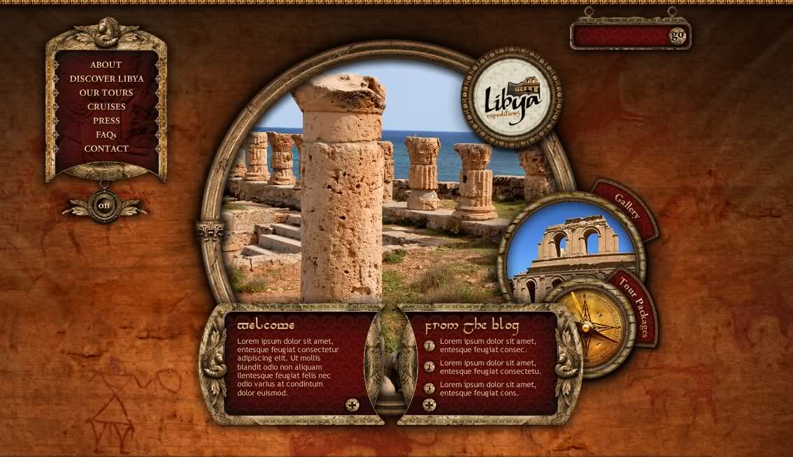
I'm opening a tour company that specializes in cultural and desert adventure tours to Libya, and this is one of the design concepts presented.

I was looking for a design that gives an ambience and character, making it an "experience."

I'm interested in hearing constructive criticism - the site will be marketed to an affluent demographic , as "unique" tours to an exotic destination.

What is attached is the home page only -

The home page will have flash elements and saharan tune ( which can be turned off of course)

The minuses in the design seem to be that the company logo is obscured and tiny, when it should be much more prominent, and the navigation could perhaps be done differently ?

I understand design should revolve around CONTENT, so as a first impression, what is YOUR impression ?

Feel free to ask any questions to help you give an honest assesment and feedback.

20fyyki.jpg
 

miles01110

macrumors Core
Jul 24, 2006
19,260
36
The Ivory Tower (I'm not coming down)
I was looking for a design that gives an ambience and character, making it an "experience."

It's certainly....unique....

The home page will have flash elements and saharan tune ( which can be turned off of course)

Lose the music. That's a great way to get me (and I'm sure, others) to never visit your site again. What elements are going to be flash?

The minuses in the design seem to be that the company logo is obscured and tiny, when it should be much more prominent, and the navigation could perhaps be done differently ?

The nav menu seems tacked on as an afterthought (same with the search). You should find a way to incorporate it into the circular portions of your site; maybe around the edges of the main picture? The nav/search bars also create a lot of useless empty space.
 

Barzakh

macrumors newbie
Original poster
Jun 2, 2009
13
0
I don't like going over-board on Flash.

There will be a Flash image progression at the center, and tiny subtle flash elements in the navigation, and on the home page only.

I debated on whether incorporating music - well, it;s not actually "music" but soothing ambient score, the kind of stuff that soothes you .

Nothing obnoxious , it's low key and interesting.

I know many people get turned off to music, and most cases because of the music and how it just annoys people.

I think a subtle ambient score can be pulled off.

Thanks for your opinions - I agree on the navigation, I think it can be executed better, perhaps following the main circle.
 

miles01110

macrumors Core
Jul 24, 2006
19,260
36
The Ivory Tower (I'm not coming down)
I don't like going over-board on Flash.

There will be a Flash image progression at the center, and tiny subtle flash elements in the navigation, and on the home page only.

Why do you need flash in the nav menu? Flash is a pain in the rear, especially on Macs. Depending on what effect you want you could just use CSS or js.

Nothing obnoxious , it's low key and interesting.

Maybe. What's "interesting" for some is a total turn-off for others, though.
 

kAoTiX

macrumors 6502
Oct 14, 2008
487
0
Midlands, UK
I think the design is a good start and definately gives a good feel for the experience. The only thing I would be concerned about is the amount of content you can fit on the page and where it would go.

To me the layout also seems slightly sparse. By means of the nav box on the left being somewhat distant from the middle section and the search box looks medievil at best.

As a place holder for the initial intro to the site the size of the main section is good but i would expand on this to provide as much content on one screen or multiple large screen as aposed to small amounts of information in a small space.

If you have a unique demographic, will they be people who are also able to navigate the site well enough to find all the information they require about what you are offering?
 

snickelfritz

macrumors 65816
Oct 24, 2003
1,109
0
Tucson AZ
I like the design and overall attention to detail, although the borders around the objects seem a bit undersaturated compared to the rich background colors.
I like the navigation; it's simple to understand.
I'd keep the music and provide an option to turn it off.
(music can really enhance some types of web experiences; this site is begging for it, IMO)

Personally, I'd just do the whole thing in Flash, and create a standard HTML/CSS layout as alternate content for mobile devices, assistive devices, and search engines.
 

dmmcintyre3

macrumors 68020
Mar 4, 2007
2,131
3
Personally, I'd just do the whole thing in Flash, and create a standard HTML/CSS layout as alternate content for mobile devices, assistive devices, and search engines.

And allow you to set a cookie for disable flash every visit for us PPC Mac users.
 

AppleMatt

macrumors 68000
Mar 17, 2003
1,784
25
UK
MUSIC

Have the default set to off, with the user option to turn it on.

Personally, there's nothing more annoying that watching a video in one tab and a website starts playing crap in another - you have to hunt around for ages etc. Typically I'll close the page instead of looking for a mute.

AppleMatt
 

snickelfritz

macrumors 65816
Oct 24, 2003
1,109
0
Tucson AZ
If the music is initially off, most users (even those that might enjoy the music) will probably not realize it's available.
Might as well not include it in the first place.
 
Register on MacRumors! This sidebar will go away, and you'll see fewer ads.