Become a MacRumors Supporter for $50/year with no ads, ability to filter front page stories, and private forums.

MDomino

macrumors member
Original poster
Jun 15, 2012
49
98
Hi,

I just got back from the Apple Store, where I had a look at the Retina MBP.
I was specifically interested in how older apps that are not yet "retinafied" would look.

And to my surprise they look REALLY bad, totally pixelated.

Now, I do understand that they would not look as crisp as apps that are retinafied, but they should look no worse than apps on the "legacy MBP".

The resolution on the Retina MBP is 2880x1800 and apparently when you do not enable scaling everything is displayed with the same "display real estate" as it was on the old MBP (which has a resolution of 1440x900). That means an app on the new Retina MBP should be displayed at the exakt same size as the same app on the old MBP, only it would be displayed crisper of course.

That also means: When you have an old app, this app could just put one of its pixels into 4 of the new Retina pixels and therefore use an effective resolution of 1440x900 on the new Retina MBP. That means the App should look EXACTLY the same as it did on the old MBP.

But they don't they look much worse and totally pixelated.
Can anybody explain to me, why that is?

Thank you!
MD

P.S.: I asked an Apple Store guy and he said that Apple is aware of this problem and that there might be a software update to fix this, but he actually didn't sound like he knew what he was talking about.

P.P.S.: I know that apps will be updated soon, but in my job I stilly heavily rely on some older software (Adobe CS4, FCP 7) which will not be updated anymore, so I would be happy if these apps just would be displayed as they would be on the old MBP.


Update: Scroll down a few posts to see a graphic which explains the issue.

Update 2: After some testing I found out that it seems not to be a software issue. Read my post here.
 
Last edited:

FranzMarc

macrumors member
May 11, 2010
85
85
What do you mean when you say "not enable scaling"? I was under the impression that running the new RMBP at its native retina resolution automatically implied scaling for those apps which do not include retina graphics.

Hence those apps appear, as you said, the same size as on 1440x900, while they are from a resolution standpoint stretched to double their native size. This naturally leads to a much worse quality than on an old non retina mbp, no?
 

OSMac

macrumors 65816
Jun 14, 2010
1,451
6
When I tried one in Retina mode all apps looked great.

Are you sure you were in Retina 1440x900 mode?
 

MDomino

macrumors member
Original poster
Jun 15, 2012
49
98
@OSMac: Yes, I'm sure. Did you actually look at any old apps that are not retinafied yet? Like Pages or Keynote or most 3rd-party apps?


@FranzMard: When I say "not enable scaling" I mean the Retina 1440x900 mode, the optimal display.

This naturally leads to a much worse quality than on an old non retina mbp, no?

Well apparently it does, but it shouldn't.
Because when you cut down the 2880x1800 displays resolution in half you have a 1440x900 resolution display. That means that older apps COULD just displayed like they were before on the old MBPs. As I said for that you would just need to take one of the applications pixels and put it on four Retina pixels.

But for some reason this is not happening, there seems to be another interpolation algorithm used and I have no idea why, because it makes all the old apps look really bad...

It also makes web images look really bad btw (unless the site is already Retina optimized), so I think everybody should be concerned about this.
 

MadTester

macrumors regular
Mar 24, 2012
136
0
@OSMac: Yes, I'm sure. Did you actually look at any old apps that are not retinafied yet? Like Pages or Keynote or most 3rd-party apps?


@FranzMard: When I say "not enable scaling" I mean the Retina 1440x900 mode, the optimal display.


Well apparently it does, but it shouldn't.
Because when you cut down the 2880x1800 displays resolution in half you have a 1440x900 resolution display. That means that older apps COULD just displayed like they were before on the old MBPs. As I said for that you would just need to take one of the applications pixels and put it on four Retina pixels.

But for some reason this is not happening, there seems to be another interpolation algorithm used and I have no idea why, because it makes all the old apps look really bad...

It also makes web images look really bad btw (unless the site is already Retina optimized), so I think everybody should be concerned about this.

Also take into account whether the apps are 32 or 64bit??
 

FranzMarc

macrumors member
May 11, 2010
85
85
Well apparently it does, but it shouldn't.
Because when you cut down the 2880x1800 displays resolution in half you have a 1440x900 resolution display. That means that older apps COULD just displayed like they were before on the old MBPs. As I said for that you would just need to take one of the applications pixels and put it on four Retina pixels.

If the old apps were displayed like they were on a non-retina mbp they would be half the size, i.e. really small I thought.

Isn't it logical that if you double the resolution of any app or icon etc., in this case so it retains its relative size on the display, or as you describe it putting 1 pixel into 4 pixels, the edges etc are less smooth?

I understood this being the same when the iPhone 3GS apps had this little double size button, allowing them to be used on an iPhone 4, but at a much reduced sharpness/smoothness.
 

tekno

macrumors 6502a
Oct 15, 2011
840
4
If the old apps were displayed like they were on a non-retina mbp they would be half the size, i.e. really small I thought.

Exactly this. Standard MBP has 1220x800 pixels whereas the RMBP has more than double. To show it at the "legacy" resolution, the apps like Pages would take-up less than half the screen. To scale it up to the usual size you're used to, you start seeing all the jaggedy pixels.

It'll be the same when Apple bring out their 'amazing' 4K TV that everyone on here is banging on about...!
 

dccorona

macrumors 68020
Jun 12, 2008
2,033
1
If the old apps were displayed like they were on a non-retina mbp they would be half the size, i.e. really small I thought.

Isn't it logical that if you double the resolution of any app or icon etc., in this case so it retains its relative size on the display, or as you describe it putting 1 pixel into 4 pixels, the edges etc are less smooth?

I understood this being the same when the iPhone 3GS apps had this little double size button, allowing them to be used on an iPhone 4, but at a much reduced sharpness/smoothness.

no because those 4 pixels are the same physical size as 1 pixel on the old computer, so it should be identical.

It's gotta be some sort of software
 

jclardy

macrumors 601
Oct 6, 2008
4,232
4,567
Non-retina apps will have their text automatically upgraded (As long as the use OS X font rendering, which 95% of apps do.) The icons will just be scaled up 2x. So one gray pixel will become 4 gray pixels on the screen.

On the old MBP those 4 pixels would just be one.

In theory they should look the same, but because the pixels on a retina display have to be closer together there is less of a gap between pixels as they still have to let light through. So the 4 pixels blown up ends up looking sharper, which makes it look more pixelated.

That is compounded with the fact that the text and retina icons look ultra crisp making the non-retina look even worse by comparison.
 

FranzMarc

macrumors member
May 11, 2010
85
85
no because those 4 pixels are the same physical size as 1 pixel on the old computer, so it should be identical.

It's gotta be some sort of software

Ok that makes sense.

What is it Apple then actually does to optimize the apps and icons to look better compared to the not yet updated ones?
 

MDomino

macrumors member
Original poster
Jun 15, 2012
49
98
As I said before it should look exactly identical, but it doesn't, far from it. I am pretty sure the scaling itself is the issue here.

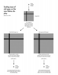
I've made a small graphic that explains what apparently is happening:

For the sake of simplicity let's assume that the old displays were 20x20px and the new ones are 40x40x and that there is an old app which just displays a horizontal line and a vertical line.

Now have a look at the attached image (you will have to watch this at 100%, else you cannot see the difference of the resulting images).

So, I am pretty sure it's the scaling that is the issue. I don't know why Apple does that? It should be extremely easy to avoid...
 

Attachments

  • ScalingIssueRetina.jpg
    ScalingIssueRetina.jpg
    156.4 KB · Views: 2,372

dccorona

macrumors 68020
Jun 12, 2008
2,033
1
Ok that makes sense.

What is it Apple then actually does to optimize the apps and icons to look better compared to the not yet updated ones?

Basically, they make the icons higher resolution. So in those icons, where there would normally be 1 pixel, there is 4. Those pixels will now be different colors instead of 1 uniform color, adding more detail to the image
 

MDomino

macrumors member
Original poster
Jun 15, 2012
49
98
Basically, they make the icons higher resolution. So in those icons, where there would normally be 1 pixel, there is 4. Those pixels will now be different colors instead of 1 uniform color, adding more detail to the image

Exactly.
With retinafied apps you don't need to scale those at all, they are already "full res" and of course they don't have "4 pixels blocks" but each pixel can have its own color.
 

Ccrew

macrumors 68020
Feb 28, 2011
2,035
3
Think apps are bad, Retina really makes you realize how crappy a lot of web graphics really are.
 

millerrh

macrumors 6502
Sep 14, 2005
463
32
I have a theory that the edges of (and gaps between) a normal pixel give off a smoothing/soft effect. Even though it is perceived as sharp, there is this gap and softness between actual pixels. So this dead zone is perceived as a certain softness to our eyes.

The retina display however, shows this same pixel as 4 very sharp pixels with basically no gap.

So even if you are seeing a true 2X representation it will appear blockier, sharper and more pixelated.

It would be cool if it could do something to smooth it out (like anti-aliasing on text). But they don't. It's actually the same on the iPad and iPhone. If you view non-retina apps, they look worse than they did on a pre-retina iPad/iPhone.

It is a little concerning because companies have much slower refresh cycles on computer software than iPhone/iPad software. It will probably be some time before most software is updated to take advantage of the screen.
 

MDomino

macrumors member
Original poster
Jun 15, 2012
49
98
Think apps are bad, Retina really makes you realize how crappy a lot of web graphics really are.

No.
That is actually precisely the same issue. Web graphics look just bad on retina displays, because they seem to be scaled up the same "wrong" way that apps are scaled up.

If they would be simply scaled up the way I suggested above (in the graphic) then web graphics should look just fine, as they did on the old MBP.

Quite frankly I don't quite understand why hardly anybody seems to care about this. Even if people don't use any old apps anymore, everbody should have the problem that all the web graphics look crappy due to this problem (unless the website is "retina aware").
 

soulsteelgray

macrumors regular
Mar 20, 2012
213
144
Quite frankly I don't quite understand why hardly anybody seems to care about this. Even if people don't use any old apps anymore, everbody should have the problem that all the web graphics look crappy due to this problem (unless the website is "retina aware").

I'm going to be honest: I don't understand exactly what the question is because I see this as analogous to the leap from the iPhone 3GS to the iPhone 4, and from the iPad 2 to the 3rd gen iPad. It's a foregone conclusion to me that--based on my prior experience of being an early adopter of the Retina display twice already--apps that don't take advantage of the Retina display will obviously be pixelated.

They're squeezing twice the number of pixels into a physical working space of its predecessor. (960 x 640 into the physical space of what used to be 480 x 320, 2048 x 1536 into the physical space of what used to be 1024 x 768, and now 2880 x 1800 into the physical space of what used to be 1440 x 900.) Everything is meant to render at 2880 x 1800, and apps that take advantage of that look stellar. If the resources in the app aren't capable of rendering at 2880 x 1800, then of course they would look like crap when rendered at 2880 x 1800, despite being squeezed back into the equivalent of a 1440 x 900 display.

tl;dr Isn't this the exact same issue with the Retina displays on the iPhone 4/4S and 3rd gen iPad? I haven't heard many complaints, if at all, about perceived issues of ugliness regarding those--that is, not to the extent that you're carrying this conversation about the Retina display on the MacBook.

As for web graphics, well, I think we all knew for a very long time just how ugly they could be, and I've learned to accept that it's the responsibility of the web designers to improve their standards.
 
Last edited:

MDomino

macrumors member
Original poster
Jun 15, 2012
49
98
Well, it's quite possible that this is exactly the same problem as with the iPhone and iPad, I don't know since I didn't follow these introductions.

The problem is: It does not HAVE to be like that. If Apple would choose to do the scaling as I explained it in the graphic above it should just look fine, both old apps and web graphics.

OF COURSE the old apps will not look as crisp as the new retina apps, but they should just look like they did before on the old MBP, if the scaling was done right. But that is not the case they look MUCH worse. That is my point here.

Have you looked at the graphic that I showed above and did you understand it?
 

soulsteelgray

macrumors regular
Mar 20, 2012
213
144
Yes, I do, but that's not how Apple has done it ever since the introduction of the iPhone 4. The onus has always been on the developers to increase the size and quality of the graphics in their apps--hence the push towards "Retina ready" updates. It's never an issue of forcing existing resources to display better; rather, it's an overhaul of all the existing resources to larger resolutions.

The way I see it, running a non-Retina app on a Retina display is the exact same thing as blowing up a 100 x 100 image to 200 x 200. As far as I'm concerned, that's the simplest way to explain why non-Retina apps look so pixelated on Retina displays.

Could Apple do it the way you suggested? Sure. But they haven't for two years, and I don't think they'll start now.
 

NathanA

macrumors 6502a
Feb 9, 2008
739
16
MDomino,

Your image makes complete sense to me, and I get where you're going (unlike apparently more than a handful of other participants to this thread). You're saying that there doesn't appear to be a perfect 4:1 pixel mapping correlation, even though there should be, and as a result, the image gets slightly "blurry" when the anti-aliasing gets applied (which is happening even though there should be no NEED to anti-alias anything if you are simply pixel-doubling).

First, a disclaimer: I have not yet seen a Retina MBP in person. But one thing I do know after some reading is that although making the 2880x1800 screen act like a 1440x900 is the default setting, it is by no means the only possible way to configure the display. You can apparently ask OS X to give you the equivalent of a 1680x1050 or 1920x1200 workspace on the display instead of a 1440x900 workspace. And in those settings, there would not be an exact 4:1 ratio.

So the question for you is, on the floor model you were looking at, are you sure that someone didn't come along before you got there and screw around with the Displays panel inside of System Preferences?

-- Nathan

EDIT: For your reading and viewing pleasure, here is an article that contains a screenshot of the "scaling" options presented to the user on the Retina MBP. There are clearly other ways to configure the screen outside of the default perfect pixel doubling option, which is the default. I suspect the computer you were using had had hits settings changed before you got there. http://www.anandtech.com/show/5996/how-the-retina-display-macbook-pro-handles-scaling
 
Last edited:

ladeer

macrumors 6502
Feb 15, 2007
391
10
I'm going to be honest: I don't understand exactly what the question is because I see this as analogous to the leap from the iPhone 3GS to the iPhone 4, and from the iPad 2 to the 3rd gen iPad. It's a foregone conclusion to me that--based on my prior experience of being an early adopter of the Retina display twice already--apps that don't take advantage of the Retina display will obviously be pixelated.

They're squeezing twice the number of pixels into a physical working space of its predecessor. (960 x 640 into the physical space of what used to be 480 x 320, 2048 x 1536 into the physical space of what used to be 1024 x 768, and now 2880 x 1800 into the physical space of what used to be 1440 x 900.) Everything is meant to render at 2880 x 1800, and apps that take advantage of that look stellar. If the resources in the app aren't capable of rendering at 2880 x 1800, then of course they would look like crap when rendered at 2880 x 1800, despite being squeezed back into the equivalent of a 1440 x 900 display.

tl;dr Isn't this the exact same issue with the Retina displays on the iPhone 4/4S and 3rd gen iPad? I haven't heard many complaints, if at all, about perceived issues of ugliness regarding those--that is, not to the extent that you're carrying this conversation about the Retina display on the MacBook.

As for web graphics, well, I think we all knew for a very long time just how ugly they could be, and I've learned to accept that it's the responsibility of the web designers to improve their standards.

If you experienced the "pixel double" mode in iPhone 4, you should know exactly what the problem is.

Remember running your old 3GS app in the Pixel Double Mode? Do you think those app looks identical on 4 and 3GS? No, they look MUCH WORSE on 4, even though they really should look identical.

MDomino made a chart above that detailed how iPhone 4 should scale up a graphic where one pixel becomes 4 identical pixel, but taking up the same amount of physical space. (left route on his chart.)

However, what iPhone 4, as well as rMBP did, was different. They somehow made 4 DIFFERENT pixels for each original pixel the OS doubled, resulting in a blurry image (right route on his chart).


MDomino:

I have thought of this problem right from day one and posted it here, but no one understood what my concern was and no one cared. This was few minutes after the keynote.

I personally have NO IDEA what is causing this weird phenomenon that we all have been seeing since iPhone 4 came out 3 years ago...

Some people provided some explanation (theories) on this thread and perhaps some of them were right.

For example, jclardy said each individual on retina screen is a lot sharper (smaller) than a pixel on the old screen. When you see one big pixel and see 4 sharp tiny pixels, the later thing you see, due to its sharpness, will expose the imperfection of the image (as a whole), and lead to an actual less sharp image.

This at first might seem counter intuitive, but might make sense.


On the other hands, millerrh provided a different theory that, the gap between pixels on the old screen enhance smoothness for viewing. Because the gap now shrinks, this "buffer zone" went away the the whole screen looks less sharp.

This theory too sounds pretty convincing to me.

I hope someone technical can really answer our questions.

Btw, how did you make your chart? It looks really professional. Do you make these kind of chart for a living?
 
Last edited:

ladeer

macrumors 6502
Feb 15, 2007
391
10
also, MDomino, on the right route of your chart, when you introduced that "gray line" (between black and white areas), did you draw that gray line yourself? In other words, are you SURE when you blow up a pixel-doubled image on rMBP, you also will see that gray line?

In other words, can you do a test viewing a 3GS app on iPhone 4 (if you don't have rMBP in your hands), and when looking at a scaled up picture, compare that picture to the original image scaled up yourself. Compare these two scaled up picture to see if Apple REALLY DID introduce new color/artifact in their scale-up, or they are actually identical.

If they are identical in every pixel, maybe the difference is really in term of pixel size.

The easiest way to tell is to download an old app on iPhone 4s, take a screen shot of it by pressing home button and power button, then see it on your PC. Then, do the same thing on the same app on 3GS, and enlarge it on your PC to 400%.

-ladeer
 

2Turbo

macrumors 6502
Feb 18, 2011
360
0
This is exactly the problem holding me back from purchasing the rMBP. As soon as I saw the keynote I came on here trying to find out if my worst fear was true. How can I stand browsing the web when everything looks like crap. Using old apps, viewing lower res photos, graphics, etc.? How can we expect the entire desktop experience to suddenly update to retina along with the entire internet?

This is very disappointing. I really really wanted a rMBP!
 
Register on MacRumors! This sidebar will go away, and you'll see fewer ads.