Become a MacRumors Supporter for $50/year with no ads, ability to filter front page stories, and private forums.
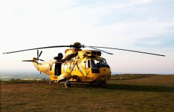
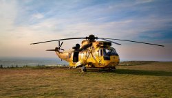
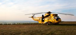
C&C please of two helicopter pics
- Thread starter Spacer
- Start date
- Sort by reaction score
You are using an out of date browser. It may not display this or other websites correctly.
You should upgrade or use an alternative browser.
You should upgrade or use an alternative browser.


sorry, neither appeal to me but on number 1 you have a rotor cut off which IMHO does not look vrey good. The second one looks more contrasty but to be honest the color palette does not work for me, they all blend into each other..
but then again, i can be wrong...")
but then again, i can be wrong...
The angle of the first with the composition a bit behind where it is on the second to give the chopper room to "move" forward would be the best IMO.
Paul
Paul
That looks a lot like the Sea King chopper Prince William co-piloted to rescue a man working on a gas rig last year.
Potential improvement recipe on photo 1:
Massively increase contrast
Desaturate by 40% ish
Hugely darken the sky
Sharpen Loads
Crop to 16x9 or 2x1
Full on Vignette
Obviously play with the settings but you should be able to go to town if you've shot in raw.
Massively increase contrast
Desaturate by 40% ish
Hugely darken the sky
Sharpen Loads
Crop to 16x9 or 2x1
Full on Vignette
Obviously play with the settings but you should be able to go to town if you've shot in raw.
I prefer the angle of the first shot as you can see more of the side of the Helicopter when stationary, but would like to have more room for the helicopter to move into as Paul mentioned (which would also mean the rotor isn't cut off).
I would have positioned the helicopter more toward (but not fully at) the left of the frame rather than the right.
The lighting is good, it brings out the yellow well, especially in the first shot.
The difficulty is that the copter and scene are all quite yellow, but there is just enough vibrancy in the yellow paint to make it stand out.
A red copter would really pop in a scene like this, but I know there isn't much you can do about that
Keep at it
Last edited:
IMO, composition is always the place to start. While I agree with those who like the angle of Number 1, the way the rotor blade is cut off tips the choice to Number 2.
I would crop tighter with the subject biased slightly to the left, thus giving the space in front that compuwar mentions. I'd have the subject lower in the image, giving better visual weight and an impression of stability. It also emphasizes the subject rather than giving so much image space to the grassy foreground.
Only after getting the composition right would I start manipulating saturation, curves etc. Capturing the image from your post isn't the ideal place to start for those adjustments, so I just lightened and sharpened it a bit, but the attached image will give you an idea what I mean by the composition comments.
Perhaps you'll get a chance to reshoot sometime so you can get the angle more like Number 1 and the composition similar to my cropping.
Thanks for serving.
Attachments
Cheap and cheerful HDR...
Here's my 2 cents (or pence, as we're in the UK).
In Photoshop - duplicate the photo onto a new layer.
On this new layer, perform Image/Adjustments/Threshold, and accept the default.
Invert this layer (Image/Adjustments/Invert)
Set the layer mode to 'Overlay'
Gaussian blur the layer to radius 90 pixels.
Thats the pseudo HDR done - you can crop and vignette as desired then.
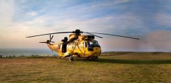
I also added a small version of how I might compose the shot - leave some space in front of the helicopter for it to move forward - it looks more natural.
I quickly butchered some extra background onto this, so it doesn't look great I know.
Obviously this is just my opinion and only one of many options.
Here's my 2 cents (or pence, as we're in the UK).
In Photoshop - duplicate the photo onto a new layer.
On this new layer, perform Image/Adjustments/Threshold, and accept the default.
Invert this layer (Image/Adjustments/Invert)
Set the layer mode to 'Overlay'
Gaussian blur the layer to radius 90 pixels.
Thats the pseudo HDR done - you can crop and vignette as desired then.
I also added a small version of how I might compose the shot - leave some space in front of the helicopter for it to move forward - it looks more natural.
I quickly butchered some extra background onto this, so it doesn't look great I know.
Obviously this is just my opinion and only one of many options.
Attachments

Looks really good now
To tweek even further:
I would overall darken the sky to stop the clouds in top left being too bright that they pull your eye away from the helicopter.
Darken the blues and maybe increase the reds a bit more in the sky to make the sunset much more obvious. It will make more sense to the viewer as to why the image is so contrasty.
Change the crop. Your original composition was great as it told a story that said "this helicopter is going to save the day somewhere over there in the background". You could even crop in tighter to the nose to give more room for the background.
Also has the heli been a little over saturated? Does it actually look that orange? Being at sunset the colour will look warmer than at mid day but I think youve pushed it a tad too much
Last edited:
What about changing the composition into something that brings the viewer into the picture instead of trying to "get it all in". There are times that trying to get the entire helicopter in the frame works but I agree with a few others that it doesn't work in this instance.
Here's a couple of examples of what I mean by changing the composition. They aren't great shots by any means but the idea is to show some different ideas for composition. I'm thinking you could get some really nice light on a high perch somewhere by the sea for a fantastic backdrop. Anyway that's my two pence worth.
Here's a couple of examples of what I mean by changing the composition. They aren't great shots by any means but the idea is to show some different ideas for composition. I'm thinking you could get some really nice light on a high perch somewhere by the sea for a fantastic backdrop. Anyway that's my two pence worth.
Attachments
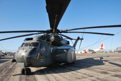
I actually like the composition of no.1 better, but the crop is off in my book. The entire wing should have been in the shot...
I would probably add enough to the right side to get it in and then add the same amount in the left side as to maintain the composition. Maybe chop a bit off at the bottom as well.
Edit:
Ok... extended the canvas to both sides equally, took some wing from the 2nd shot to finish off the cut blade. Filled the gaps in each side. Cropped top and bottom.
Attachments
Last edited:


Register on MacRumors! This sidebar will go away, and you'll see fewer ads.