Hey all,
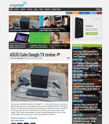
Some of you may remember me; some time back (roughly a year and a half ago), I used this exact forum as a testing platform for my blog, GearHungry (FYI I greatly appreciate all feedback received back in the day!). The site's been growing steadily and now has a reasonable following. Now, I figure it's time for a redesign, so I'm back for a bit of helpful advice!
Attached are screenshots, one of the current site (top) and of the redesign (bottom).
It's obviously a mockup, so not all details are sorted out, but I'd love to know which site seems more appealing and attractive to you, and (if you've got time), why
Thanks a ton for your help! Sorry, the images are rather large, you may need to zoom out a little (snapped on a retina MBP).
Here they are side by side: LINK
Last edited: