Become a MacRumors Supporter for $50/year with no ads, ability to filter front page stories, and private forums.
Simulator Provides Early Look at iOS 7 on the iPad
- Thread starter MacRumors
- Start date
- Sort by reaction score
You are using an out of date browser. It may not display this or other websites correctly.
You should upgrade or use an alternative browser.
You should upgrade or use an alternative browser.
Photoshop hack job
This is a photoshop hack job. I know this is a rumor site but come on this is bad
This is a photoshop hack job. I know this is a rumor site but come on this is bad
This is really a let down, how can Jony watch that GUI and approve it? Maybe his team is bunch of drones that only say "yes" to him. And Tim Cook? How can he look at the GUI/Icons and approve it too?
The worst part is that Apple did nothing new, not breakthrough in GUI design and that is just a big whole shame.
Just 2 months ago I was watching a Samsung Galaxy ACE, the lock screen is just non intuitive, guess what, is the same lock screen iOS uses now, t h e s a m e !
The worst part is that Apple did nothing new, not breakthrough in GUI design and that is just a big whole shame.
Just 2 months ago I was watching a Samsung Galaxy ACE, the lock screen is just non intuitive, guess what, is the same lock screen iOS uses now, t h e s a m e !
Skeuomorphic Scott where are YOU!!!
Am I the only one not liking the new design?
Don't get me wrong I like how Apple is making an effort to standardize the look across its apps but I am not liking this whole glass look.
I miss Scott and I miss Skeuomorphic design. This new android/WinMo garbage is taking away everything that was the iPhone. This is conformity which is what was wrong with Apple before Steve got back in charge and turned the company back around a few years later. I ran iOS 7 with an open mind but after 4 days on my daily I desperately switched back to iOS 6. Nothing felt the same and what I have come to know and love about my Apple products for so long now. I am all for change and updates but total abandonment of what made you so successful, not for that. I love all the feature updates, that I am not complaining about. I am not complaining about the bugs as I knew going into it that is was a Beta, it is the design that I hate. Could it be tweaked before release? Yes, but they did a complete overhaul and minor tweaks to the design won't change it enough to make it familiar again. Skeuomorphic design felt premium because there was attention to detail and it tried to mimic reality. I do not plan to update to iOS 7 when it is released and I am recommending to everyone I know not to make the jump. This is not Apple at its best and I hope they realize their mistake before it is too late.
I miss Scott and I miss Skeuomorphic design. This new android/WinMo garbage is taking away everything that was the iPhone. This is conformity which is what was wrong with Apple before Steve got back in charge and turned the company back around a few years later. I ran iOS 7 with an open mind but after 4 days on my daily I desperately switched back to iOS 6. Nothing felt the same and what I have come to know and love about my Apple products for so long now. I am all for change and updates but total abandonment of what made you so successful, not for that. I love all the feature updates, that I am not complaining about. I am not complaining about the bugs as I knew going into it that is was a Beta, it is the design that I hate. Could it be tweaked before release? Yes, but they did a complete overhaul and minor tweaks to the design won't change it enough to make it familiar again. Skeuomorphic design felt premium because there was attention to detail and it tried to mimic reality. I do not plan to update to iOS 7 when it is released and I am recommending to everyone I know not to make the jump. This is not Apple at its best and I hope they realize their mistake before it is too late.
I know how you feel about losing the familiarity, I will miss the old design too. But I'm not going to stay on iOS 6 forever. Things evolve. Deal with it.
I know this is supposed to be a rumor site. But this rumor isn't even believable. It's just blown up pictures of ios7 for iPhone.
After watching this site for 2 years, to my surprise, they actually get nearlly every rumor right.
Thats why I bougth ipad 4 recently, cause I know the next ipad5 will have a terrible design plus the awful iOS 7. Thank yo macrumors
It's interesting how Apple tells developers to write new layouts specifically designed for the iPad, but then all Apple themselves provide is a blown-up iPhone UI.
until apple realizes something, you have no idea what they do or do not do. it's not out yet.
I hope that the final iOS7 iPad UI treats the iPad as a first-tier client and gives it a thoroughly tablet experience.
when has that ever not been the case? why worry about it?
I hope Apple makes use of the iPad's larger screen real estate for some apps to run at the same time on the display a la the MS Tablet commercial. Run a Pages or Numbers document with a small portion of the screen available for IM chatting with clients or so-workers. The iPad would benefit from "true" multitasking that doesn't require double clicking/fingers swipes to open the multitasking menu, selecting the app, and repeating this process again. Why can't a simple iMessage reply be sent without having to leave the app you're in?
Last edited:
Man, I don't know what reality you're talking about. The skeuomorphism in iOS/OSX is atrocious. I can't remember the last time I used a physical paper notebook, legal pad or calendar. I actually feel insulted whenever I see it. It's like putting a turtle and rabbit on my car's speedometer like I'm some illiterate idiot that needs translation and comfort for the things I look at.Skeuomorphic design felt premium because there was attention to detail and it tried to mimic reality. I do not plan to update to iOS 7 when it is released and I am recommending to everyone I know not to make the jump.
That said, the color scheme of iOS7 it too freaking gaudy. My eyeballs start to bleed every time I look at it.

Man, I don't know what reality you're talking about. The skeuomorphism in iOS/OSX is atrocious. I can't remember the last time I used a physical paper notebook, legal pad or calendar. I actually feel insulted whenever I see it. It's like putting a turtle and rabbit on my car's speedometer like I'm some illiterate idiot that needs translation and comfort for the things I look at.
That said, the color scheme of iOS7 it too freaking gaudy. My eyeballs start to bleed every time I look at it.
It also uses up resources that do make a difference on mobile devices. I'd rather have a clean, simple and efficient interface than a calendar app with leather and stitching, I mean, what if you're a vegan?
I agree that iOS 7 took it too far. It's a start in the right direction but many aspects seem rushed and unpolished. Removing the glossy design cues and skeuomorphism is good, but the "Googie Architecture" inspired design, lack of contrast (esp on the keyboard), odd buttons and switches seem more like a drafted version than a beta.
Skeuomorphic Scott where are YOU!!!
Am I the only one not liking the new design?
Don't get me wrong I like how Apple is making an effort to standardize the look across its apps but I am not liking this whole glass look.
Have you seen it on an actual phone? Have you seen it without one of the default wallpapers?
It looks SO much nicer when you're looking at it on the actual device as opposed to their website.
Honestly, their biggest mistake was the default wallpapers. They should've made the default wallpaper a darker, nature wallpaper. It makes the new OS look and feel completely different as opposed to one of the stock ones, which can sometimes feel a bit cheesy or colorful/cheap.
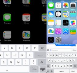
Do people realize that this is just the iPhone controls resizing using autolayout on the iPad?
This means literally nothing was done to customize for the iPad - because the interface wasn't ready for the iPad in this build.
People are mistaking this for a true version of iOS 7 for iPad, when its just the iPhone version scaled up.
That would suggest AutoLayout is working pretty well then.
You read the comments above, first, didn't you?
There's a reason Apple did not demo iOS 7 on iPad at WWDC during the keynote. It's not ready for primetime.
What you're seeing is the iPhone UI blown up to fit the larger screen, ala Android phone apps on Android tablets (not the same thing as iPhone on iPad), and iPhone apps on iPad have the built in "1x / 2x" button and users should know the difference.
Guys, if you read the instructions they give to do it, they're just copying over the default settings from the iPad under iOS 6 and emulating it with the iPhone's iOS 7 resources.
In other words, this is not the iPad with iOS 7. It's the iPad with the iPhone interface stretched across the frame. This is why the flashlight toggle is there too.
If this is a iPhone UI stretched to fit a larger screen why is the Calendar icon different than the one shown on the iPhone? Doesn't iOS 6 have icon variances between iPad and iPhone/iPod Touch?
Also keyboard?
Attachments
3 things:
1. Low contrast between light gray text and white background makes it hard to read quickly.
2. Also, all these white backgrounds make the black edge of the screen inset under the glass pop.
3. Those of us who jailbroke and have used ghostly white minimalist themes, it's a bit, well, eyeball-buggering after a while. On the plus side, maybe it'll get people to turn the brightness down on their devices and get better battery life.
...or just be frustrating when they really can't read that light gray text.
iOS 7 is probably the least clean and consistent software I have ever seen and iPad blows it up to be worse. What is settings? Is that a gear wheel for a bicycle? Why is there no consistency in the icons? Why are there two compasses for two different apps? The colors are way too saturated, not easy on the eyes. Game center - what the hell? Photos icon? Tedious and uninspired Camera? Ugly and overtelling, not representing the hardware (lens used) on the back. Passport? OMG. And so on... Apple can't be serious about this? I won't upgrade to iOS 7 and I have already reversed to iOS 6 again. Gonna go for stock Android if they do not fix that iOS. There are also buttons missing in the OS so text is just floating around, even badly aligned.
I hope Apple makes use of the iPad's larger screen real estate for some apps to run at the same time on the display a la the MS Tablet commercial. Run a Pages or Numbers document with a small portion of the screen available for IM chatting with clients or so-workers. The iPad would benefit from "true" multitasking that doesn't require double clicking/fingers swipes to open the multitasking menu, selecting the app, and repeating this process again. Why can't a simple iMessage reply be sent without having to leave the app you're in?
Split screen multi-tasking could be something they're keeping secret this fall. Remember that nothing was demoed on the ipad at wwdc.
If this is a iPhone UI stretched to fit a larger screen why is the Calendar icon different than the one shown on the iPhone? Doesn't iOS 6 have icon variances between iPad and iPhone/iPod Touch?
Also keyboard?
To my knowledge the only icon that currently differs is the clock.
Split screen multi-tasking could be something they're keeping secret this fall. Remember that nothing was demoed on the ipad at wwdc.
And guess what would be needed for split-screen multi-tasking to work well on iOS? Auto-layout APIs, introduced in iOS 6.
With iOS 7, Apple is pushing heavily for devs to use auto-layout APIs, as it will help them make apps that are backward compatible with the iOS 6 interface.
Presumably in iOS7, the whole system interface has been rebuilt using the auto-layout APIs, as we can see in this simulator hack it can easily scale apps without any major cosmetic glitches.
But of course Apple is making iPad specific layouts for all of its apps, and that's what missing from this hack.
The release of iOS 7 would be the perfect moment for Apple to introduce both split-screen multi-tasking AND a bigger iPhone...
Last edited:
It's interesting how Apple tells developers to write new layouts specifically designed for the iPad, but then all Apple themselves provide is a blown-up iPhone UI.
I hope that the final iOS7 iPad UI treats the iPad as a first-tier client and gives it a thoroughly tablet experience.
It is important to remember that you are now discussing something that is not even in beta yet. There is no reason to believe anything the simulator shows today is the way it will look on the iPad.
----------
Good luck with all those white UI on your iPad screen. Your eyes should feel great after long period of time.
Umm Ok. These discussions about too much white are quite interesting. How do you bear the MacRumors site or even Google on a big computer monitor?
----------
iOS 7 is probably the least clean and consistent software I have ever seen
Hyperbole much? I bet it's not.
You have never even seen a Beta version of iOS7 running on an iPad so how can you make that claim?and iPad blows it up to be worse.
What is settings? Is that a gear wheel for a bicycle? Why is there no consistency in the icons? Why are there two compasses for two different apps? The colors are way too saturated, not easy on the eyes. Game center - what the hell? Photos icon? Tedious and uninspired Camera? Ugly and overtelling, not representing the hardware (lens used) on the back. Passport? OMG. And so on... Apple can't be serious about this? I won't upgrade to iOS 7 and I have already reversed to iOS 6 again. Gonna go for stock Android if they do not fix that iOS. There are also buttons missing in the OS so text is just floating around, even badly aligned.
Some of the icons can use help. If you are hoping to get away from buttonless text, stock Android would be a poor destination choice.
Register on MacRumors! This sidebar will go away, and you'll see fewer ads.