Become a MacRumors Supporter for $50/year with no ads, ability to filter front page stories, and private forums.

acearchie

macrumors 68040
Original poster
Jan 15, 2006
3,264
104
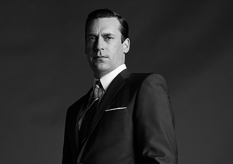
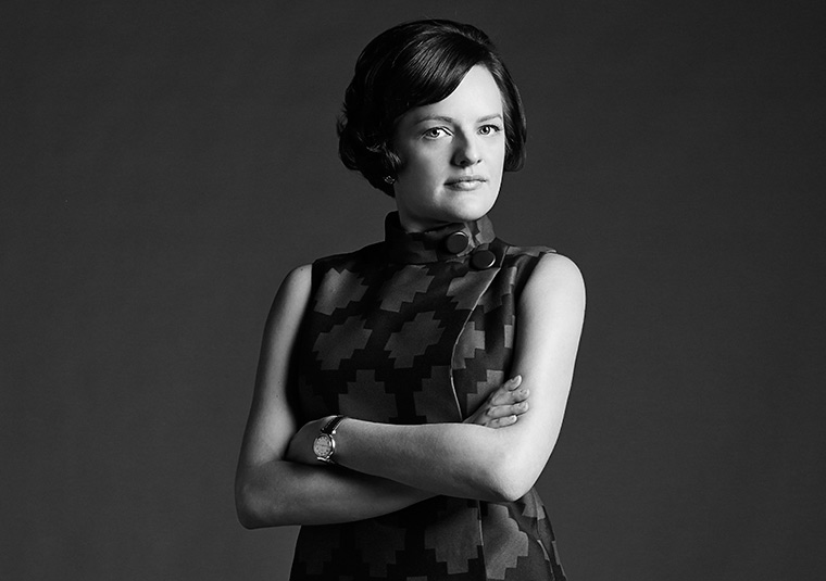
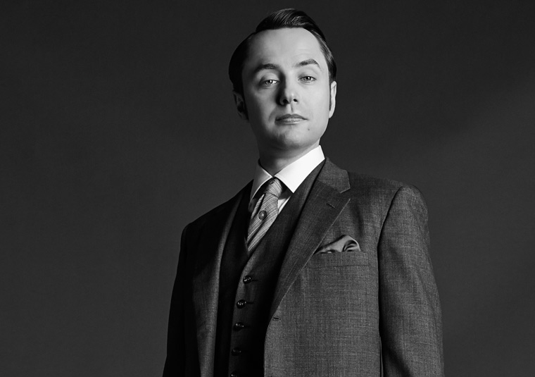
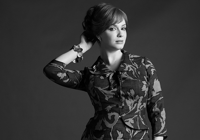
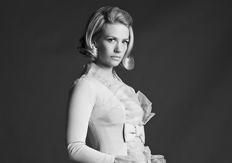
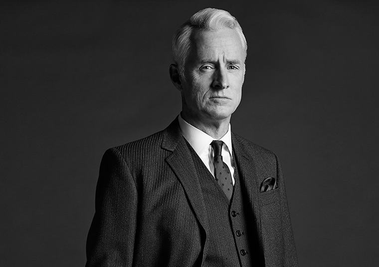
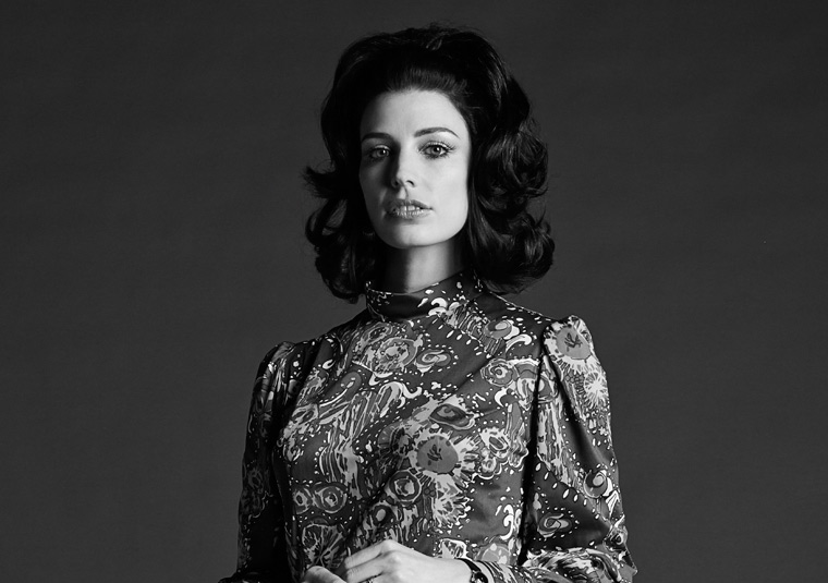
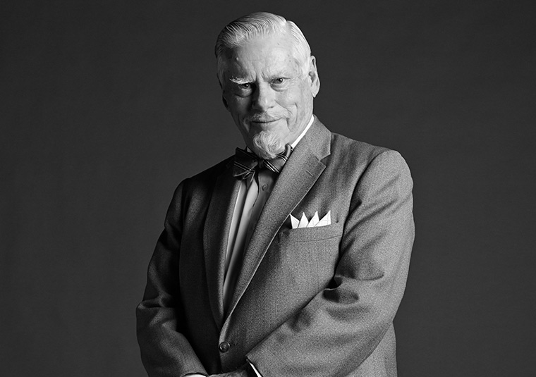
I recently saw the promo pics for the new season of Mad Men.

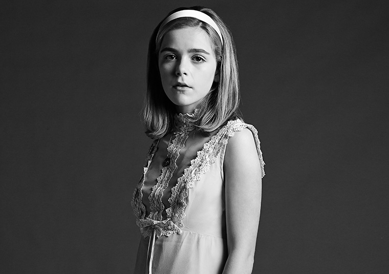
I really liked the style and simplicity of them and I am looking to replicate them myself in the future. What do you think? Do you like the style? For me it seems to fit in well with the era (that they are trying to emulate) and showing the raw characters.

I thought I would post some here to see what other people thing and see if they agree with my simple idea of their lighting setup: A large softbox camera right with subject standing away from the background and essentially that is it.

I think I am right in saying that the position of the lighting doesn’t change but the body positions, especially for the women, does giving them a more flattering light with less harsh shadows.

Here are some examples:

0wasxip.jpg

ukjRCqE.jpg

yhwXqSU.jpg

UhceUlj.jpg

wUiD7qX.jpg

YfIA2Ss.jpg

9jJACzc.jpg

qWNP8O9.jpg

EcLyXh1.jpg
 

Prodo123

macrumors 68020
Nov 18, 2010
2,326
10
It looks like a two-light setup to me; a large, soft key light, most likely a softbox, to the right to illuminate the face, and a small but uniform fill light to brighten the shadows a little bit. You can see the reflection of the second light in the women's jewelry.
I like this setup very much. It gives a dramatic contrast that brings out the definition in the subject's face.
 

MCH-1138

macrumors 6502
Jan 31, 2013
448
543
California
I am not seeing the second light -- just the softbox at camera right and a little high. But it is entirely possible that I am just missing it.

In any event, I agree that the setup works well in these photos. And I think you are right that the light position looks generally consistent with changes in body position influencing the look.
 

acearchie

macrumors 68040
Original poster
Jan 15, 2006
3,264
104
Had a quick test to see if I could replicate these with the kit I have.

Having a busy background really detracts from it so when I have a plain white or black background I will have another go.

I think it's an important factor to have the body slightly slanted. Really adds to the picture.

From my brief experiments I don't think there is any fill as I had a similar shadow roll off.
 

snberk103

macrumors 603
Oct 22, 2007
5,503
91
An Island in the Salish Sea
It looks like a two-light setup to me; ....

....
Having a busy background really detracts from it so when I have a plain white or black background I will have another go.
....
From my brief experiments I don't think there is any fill as I had a similar shadow roll off.

I think Prodo123 is correct. You can also see it in the ears and in the whites of the eyes that should be shadow. Instead of a light it may just be reflector... but there is something throwing a little light back into the shadows.

re: the cluttered background... what aperture are you using? And how far back is the background from your subjects? One of the reasons a good studio is so big is allow a larger gap between the subject and the background... perhaps you just need to create that gap in your setup?

One of the things about these promo photos that makes these not of the era is that the DoF is too crisp. Back in that time photos like this would have been shot on medium format at a minimum, and very likely a 4x5. The larger the format, the shorter the DoF generally (if you were using equivalent lense lengths i.e. 'normal' to 'norma'). Also - film was slower so apertures were wider to compensate. Look at photos from that era, and many of them were starting to get soft around the bits of the person that extended towards the background. These modern promo photos are too crisp by far to be from that era.
 

kevinfulton.ca

macrumors 6502
Aug 29, 2011
284
1
Looks like a straight forward single light setup. Look at the catch light in the eyes and you'll see the setup. You have a single light on the high right with a bounce card to their left to soften the shadows. Whatever modifier they're using it's not very big since the transition to shadow is relatively sharp (smaller light sources=harder shadows). You may want to try an umbrella (bounced) or a beauty dish if you if you have one available.
 

acearchie

macrumors 68040
Original poster
Jan 15, 2006
3,264
104
Whatever modifier they're using it's not very big since the transition to shadow is relatively sharp (smaller light sources=harder shadows). You may want to try an umbrella (bounced) or a beauty dish if you if you have one available.

When you say bounced do you mean reflective? Originally I thought it might be a job for my giant softbox but I think I agree more with your suggestion of a smaller modifier. Will have to have more of an experiment early next week.

Is it just me or do they all look pissed off?

Don’t know if you watch the series but I feel that it really does sum up the characters perfectly.

If anyone else does see what you think from my interpretation. May contain spoilers depending on how much you watch. It may read as a ramble but I really enjoyed these shots and this is what I took out of them.

From top to bottom.

Don Constantly confused about life and never appears to be truly happy. He believes you are born alone and you die alone and this image I feel shows his synical view on life.

Peggy Trying to really establish herself as a woman in the industry. Recently broken away from Drapers agency and the professional pose hints at trying to up her game.

Pete Constantly acting professional and always appearing to make himself bigger than he is. Being an account man he has to keep people happy but at the same time show his authority.

Joan Uses what she has and this shot shows off her sexier side and how she uses it to progress and manipulate.

Betty A kid trapped in an adults body. Very looks conscious and recently recovered from an eating disorder (the fatter kind) so keen to show off the asset that she is most proud of. The most flattering shot IMO.

Roger Even in a “serious” portrait he has a smirk on his face. The three piece suggests business man but the expression doesn’t quite match.

Megan Only female turned away from the light giving a stark contrast across the face. This picture linking with the tag line of “the affair to remember” for the new season could possibly mean that she cheats on Don rather than the other way round how we are used to. The expression is difficult to judge as well but it feels like there is some uncertainty.

Bertrand A business man but always smiling and seeing the positives. I wonder if he will finally get an office on the second floor!

Sally Worst of the bunch for me this one but I expect it’s trying to show off how she is still unhappy living with her mother and is at a difficult time in terms of growing up from a girl into a young woman. A transition we saw a glimpse of last season.
 
Register on MacRumors! This sidebar will go away, and you'll see fewer ads.