What do you think? How much of an influence will the recent iTunes design changes have on the direction of the GUI on OS X 10.7?
I actually wouldn't be surprised if they instead re-imagined the GUI from the ground up, but if that shouldn't happen and they're going for more of an incremental improvement, then it's not unthinkable that they're using iTunes as a trial balloon again, to get some reactions to some of the interface changes. After all, the "source list", Coverflow, metal windows etc. were all pioneered on iTunes before they appeared in other OS X apps, if I remember correctly.
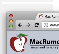
For example, I could imagine Apple applying the vertical window buttons to other applications where the title bar is not strictly necessary and where the user would profit from a little more efficient handling of space. Tabs on top will probably return in some way in Safari, which could be intelligently combined with a vertical window button layout. Maybe somewhat like the current version of Chrome ?!
This is what Mail might look like (next to what it looks like currently)") :
:
I actually wouldn't be surprised if they instead re-imagined the GUI from the ground up, but if that shouldn't happen and they're going for more of an incremental improvement, then it's not unthinkable that they're using iTunes as a trial balloon again, to get some reactions to some of the interface changes. After all, the "source list", Coverflow, metal windows etc. were all pioneered on iTunes before they appeared in other OS X apps, if I remember correctly.
For example, I could imagine Apple applying the vertical window buttons to other applications where the title bar is not strictly necessary and where the user would profit from a little more efficient handling of space. Tabs on top will probably return in some way in Safari, which could be intelligently combined with a vertical window button layout. Maybe somewhat like the current version of Chrome ?!
This is what Mail might look like (next to what it looks like currently)
: