Become a MacRumors Supporter for $50/year with no ads, ability to filter front page stories, and private forums.

cara0910

macrumors member
Original poster
Jun 1, 2011
39
0
Hey everyone,

I'm starting up a language school in Brazil. The company provides courses directly to students and language consulting for schools and businesses. Unfortunately, I don't have enough funds to pay for a proper logo.

I myself designed our current logo, found at this site: http://www.linguity.com.

However, I recently went on e-lance and hired a company to design a logo for just 150 bucks.

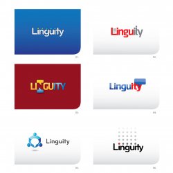
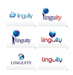
I have attached the 12 concepts they came up with in two rounds. I'm a bit disappointed because they all seem very cheesy to me. I wanted something modern but not too corporate, and something related to education.

Any tips on how I can improve upon the concepts in the attached pics? So far, I'm thinking that the black logo with the dots and red dot over the first 'i' is the best one, but I want to improve it to make it more interesting and relevant to a company that has to do with education.

Any advice will be GREATLY appreciated! I follow the macrumors community and know you all generally have interesting, well-formed opinions. I'm hoping to get a few of those so I can move forward!
 

Attachments

  • Linguity-logos.jpg
    Linguity-logos.jpg
    470.6 KB · Views: 249
  • LINGUITY-logo-round2.jpg
    LINGUITY-logo-round2.jpg
    49.9 KB · Views: 164

bluetooth

macrumors 6502a
May 1, 2007
662
1
Toronto
First of all, I would ask why they are not giving you initial concept designs in black and white? All of these gradients, gloss, bevels and emboss effects do not lend any credence to the overall design.

All of these logo's imo look very now or trendy and even (as you suggested) corporate. It is getting more and more difficult for companies to create original logos.

We’re all surrounded by the same influences and exposed to the same shapes, forms, and patterns, especially with the recent trend of gloss, bevel and emboss effects.

All of these concepts or designs look very similar in terms of layout and presentation. They do not portray a well thought out concept or design that will define your business and/or allow it to stand out in a marketplace.

Trends come and go. When you’re talking about changing a pair of jeans, or buying a new dress, that’s fine, but when your brand identity is concerned, longevity is key.

 Don’t follow the pack with these types of logo designs, you need to stand out.

Tell them you would like them to work in black first. By leaving colour to the end of the process, you focus on the idea. No amount of gradient or colour will rescue a poorly designed mark.

Not every logo needs a symbol

. Sometimes a client just needs a professional wordmark to identify their business. This can be truly effective if done properly.

Ask them to Keep the design simple so it will allow for flexibility in size. Ideally, your design should work at a minimum of around one inch without loss of detail. Look at the logos of large corporations like Mitsubishi, Samsung, FedEx, BBC etc. Their logos look simple and are easier to recognise because of it.

One thing to remember.

 That’s it. Their or your logo should leave the consumer/customer et. with just one thing to remember about the design. All strong logos have one single feature to help them stand out.

 Not two, three, or four.

 One.

I would personally ask that they start again and at least take these above points into account. Just my 2 cents.
 
Last edited:

THX1139

macrumors 68000
Mar 4, 2006
1,928
0
...However, I recently went on e-lance and hired a company to design a logo for just 150 bucks.

You get what you pay for. Those are pretty generic ugly $150 logos that are probably resold over and over. Just swap out the name and resell it!

...I'm a bit disappointed because they all seem very cheesy to me.

You get what you pay for. Next time save your money and hire someone. Or if you absolutely can't afford to hire a professional, try calling a design school and see if you can get access to a student to help you.

Any advice will be GREATLY appreciated! I follow the macrumors community and know you all generally have interesting, well-formed opinions. I'm hoping to get a few of those so I can move forward!

So, you went on the cheap and got crappy results... and now you want people to help you fix the problem? Eh, good luck with that. My advice is to lower your expectations (you get what you pay for), or start over. And yeah... I suppose the black dot logo is okay, but it probably doesn't say anything about what you do. You'd be better off grabbing the "thought bubble" from the logo to the left and try to incorporate it somehow. But that might look a bit cliché like the rest of those logos. These are just so trendy and dated.
 

gmanterry

macrumors regular
May 31, 2008
113
0
Phoenix, AZ
For what it's worth...

I like number nine. It conveys the idea of world unity through language. I lived in French West Africa for eight and a half years and was a Peace Corps Volunteer.

Terry
 

sjinsjca

macrumors 68020
Oct 30, 2008
2,238
555
#5 is very clever.

It includes a graphic logo that you can really hang your hat on. A world-class effort.
 

cara0910

macrumors member
Original poster
Jun 1, 2011
39
0
You get what you pay for. Those are pretty generic ugly $150 logos that are probably resold over and over. Just swap out the name and resell it!


You get what you pay for. Next time save your money and hire someone. Or if you absolutely can't afford to hire a professional, try calling a design school and see if you can get access to a student to help you.


So, you went on the cheap and got crappy results... and now you want people to help you fix the problem? Eh, good luck with that. My advice is to lower your expectations (you get what you pay for), or start over. And yeah... I suppose the black dot logo is okay, but it probably doesn't say anything about what you do. You'd be better off grabbing the "thought bubble" from the logo to the left and try to incorporate it somehow. But that might look a bit cliché like the rest of those logos. These are just so trendy and dated.

I understand that I get what I paid for, and I'm frankly prepared to use whatever I can to move forward and start making money to reinvest in a proper logo. Unfortunately, I don't have much money right now, so I can't invest $1000 in a decent logo.

I came to this forum hoping to avoid comments like yours. I'm experienced in fields other than graphic design, and I have helped people for free MANY times throughout the years, mostly online in communities like this. That's part of the beauty of the Internet: discovering how many people will help others just because they can.

I didn't ask you to design the logo. I asked for your advice on how to improve upon generic logos and make them slightly more original, or combine two of the logos to make something presentable. Having your condescending comments does not help me in the least. Please just don't respond if you have nothing truly constructive to say. I obviously know that 150 bucks is below most Americans' going rate. The company I went with is in Argentina, so I figured that 150 bucks there is worth 500-600 in the U.S., and that I may get something better than what I currently have.

Companies DO switch logos, and once I prove my concept and make a bit of money, I'll reinvest it in improving my product and image. At this point, I just don't have that money, and I was hoping for positive criticism. Thank you very much to the other two for your input :)
 

cara0910

macrumors member
Original poster
Jun 1, 2011
39
0
First of all, I would ask why they are not giving you initial concept designs in black and white? All of these gradients, gloss, bevels and emboss effects do not lend any credence to the overall design.

All of these logo's imo look very now or trendy and even (as you suggested) corporate. It is getting more and more difficult for companies to create original logos.

We’re all surrounded by the same influences and exposed to the same shapes, forms, and patterns, especially with the recent trend of gloss, bevel and emboss effects.

All of these concepts or designs look very similar in terms of layout and presentation. They do not portray a well thought out concept or design that will define your business and/or allow it to stand out in a marketplace.

Trends come and go. When you’re talking about changing a pair of jeans, or buying a new dress, that’s fine, but when your brand identity is concerned, longevity is key.

 Don’t follow the pack with these types of logo designs, you need to stand out.

Tell them you would like them to work in black first. By leaving colour to the end of the process, you focus on the idea. No amount of gradient or colour will rescue a poorly designed mark.

Not every logo needs a symbol

. Sometimes a client just needs a professional wordmark to identify their business. This can be truly effective if done properly.

Ask them to Keep the design simple so it will allow for flexibility in size. Ideally, your design should work at a minimum of around one inch without loss of detail. Look at the logos of large corporations like Mitsubishi, Samsung, FedEx, BBC etc. Their logos look simple and are easier to recognise because of it.

One thing to remember.

 That’s it. Their or your logo should leave the consumer/customer et. with just one thing to remember about the design. All strong logos have one single feature to help them stand out.

 Not two, three, or four.

 One.

I would personally ask that they start again and at least take these above points into account. Just my 2 cents.

Thank you very much for this advice :)

----------

You get what you pay for. Those are pretty generic ugly $150 logos that are probably resold over and over. Just swap out the name and resell it!


You get what you pay for. Next time save your money and hire someone. Or if you absolutely can't afford to hire a professional, try calling a design school and see if you can get access to a student to help you.


So, you went on the cheap and got crappy results... and now you want people to help you fix the problem? Eh, good luck with that. My advice is to lower your expectations (you get what you pay for), or start over. And yeah... I suppose the black dot logo is okay, but it probably doesn't say anything about what you do. You'd be better off grabbing the "thought bubble" from the logo to the left and try to incorporate it somehow. But that might look a bit cliché like the rest of those logos. These are just so trendy and dated.

Thank you, by the way, for the end of your post. It was actually helpful to get your input on that.
 

Apple OC

macrumors 68040
Oct 14, 2010
3,667
4,328
Hogtown
#5 is very clever.

It includes a graphic logo that you can really hang your hat on. A world-class effort.

I agree with #5 ... it works very well ... nothing wrong with a $150 logo ... IMO if you pay much more you are then paying for someone's ego.

good luck
 

THX1139

macrumors 68000
Mar 4, 2006
1,928
0
I agree with #5 ... it works very well ... nothing wrong with a $150 logo ... IMO if you pay much more you are then paying for someone's ego.

good luck

I hate it when people insult designers when they have no clue about what they are talking about. I hate it so much that I'm going to waste 15 minutes venting in this post.

Okay... $150 for a generic template logo that is cut up and resold over and over... yeah, sure. But an original logo that is designed to meet the clients needs for $150? :rolleyes:

I'd like to see you sit down and design a GOOD original logo for $150. Here, I'll break it down for you to illustrate how moronic the response you wrote was. Let's say that you are a decent designer and your client is fairly easy to work with (which is a rarity). You might spend 1, maybe 2 hours on research. I usually spend about 5 to 10 hours depending on complexity of the job. So, once you get kind of an idea for a direction, you pull out that $10 sketchbook and start knocking around ideas in thumbnail mode. I'll be conservative and say that you spend 2 hours doing that (I usually spend 8-10 hours avg.). Once I have 5 or 6 concepts, I start refining those ideas (still in sketch mode) to get something that I'm happy with and that I can get computer ready. Add 3 more hours. Then, depending on the contract, I choose 5 of the best ideas and take them into Illustrator to vectorize them. Depending on the complexity, add an hour per sketch for an additional 5 hours. I'm pretty fast, so let's drop that down to 2 hours to trace all of them (and no, I don't use live trace). Once the initial trace is done, I start selecting type that will go with the mark, along with searching through the $200 Pantone swatchbook to come up with a color palette based on my research and my design and the clients needs. Add another 2 hours.

Now that I've done all that, I'm ready to show the first round of designs to the client. For that, I usually drive over and meet with them in person ( I mount the designs on boards for presentation), or if they are online, I create a PDF and type up a lengthy email explaining (selling) each concept. Add 1 hour (although it's more) to prepare for all that.

Now that we have handed off the initial designs for the first round with the client, let's see how many hours we have invested thus far. 12 hours and that is extremely conservative. And it doesn't include over-head of running your business. But let's skip that part to keep this easy for you.

So, the client emails/calls back and goes over what they are thinking and they choose 2 of the designs to give further exploration. If you are really good or lucky, you might get away with them choosing one design and you're done (with the design portion of the job). Eh, that NEVER happens. So, you take their feedback and start on round 2 of designs based on that feedback. Add another 2 hours to the 12, which brings us to a total of 14 hours. Send that round of design to the client and they get back to you with final tweaks and a choice for their final logo. At that point, you show them color palettes applied to the design along with any supporting type choices. So, add another 3 hours to do ALL that. We're up to 17 hours and were still not done. Once I send over the final design along with color/type choices... I give them one last chance to change color or type and then we lock down the logo and I go back into the final logo and clean it up... and export different versions for media types. Then the logo is prepped for delivery and the files archived and the client is invoiced. Add another 2 (conservative) hours for all that. Total without overhead? 19-20 hours. Or $7-8 bucks an hour (without covering for overhead).

I also didn't include support documentation of logo use. If the job is large, I usually design a style guide to go with the logo. At the minimum, I have to include some kind of usage guide so the client won't screw it up. I would add the hours for you, but hopefully, you are seeing my point.

So, if I want to get paid more than $8 hour to do design you think it's about my ego? $8 bucks an hour with a $40k, 4 year design degree.. and studio overhead? Really?

The reason the OP doesn't like his logo is that he didn't pay for the process I described above. You get what you pay for.
 

Apple OC

macrumors 68040
Oct 14, 2010
3,667
4,328
Hogtown
I hate it when people insult designers when they have no clue about what they are talking about. I hate it so much that I'm going to waste 15 minutes venting in this post.

Okay... $150 for a generic template logo that is cut up and resold over and over... yeah, sure. But an original logo that is designed to meet the clients needs for $150? :rolleyes:

I'd like to see you sit down and design a GOOD original logo for $150. Here, I'll break it down for you to illustrate how moronic the response you wrote was. Let's say that you are a decent designer and your client is fairly easy to work with (which is a rarity). You might spend 1, maybe 2 hours on research. I usually spend about 5 to 10 hours depending on complexity of the job. So, once you get kind of an idea for a direction, you pull out that $10 sketchbook and start knocking around ideas in thumbnail mode. I'll be conservative and say that you spend 2 hours doing that (I usually spend 8-10 hours avg.). Once I have 5 or 6 concepts, I start refining those ideas (still in sketch mode) to get something that I'm happy with and that I can get computer ready. Add 3 more hours. Then, depending on the contract, I choose 5 of the best ideas and take them into Illustrator to vectorize them. Depending on the complexity, add an hour per sketch for an additional 5 hours. I'm pretty fast, so let's drop that down to 2 hours to trace all of them (and no, I don't use live trace). Once the initial trace is done, I start selecting type that will go with the mark, along with searching through the $200 Pantone swatchbook to come up with a color palette based on my research and my design and the clients needs. Add another 2 hours.

Now that I've done all that, I'm ready to show the first round of designs to the client. For that, I usually drive over and meet with them in person ( I mount the designs on boards for presentation), or if they are online, I create a PDF and type up a lengthy email explaining (selling) each concept. Add 1 hour (although it's more) to prepare for all that.

Now that we have handed off the initial designs for the first round with the client, let's see how many hours we have invested thus far. 12 hours and that is extremely conservative. And it doesn't include over-head of running your business. But let's skip that part to keep this easy for you.

So, the client emails/calls back and goes over what they are thinking and they choose 2 of the designs to give further exploration. If you are really good or lucky, you might get away with them choosing one design and you're done (with the design portion of the job). Eh, that NEVER happens. So, you take their feedback and start on round 2 of designs based on that feedback. Add another 2 hours to the 12, which brings us to a total of 14 hours. Send that round of design to the client and they get back to you with final tweaks and a choice for their final logo. At that point, you show them color palettes applied to the design along with any supporting type choices. So, add another 3 hours to do ALL that. We're up to 17 hours and were still not done. Once I send over the final design along with color/type choices... I give them one last chance to change color or type and then we lock down the logo and I go back into the final logo and clean it up... and export different versions for media types. Then the logo is prepped for delivery and the files archived and the client is invoiced. Add another 2 (conservative) hours for all that. Total without overhead? 19-20 hours. Or $7-8 bucks an hour (without covering for overhead).

I also didn't include support documentation of logo use. If the job is large, I usually design a style guide to go with the logo. At the minimum, I have to include some kind of usage guide so the client won't screw it up. I would add the hours for you, but hopefully, you are seeing my point.

So, if I want to get paid more than $8 hour to do design you think it's about my ego? $8 bucks an hour with a $40k, 4 year design degree.. and studio overhead? Really?

The reason the OP doesn't like his logo is that he didn't pay for the process I described above. You get what you pay for.

Not every client has "Nike money" to pay for what you want to charge.

I have worked in the Printing and Graphic Arts Industry for over 25 years and have met thousands of Designers like you describe ... I have seen clients duped into paying hundreds of thousands for Branding where all they received was the same generic logos you describe as "you get what you pay for". Graphic Designers that want to bill 30 + hours working on a logo are a dime a dozen.

The only worthy designers are the ones who have Unique Artistic Creative Talent.

Feel free to show me some logos you feel are worth thousands of dollars ... I have seen it all in this business.

And by the way ... Nike paid $30 for the swoosh logo :cool:
 

Designer Dale

macrumors 68040
Mar 25, 2009
3,950
100
Folding space
Not every client has "Nike money" to pay for what you want to charge.

I have worked in the Printing and Graphic Arts Industry for over 25 years and have met thousands of Designers like you describe ... I have seen clients duped into paying hundreds of thousands for Branding where all they received was the same generic logos you describe as "you get what you pay for". Graphic Designers that want to bill 30 + hours working on a logo are a dime a dozen.

The only worthy designers are the ones who have Unique Artistic Creative Talent.

Feel free to show me some logos you feel are worth thousands of dollars ... I have seen it all in this business.

And by the way ... Nike paid $30 for the swoosh logo :cool:

$35 charged at $2 per hour, and the client wasn't overwhelmed by the design. The designer later received a swoosh diamond ring and an envelope full of Nike stock in gratitude.

Article on Wikipedia is supported by others.

http://www.google.com/search?client=safari&rls=en&q=nike+swoosh+designer&ie=UTF-8&oe=UTF-8

Dale
 

Apple OC

macrumors 68040
Oct 14, 2010
3,667
4,328
Hogtown
$35 charged at $2 per hour, and the client wasn't overwhelmed by the design. The designer later received a swoosh diamond ring and an envelope full of Nike stock in gratitude.

Article on Wikipedia is supported by others.

http://www.google.com/search?client=safari&rls=en&q=nike+swoosh+designer&ie=UTF-8&oe=UTF-8

Dale

Thanks for the link Dale ... I never knew the whole story behind the Nike logo.

pretty cool that a logo she charged $35 for originally turned into a whack of Nike Stock.

Nice gesture on the part of Mr. Knight and Nike. :cool:
 

farmboy

macrumors 65816
Nov 26, 2003
1,296
478
Minnesota
My advice is: do not over think this!

This is heresy among designers, but other aspects of marketing your very small business will usually serve you just as well as the absolutely *perfect* logo. Millions of failed businesses had nice logos. Good designs, logos included, are practically euphoric examples of human art and ingenuity, with both conscious and subconscious appeal. But a Loewy-Lubalin-Glaser-Olins design won't make a bad product better.

I'd pay more for--or put more effort into-- a good tag / headline / marketing plan than a logo, if it came to one or the other on a limited budget.

Most of these logos are OK (not great), but none will sell your product by itself. But you can use your marketing materials to put any of these logos to work for you with a good layout that draws your eye to the logo and company name or product (color-size-location-consistency-repetition). Personally I'm leaning toward a slightly bolder version of #5 minus the gradients.
 

cara0910

macrumors member
Original poster
Jun 1, 2011
39
0
I hate it when people insult designers when they have no clue about what they are talking about. I hate it so much that I'm going to waste 15 minutes venting in this post.

Okay... $150 for a generic template logo that is cut up and resold over and over... yeah, sure. But an original logo that is designed to meet the clients needs for $150? :rolleyes:

I'd like to see you sit down and design a GOOD original logo for $150. Here, I'll break it down for you to illustrate how moronic the response you wrote was. Let's say that you are a decent designer and your client is fairly easy to work with (which is a rarity). You might spend 1, maybe 2 hours on research. I usually spend about 5 to 10 hours depending on complexity of the job. So, once you get kind of an idea for a direction, you pull out that $10 sketchbook and start knocking around ideas in thumbnail mode. I'll be conservative and say that you spend 2 hours doing that (I usually spend 8-10 hours avg.). Once I have 5 or 6 concepts, I start refining those ideas (still in sketch mode) to get something that I'm happy with and that I can get computer ready. Add 3 more hours. Then, depending on the contract, I choose 5 of the best ideas and take them into Illustrator to vectorize them. Depending on the complexity, add an hour per sketch for an additional 5 hours. I'm pretty fast, so let's drop that down to 2 hours to trace all of them (and no, I don't use live trace). Once the initial trace is done, I start selecting type that will go with the mark, along with searching through the $200 Pantone swatchbook to come up with a color palette based on my research and my design and the clients needs. Add another 2 hours.

Now that I've done all that, I'm ready to show the first round of designs to the client. For that, I usually drive over and meet with them in person ( I mount the designs on boards for presentation), or if they are online, I create a PDF and type up a lengthy email explaining (selling) each concept. Add 1 hour (although it's more) to prepare for all that.

Now that we have handed off the initial designs for the first round with the client, let's see how many hours we have invested thus far. 12 hours and that is extremely conservative. And it doesn't include over-head of running your business. But let's skip that part to keep this easy for you.

So, the client emails/calls back and goes over what they are thinking and they choose 2 of the designs to give further exploration. If you are really good or lucky, you might get away with them choosing one design and you're done (with the design portion of the job). Eh, that NEVER happens. So, you take their feedback and start on round 2 of designs based on that feedback. Add another 2 hours to the 12, which brings us to a total of 14 hours. Send that round of design to the client and they get back to you with final tweaks and a choice for their final logo. At that point, you show them color palettes applied to the design along with any supporting type choices. So, add another 3 hours to do ALL that. We're up to 17 hours and were still not done. Once I send over the final design along with color/type choices... I give them one last chance to change color or type and then we lock down the logo and I go back into the final logo and clean it up... and export different versions for media types. Then the logo is prepped for delivery and the files archived and the client is invoiced. Add another 2 (conservative) hours for all that. Total without overhead? 19-20 hours. Or $7-8 bucks an hour (without covering for overhead).

I also didn't include support documentation of logo use. If the job is large, I usually design a style guide to go with the logo. At the minimum, I have to include some kind of usage guide so the client won't screw it up. I would add the hours for you, but hopefully, you are seeing my point.

So, if I want to get paid more than $8 hour to do design you think it's about my ego? $8 bucks an hour with a $40k, 4 year design degree.. and studio overhead? Really?

The reason the OP doesn't like his logo is that he didn't pay for the process I described above. You get what you pay for.

I understand a lot of work goes into creating a great logo. Unfortunately, we are a startup and don't have even $500 to spend on this. Remember, we're working with an Argentine company and $150 for them is over 600 Argentine pesos, about 1/3 of a minimum wage for the entire month. So basically I'm paying the equivalent of $400 in the U.S. $400 for 20 hours of work = $20/hour, which is not a terrible wage at all - not amazing, but I've certainly made less in my life. I thought a decent logo may come out of it, or at least something better than what I created, considering I downloaded a free program and just did whatever I could. I have zero experience with logo design (which you can probably tell :))

I understand you're angry that people seem to not respect what you do, but I came to this forum humbly asking for advice from what I know to be kind, helpful, knowledgeable people. Like I said, I've given that advice in the past. I could have said, "I've designed these logos - what do you think?" But I didn't. I told everyone the truth and asked to get back a little of what I've given out in the past. The Internet is generally like that. Ideally, you give and take.

On that note, thank you for the advice you did give.

----------

My advice is: do not over think this!

This is heresy among designers, but other aspects of marketing your very small business will usually serve you just as well as the absolutely *perfect* logo. Millions of failed businesses had nice logos. Good designs, logos included, are practically euphoric examples of human art and ingenuity, with both conscious and subconscious appeal. But a Loewy-Lubalin-Glaser-Olins design won't make a bad product better.

I'd pay more for--or put more effort into-- a good tag / headline / marketing plan than a logo, if it came to one or the other on a limited budget.

Most of these logos are OK (not great), but none will sell your product by itself. But you can use your marketing materials to put any of these logos to work for you with a good layout that draws your eye to the logo and company name or product (color-size-location-consistency-repetition). Personally I'm leaning toward a slightly bolder version of #5 minus the gradients.

I couldn't agree with you more. At this stage there is a lot of stuff more important than our logo. We just want something professional and presentable, and I felt our logo now is VERY amateur.
 

Apple OC

macrumors 68040
Oct 14, 2010
3,667
4,328
Hogtown
My advice is: do not over think this!

This is heresy among designers, but other aspects of marketing your very small business will usually serve you just as well as the absolutely *perfect* logo. Millions of failed businesses had nice logos. Good designs, logos included, are practically euphoric examples of human art and ingenuity, with both conscious and subconscious appeal. But a Loewy-Lubalin-Glaser-Olins design won't make a bad product better.

I'd pay more for--or put more effort into-- a good tag / headline / marketing plan than a logo, if it came to one or the other on a limited budget.

Most of these logos are OK (not great), but none will sell your product by itself. But you can use your marketing materials to put any of these logos to work for you with a good layout that draws your eye to the logo and company name or product (color-size-location-consistency-repetition). Personally I'm leaning toward a slightly bolder version of #5 minus the gradients.

^^^ I agree with this advice ... why spend too much on an overpriced logo?
The money is better spent on helping market the Language School.

I also agree with dropping the vignette on #5 and maybe a font change ... making the logo 2 color will make reproducing school material much more cost effect ... maybe 2 Blues similar to this. ... good luck
 

Attachments

  • Linguity.jpg
    Linguity.jpg
    17 KB · Views: 541

cara0910

macrumors member
Original poster
Jun 1, 2011
39
0
^^^ I agree with this advice ... why spend too much on an overpriced logo?
The money is better spent on helping market the Language School.

I also agree with dropping the vignette on #5 and maybe a font change ... making the logo 2 color will make reproducing school material much more cost effect ... maybe 2 Blues similar to this. ... good luck

Wow, that actually looks much better! You are awesome. Thank you so much for the input. If you don't mind my asking, what font is that?
 

Apple OC

macrumors 68040
Oct 14, 2010
3,667
4,328
Hogtown
Wow, that actually looks much better! You are awesome. Thank you so much for the input. If you don't mind my asking, what font is that?

Your quite welcome Cara ... the font is called "Blue Highway" ... it is a standard font I found in Adobe Photoshop CS5.

IMO the logo is not bad ... kind of reminds me of a "thought bubble" thinking outside of a box.

best of luck with starting the school :D
 

cara0910

macrumors member
Original poster
Jun 1, 2011
39
0
Your quite welcome Cara ... the font is called "Blue Highway" ... it is a standard font I found in Adobe Photoshop CS5.

IMO the logo is not bad ... kind of reminds me of a "thought bubble" thinking outside of a box.

best of luck with starting the school :D

Thank you so much. Again, you are awesome. I also think the logo looks DECENT. Nothing amazing - but we just need something presentable to get our idea on the ground and going. We don't know how well people will take to it, so we're starting off 'aos poucos' as they say in Portuguese: bit by bit.

I also think, by the way, that logo six (black with the red dot) would be fine and would work well as a flavicon (with just the Li and the red dot). It really jumped out at me, although I agree with another poster that it doesn't really communicate that much about us.
 

bluetooth

macrumors 6502a
May 1, 2007
662
1
Toronto
^^^ I agree with this advice ... why spend too much on an overpriced logo?
The money is better spent on helping market the Language School.


I also agree with dropping the vignette on #5 and maybe a font change ... making the logo 2 color will make reproducing school material much more cost effect ... maybe 2 Blues similar to this. ... good luck

I have heard this time and time again from small business owners and can never understand the philosophy.

A logo can be a very valuable addition to your business: the right logo can be a key part of your marketing strategy.

The right designer can create a logo that catches eyes in your target demographic, that reflects the product or service you offer and that identifies you in a crowded industry. But a generic logo, with your business name added in, can’t do any of those things. Consider a logo in terms of an investment: if it can help you land multiple sales, you can get a definite return on that investment.

Old adage and it's cliche but you have to spend money to make money.

Just my 2 cents. :cool:

_____________.

Same goes for companies that let their websites go without any updates for sometimes years at a time, with lasa
 
Last edited:

cara0910

macrumors member
Original poster
Jun 1, 2011
39
0
I have heard this time and time again from small business owners and can never understand the philosophy.

A logo can be a very valuable addition to your business: the right logo can be a key part of your marketing strategy.

The right designer can create a logo that catches eyes in your target demographic, that reflects the product or service you offer and that identifies you in a crowded industry. But a generic logo, with your business name added in, can’t do any of those things. Consider a logo in terms of an investment: if it can help you land multiple sales, you can get a definite return on that investment.

Old adage and it's cliche but you have to spend money to make money.

Just my 2 cents. :cool:

Bluetooth I have seen and I'm envious of the many great logos out there. Logos can certainly make a difference, and we will likely redesign ours if we achieve any amount of success. Unfortunately, some businesses are started by the rich and others by the not-so-rich. We're the latter. With limited resources, it is much wiser to put money into designing the program, etc. than the logo, because no matter how great your logo is, if your product sucks, you're toast.

On the flipside, a good logo is just the foot in the door. No matter how good the business, if you can't get people to listen to you, you can't even prove the concept. It will also become very important when/if we work on a large scale, but for now it's just something to say we're professional.

So that's why we went with something cheap. It's better than our current logo and looks more professional, and it's not so expensive that we can't spend money on the things that matter. This isn't a makeup company that spends 80% on marketing; it's an educational company that's going to have high service costs to deliver a good product.
 

Apple OC

macrumors 68040
Oct 14, 2010
3,667
4,328
Hogtown
Bluetooth I have seen and I'm envious of the many great logos out there. Logos can certainly make a difference, and we will likely redesign ours if we achieve any amount of success. Unfortunately, some businesses are started by the rich and others by the not-so-rich. We're the latter. With limited resources, it is much wiser to put money into designing the program, etc. than the logo, because no matter how great your logo is, if your product sucks, you're toast.

On the flipside, a good logo is just the foot in the door. No matter how good the business, if you can't get people to listen to you, you can't even prove the concept. It will also become very important when/if we work on a large scale, but for now it's just something to say we're professional.

So that's why we went with something cheap. It's better than our current logo and looks more professional, and it's not so expensive that we can't spend money on the things that matter. This isn't a makeup company that spends 80% on marketing; it's an educational company that's going to have high service costs to deliver a good product.

that is a good sound way of looking at things ... chances are your early growth will come from referrals and word of mouth.

When the school grows a bit there will always be time to re-fresh the look.

cheers
 

cara0910

macrumors member
Original poster
Jun 1, 2011
39
0
that is a good sound way of looking at things ... chances are your early growth will come from referrals and word of mouth.

When the school grows a bit there will always be time to re-fresh the look.

cheers

We'll see if the business works out. I'm in Brazil, but I won't be for much longer if it doesn't work out. If it doesn't, I'll have to face the U.S. job market *shudders*.

My partner is unenthusiastic about the fifth logo in general, so we may end up going with the sixth. But in any case, thank you very much for the help and your very kind comments. May the karma police see to it that you get paid back in kind.
 

Apple OC

macrumors 68040
Oct 14, 2010
3,667
4,328
Hogtown
The sixth logo also looks good ... plus works well as 2 color for economical Printing.

There is always room for more educational business ... I am sure things will work out fine.

cheers to both of you :)
 

bluetooth

macrumors 6502a
May 1, 2007
662
1
Toronto
Bluetooth I have seen and I'm envious of the many great logos out there. Logos can certainly make a difference, and we will likely redesign ours if we achieve any amount of success. Unfortunately, some businesses are started by the rich and others by the not-so-rich. We're the latter. With limited resources, it is much wiser to put money into designing the program, etc. than the logo, because no matter how great your logo is, if your product sucks, you're toast.

On the flipside, a good logo is just the foot in the door. No matter how good the business, if you can't get people to listen to you, you can't even prove the concept. It will also become very important when/if we work on a large scale, but for now it's just something to say we're professional.

So that's why we went with something cheap. It's better than our current logo and looks more professional, and it's not so expensive that we can't spend money on the things that matter. This isn't a makeup company that spends 80% on marketing; it's an educational company that's going to have high service costs to deliver a good product.

Hey, it's all good and I understand what you are saying. As I said, I was just chipping in my 2 cents for what it was worth.

Best of luck with your business venture! It's really nice to see that you are taking an interest in the education
sector. :cool:
 

cara0910

macrumors member
Original poster
Jun 1, 2011
39
0
Hey, it's all good and I understand what you are saying. As I said, I was just chipping in my 2 cents for what it was worth.

Best of luck with your business venture! It's really nice to see that you are taking an interest in the education
sector. :cool:

Thank you! And thank you for your advice :)
 
Register on MacRumors! This sidebar will go away, and you'll see fewer ads.