Hi. I just have some comparison shots between my 4S vs my friends 4. I was wondering which screen is actually closer to what should be displayed.
Left: iPhone 4 (GSM), White, 32GB (not sure, but was pre-loaded with iOS 4)
Right: iPhone 4S, Black, 64GB (Week 6, 2012)
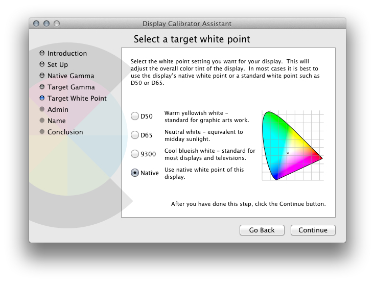
1. Settings (Brightness setting)
![DSC04515.JPG]()
I know I should've turned Auto-Brightness set to "OFF" but they both pretty much were at the same brightness.
As you can see the 4 is "cool" and the 4S "warm"
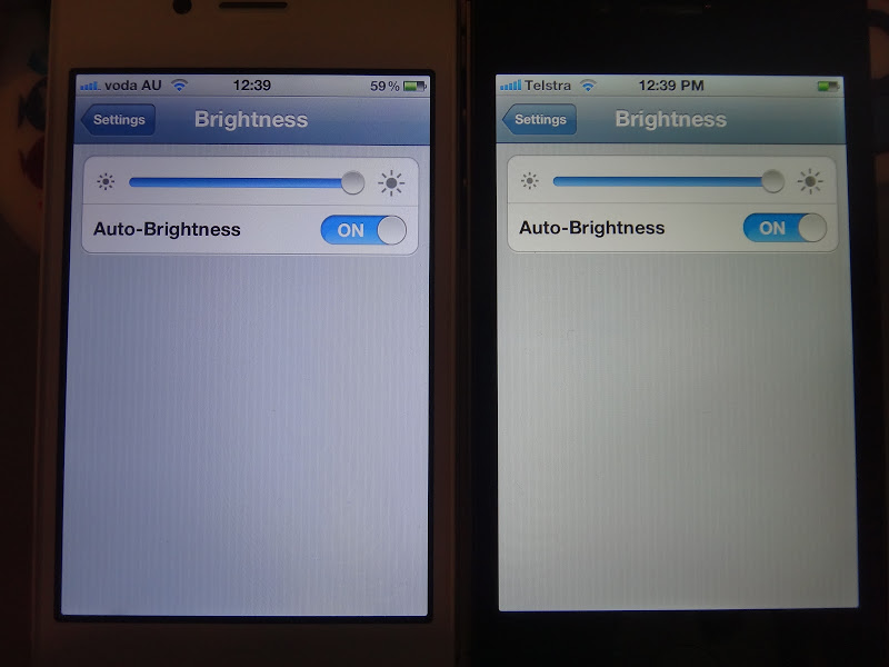
2. Safari (blank page)
![DSC04518.JPG]()
This is what confuses me. With the two different coloured looking displays, the Safari interface has either an either really blue (4) vs the blue grey colour on the 4S.
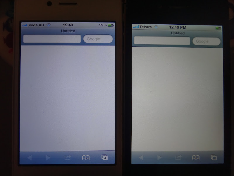
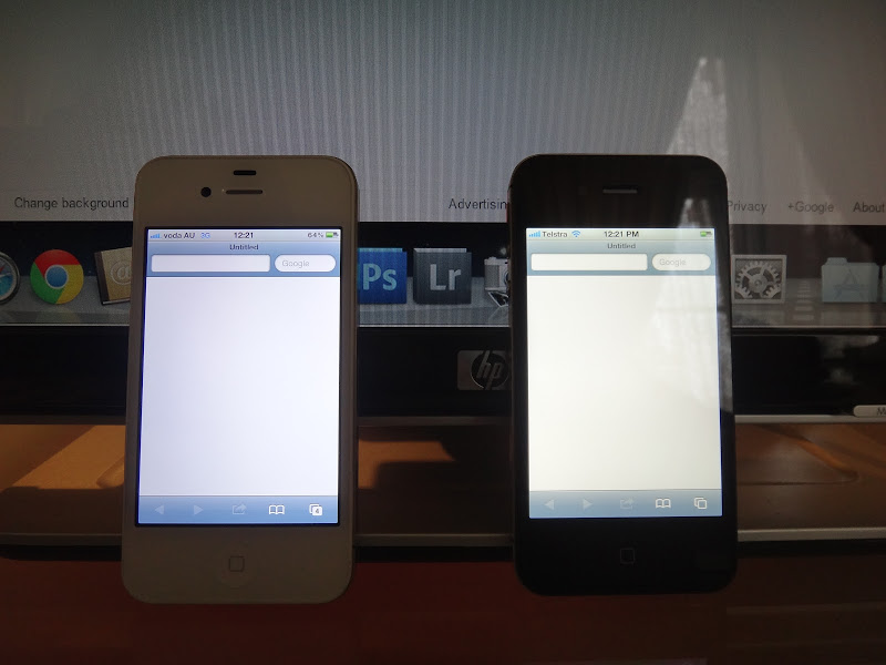
3. Safari 2
![DSC04513.JPG]()
Shot from a distance.
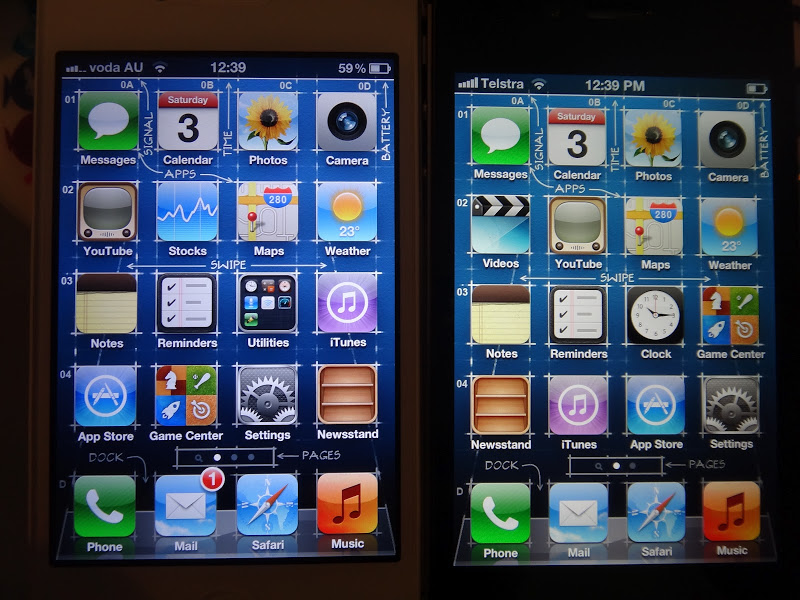
4. Home Screen
![DSC04517.JPG]()
Same home screen wallpaper. You can see the blue wallpaper is much more "blue" on the 4.
If you look at the greys (camera app) you can see one the 4 looks silver and the 4S is grey.
If you look at the whites (calendar icon) the white is a bit brighter on the 4S.
Looking at yellows, the 4S is more yellow and less orange. However, looking at the Weather icon, the yellow on the 4S actually brings out the sun and the contrast seems to be a bit better (?)
However, the YouTube app and Reminders app seem to have more contrast on the 4.
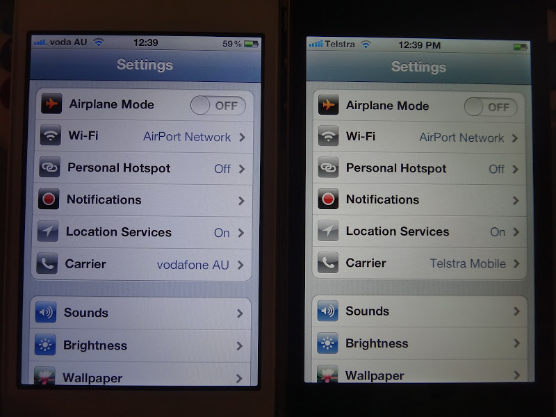
5. Settings menu
![DSC04516.JPG]()
If you look at all the icons on the left, you see that the contrast (like on the Weather icon) on the 4S shows the gloss shine semi-circle thing while it's more subtle on the 4.
Here is a screenshot of the Settings menu. Here you can use your calibrated monitor to view what should be the correct colour.
![IMG_0082.PNG]()
So, my question is, which display is more accurate to what is supposed to be displayed?
Left: iPhone 4 (GSM), White, 32GB (not sure, but was pre-loaded with iOS 4)
Right: iPhone 4S, Black, 64GB (Week 6, 2012)
1. Settings (Brightness setting)
I know I should've turned Auto-Brightness set to "OFF" but they both pretty much were at the same brightness.
As you can see the 4 is "cool" and the 4S "warm"
2. Safari (blank page)
This is what confuses me. With the two different coloured looking displays, the Safari interface has either an either really blue (4) vs the blue grey colour on the 4S.
3. Safari 2
Shot from a distance.
4. Home Screen
Same home screen wallpaper. You can see the blue wallpaper is much more "blue" on the 4.
If you look at the greys (camera app) you can see one the 4 looks silver and the 4S is grey.
If you look at the whites (calendar icon) the white is a bit brighter on the 4S.
Looking at yellows, the 4S is more yellow and less orange. However, looking at the Weather icon, the yellow on the 4S actually brings out the sun and the contrast seems to be a bit better (?)
However, the YouTube app and Reminders app seem to have more contrast on the 4.
5. Settings menu
If you look at all the icons on the left, you see that the contrast (like on the Weather icon) on the 4S shows the gloss shine semi-circle thing while it's more subtle on the 4.
Here is a screenshot of the Settings menu. Here you can use your calibrated monitor to view what should be the correct colour.
So, my question is, which display is more accurate to what is supposed to be displayed?
 I ****ing hate them! But the good news is there is a tweak in cydia called colour profiles, it lets you change the colour of the screen. i use it to make by screen look blue.