Become a MacRumors Supporter for $50/year with no ads, ability to filter front page stories, and private forums.
The New Dock
- Thread starter GoGa
- Start date
- Sort by reaction score
You are using an out of date browser. It may not display this or other websites correctly.
You should upgrade or use an alternative browser.
You should upgrade or use an alternative browser.

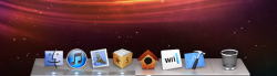
Apple has updated the dock in OS X! I think it looks tonnes better, much cleaner and less gloss.
Pic:
Image
What does everyone think?
Reminiscent of the original Dock. Much cleaner. I like it.
If they changed the dock on Mountain Lion, they should change the one on iOS 6 since they basically used the same one. If they don’t, then they won’t match anymore. I know, third world problems.
Can you check if there is an option to use the old one real quick? Not a big deal though, I can always just hack it back with an app.
Can you check if there is an option to use the old one real quick? Not a big deal though, I can always just hack it back with an app.
I don't get it. What's different?
It's subtle, but it's not as glossy.
I don't get it. What's different?
Different indicators, reflections, less glossy...
Attachments
The aluminum finish on that dock is reason enough for me to shell out the $19.99 for ML. Good riddance to the crosswalk markings that separates apps from the trash can and those oval indicator lights; it looks so much cleaner. I look forward to not falling back to the 2D dock for the first time in many years.
The aluminum finish on that dock is reason enough for me to shell out the $19.99 for ML. Good riddance to the crosswalk markings that separates apps from the trash can and those oval indicator lights; it looks so much cleaner. I look forward to not falling back to the 2D dock for the first time in many years.
Just get somebody to upload the resources folder from dock.app and you get the same look in lion by copying over the correct files
I know, third world problems.
Heh, I think you mean first world problems.
Yes Please someone upload the resource files so I can make my Lion look like Mountain Lion. lol please and thanks.
Changes of the new Dock
1. The dock now has it's own shadow like a window.
2. The perspective has changed slightly.
3. The icons are lower on the dock by 3 pixels now.
4. The scurve images are gone so the dock maybe rendered by software now, indicators, dock separators and the dock's frontline are still customizable PNG's.
5. The icon shadows on the dock are now at a 90° angle instead of 45°.
6. Strangely the trash icon needs it's own reflection PNG's.
![473309831.png]()
![874194391.png]()
7. There are also new dock resize cursors.
![546076904.png]()
![387556818.png]()
Large comparison shots
DP3 (12A206j) custom dock
![738499194.png]()
DP4 (12A239) default dock
![921671450.png]()
Selective screenshot of the dock, notice that this screenshot only has it's reflective mask and not the shape or color of the dock?
![664303216.png]()
1. The dock now has it's own shadow like a window.
2. The perspective has changed slightly.
3. The icons are lower on the dock by 3 pixels now.
4. The scurve images are gone so the dock maybe rendered by software now, indicators, dock separators and the dock's frontline are still customizable PNG's.
5. The icon shadows on the dock are now at a 90° angle instead of 45°.
6. Strangely the trash icon needs it's own reflection PNG's.


7. There are also new dock resize cursors.


Large comparison shots
DP3 (12A206j) custom dock

DP4 (12A239) default dock

Selective screenshot of the dock, notice that this screenshot only has it's reflective mask and not the shape or color of the dock?

Last edited:
1. The dock now has it's own shadow like a window.
2. The perspective has changed slightly.
3. The icons are lower on the dock by 3 pixels now.
4. The scurve images are gone so the dock maybe rendered by software now, indicators, dock separators and the dock's frontline are still customizable PNG's.
5. The icon shadows on the dock are now at a 90° angle instead of 45°.
6. Strangely the trash icon needs it's own reflection PNG's.
ImageImage
7. There are also new dock resize cursors.
ImageImage
Large comparison shots
DP3 (12A206j) custom dock
Image
DP4 (12A239) default dock
Image
Selective screenshot of the dock, notice that this screenshot only has it's reflective mask and not the shape or color of the dock?
Image
lovely icons
Heh, I think you mean first world problems.
Third world dock problems are related to boats.
Yeah, my bad. Yesterday was a long day for me.

Is it it funny Microsoft is making windows more and more transparency and apple is making OS X less transparency .
No they are not, have you seen Windows 8 lately? they are removing the aero glass frame in the final build and the start screen is a bunch of colored tiles. heres the source http://www.engadget.com/2012/05/18/microsoft-reveals-new-windows-8-desktop-ui/
Folks don't get me wrong but instead of wasting time on useless stuff like appearance of dock they should work on the memory management, wifi connectivity problems or more like slowing problems of Lion . . . . thit is **** coz I bet there's no difference in its functionality
Folks don't get me wrong but instead of wasting time on useless stuff like appearance of dock they should work on the memory management, wifi connectivity problems or more like slowing problems of Lion . . . . thit is **** coz I bet there's no difference in its functionality
Yes, because the fact that a few of the developers that worked on Mountain Lion updated the look of the dock, that means the entire rest of the team was just twiddling their thumbs in anticipation instead of working on the rest of the OS. And once those devs finished their work on the dock, they cashed in their check and got out of Dodge.
could someone please upload the background images and indicators so I can make Lion's dock look like that ?
?
Register on MacRumors! This sidebar will go away, and you'll see fewer ads.