Become a MacRumors Supporter for $50/year with no ads, ability to filter front page stories, and private forums.
Fixing The iOS 7 Icons (What does everyone think of these?)
- Thread starter nevesis
- Start date
- Sort by reaction score
You are using an out of date browser. It may not display this or other websites correctly.
You should upgrade or use an alternative browser.
You should upgrade or use an alternative browser.

I like the look of it, but from a usability standpoint, they are worse than the actual ones because they are harder to differentiate; they're mostly all white, and the unnecessary bits of color in Settings, Compass, Phone, Mail, Safari, Music, etc. have no use. The color used in iOS 7 is used more intelligently, I prefer the actual iOS 7 icons.
I am worried iOS7 will look like poo on the black iPhone. There have been no photos of the new OS on a black phone...
Honestly, ANY Safari icon looks better than this preschoolers nightmare they have shipped with the beta. It is just plain fugly.
i think there is too much white.
Agreed.
Agreed thrice!
I am worried iOS7 will look like poo on the black iPhone. There have been no photos of the new OS on a black phone...
I don't think it look to bad. Not a good pic but that's all I could do for now.
Attachments
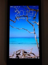
I don't think it look to bad. Not a good pic but that's all I could do for now.
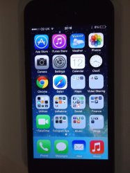
Not as bad considering you've hid almost half the stock icons.
Not as bad considering you've hid almost half the stock icons.
So Game centre, Passbook, Vodeos and Maps make almoust half of the stock Apps? Some people here would wish that
")
Good maths anyway
So Game centre, Passbook, Vodeos and Maps make almoust half of the stock Apps? Some people here would wish that
Good maths anyway
Weather, maps, videos, notes, reminders, game center, stocks, game center, newstand, passbook, compass, calculator, etc..
When they're all hidden in folders. No, it doesn't look as bad.
Weather, maps, videos, notes, reminders, game center, stocks, game center, newstand, passbook, compass, calculator, etc..
When they're all hidden in folders. No, it doesn't look as bad.
Game centre twice? Nice
Anyway, they are organised acordingly based on their relavance. I won't have an App I don't often use on my first page (and not based on how icons look like, something I don't care much about)
Becides, most apps you mentioned are in a folder, main page.
I am worried iOS7 will look like poo on the black iPhone. There have been no photos of the new OS on a black phone...
I will never understand this sentiment. Your monitor is probably surrounded by black, your MacBook probably has a black bezel, and your TV is likely black.
MacRumors is totally clashing with my Dell display right now.
What does everyone think of these?
You didn't fix the settings or camera icons.
I do think these are really nice, however, I still don't think these are the kind of designs Apple would implement, they are the kind of thing that you would get in a jailbreak theme for winterboard or something.
I do especially like the messages icon though
I do especially like the messages icon though
I think this guy's subtle tweaks of the new iOS 7 icons is a reasonable compromise: http://dribbble.com/shots/1109343-iOS-7-Redesign/attachments/140192
![Redesign_iOS7_Comparison_V2.jpg]()

I think this guy's subtle tweaks of the new iOS 7 icons is a reasonable compromise
He should have used the same wallpaper on both to compare them! Not one bright and one dark!
Becides, most apps you mentioned are in a folder, main page.
Exactly my point. They're all hidden in folders which is why I agree with you that your home screen now doesn't look to bad now.
Register on MacRumors! This sidebar will go away, and you'll see fewer ads.