Become a MacRumors Supporter for $50/year with no ads, ability to filter front page stories, and private forums.

mumph

macrumors regular
Original poster
Apr 18, 2013
115
0
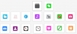
I've started to make a few of my own to see what I could come up with. Basing them on iOS7's style but making them better (in my opinion) by making them more consistent and less ambiguous. They are created using a complex grid system and I've chosen complimentary colours to help with consistency and clarity but I'm still getting that bit right (hopefully Apple are too).

What do you think?

Be warned, there is a splash of green felt :p
 

Attachments

  • Screen Shot 2013-06-17 at 22.06.31.png
    Screen Shot 2013-06-17 at 22.06.31.png
    87.4 KB · Views: 769
Last edited:

sonicrobby

macrumors 68020
Apr 24, 2013
2,482
526
New Orleans
I've started to make a few of my own to see what I could come up with. Basing them on iOS7's style but making them better (in my opinion) by making them more consistent and less ambiguous.

What do you think?

Much better than what the have now. Good work!
 

Shrink

macrumors G3
Feb 26, 2011
8,929
1,727
New England, USA
I think there are 384,576 threads about the iOS 7 icons.

Couldn't this possibly have been posted on one of them...instead of opening ANOTHER iOS 7 thread?
 

Jare

macrumors 65816
Jun 17, 2010
1,190
1
Canada
I think there are 384,576 threads about the iOS 7 icons.

Couldn't this possibly have been posted on one of them...instead of opening ANOTHER iOS 7 thread?

Nope. Sadly, this needed it's own thread because the OP's icons were so revolutionary, that in any other thread they'd be skipped over without a comment.

:rolleyes:
 

falconeight

Guest
Apr 6, 2010
1,866
2
Icons, Icons, Icons. Is that all people know. We get it some people don't like them. Relax, have a beer.
 

chekz0414

macrumors 6502a
Jul 3, 2011
770
99
FL
I personally prefer Apple's icons to that, Sorry... It doesn't have much variety in color at all... and it looks boring....
 

Michael Goff

Suspended
Jul 5, 2012
13,329
7,421
Icons, Icons, Icons. Is that all people know. We get it some people don't like them. Relax, have a beer.

But... these people are one picture away from being hired by Apple for their obviously superior artistic talents!

DON'T STEAL THAT FROM THEM.
 

seetheforest

macrumors regular
Dec 24, 2010
104
12
Nope. Sadly, this needed it's own thread because the OP's icons were so revolutionary, that in any other thread they'd be skipped over without a comment.

:rolleyes:
The irony is that the same would be true of someone posting the iOS 7 icons prior to their reveal. Well, someone might take a second to suggest how repulsive they look and chastise whoever posted them for having no taste.
 

HCO

macrumors regular
Oct 31, 2011
153
18
Memphis,Tenneessee
i enjoy iOS 7 and the icons that are on there. no need to change them. if you want them changed wait for a jailbreak. this is sad how everyone is crying over icons. forget the image on them. how do they work is all i care about.
 

Jare

macrumors 65816
Jun 17, 2010
1,190
1
Canada
The irony is that the same would be true of someone posting the iOS 7 icons prior to their reveal. Well, someone might take a second to suggest how repulsive they look and chastise whoever posted them for having no taste.

Ok? Don't know why you quoted me on that.
 

.beam.

macrumors member
Jun 17, 2013
40
0
I've started to make a few of my own to see what I could come up with. Basing them on iOS7's style but making them better (in my opinion) by making them more consistent and less ambiguous. They are created using a complex grid system and I've chosen complimentary colours to help with consistency and clarity but I'm still getting that bit right (hopefully Apple are too).

What do you think?

Be warned, there is a splash of green felt :p

I love these. Love love love! You should've been in charge of iOS7!
 

tonyr6

macrumors 68000
Oct 13, 2011
1,736
732
Brooklyn NY
The only icon I don't like from the official iOS is the settings app. It looks more that a steering wheel then settings.
 

xcodeaddict

macrumors 6502a
Mar 2, 2013
602
0
I've started to make a few of my own to see what I could come up with. Basing them on iOS7's style but making them better (in my opinion) by making them more consistent and less ambiguous. They are created using a complex grid system and I've chosen complimentary colours to help with consistency and clarity but I'm still getting that bit right (hopefully Apple are too).

What do you think?

Be warned, there is a splash of green felt :p

Good first attempt, but the corners are wrong; they're not quarter-circle rounded corners now, they're bezier-handles-curved-thingiemajiggies... I know how to make them, forgot the "official" graphics terminology :p


A lot of the logos look very unsure of themselves, and a little "timid"... if that makes sense? Nice try :) thank you.

PS: You could sell your services to Android, without meaning to sound rude - they aren't so fussy about balance :D :D
 

na1577

macrumors 6502a
Jan 20, 2008
899
88
Some of them are a lot better, some a little worse, and some that are ok. I like the fact that your gradients are more subtle than Apple's. I'm amazed that they got that aspect of them so wrong. I can also tell what each icon* is supposed to be without already knowing what it's supposed to be, which is something that Apple's lacks (Game Center, Photos).

*But you do have two icons that resemble dice. I'm assuming one is Game Center, what is the other one?
 

xcodeaddict

macrumors 6502a
Mar 2, 2013
602
0
Some of them are a lot better, some a little worse, and some that are ok. I like the fact that your gradients are more subtle than Apple's. I'm amazed that they got that aspect of them so wrong. I can also tell what each icon* is supposed to be without already knowing what it's supposed to be, which is something that Apple's lacks (Game Center, Photos).

*But you do have two icons that resemble dice. I'm assuming one is Game Center, what is the other one?

"wrong" is an opinion, and only that. I think they are fabulous, as do many, many people.
 

ajvizzgamer101

macrumors 65816
Mar 3, 2008
1,007
26
United States
I've started to make a few of my own to see what I could come up with. Basing them on iOS7's style but making them better (in my opinion) by making them more consistent and less ambiguous. They are created using a complex grid system and I've chosen complimentary colours to help with consistency and clarity but I'm still getting that bit right (hopefully Apple are too).

What do you think?

Be warned, there is a splash of green felt :p

Don't like Music, Compass, Game Centers, Contacts, Clocks, or Photos. Weather, Safari, Messages, Settings, Newsstand, Camera are better.
 
Register on MacRumors! This sidebar will go away, and you'll see fewer ads.