We seem to spend a great deal of time thinking about and discussing camera gear, camera settings, lighting, focus, depth of field, subject and image processing software but an often overlooked aspect of photography is the photographers perspective. Yet, a carefully chosen perspective can elevate an image from snap shot to good shot or even great shot.
Ill use two of my shots as an example of the difference perspective can make.
Both shots are of a pair of mallard ducks but to me, its clear that the first is simply a shot snapped while standing at the edge of a pond and the second was more carefully planned and definitely harder to get with worn knees.
My point is that, although we dont always need to change perspective or can change perspective, its important to think about it before releasing the shutter.
--------------------
Now on with the contest and some great shots submitted this week.
DirtySocks85: Not sure what happened here buy Im not seeing an image from flickr. Terrible perspective.
") Alexander.Of.Oz
Alexander.Of.Oz: This is a good shot that is technically well captured with great detail and texture but its not quite what I had I mind.
Parkin Pig: This exactly what I had in mind. Youve created an interesting image by simply changing perspective and shooting straight up. Bonus points for creating an interesting shot of something that is normally the bane of any landscape photographers existence. Well Done.
jodelli: Not a 100% sure but this looks like a shot of a building turned 90 degrees in post. Not really what I had in mind.
Fezwick: Good job with this shot. The perspective emphasizes the depth of the hole even if it may not have been very deep
it looks it.
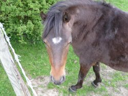
Hughmac: An unusual perspective yes. However, its not one that I would choose for an animal as magnificent as a horse. Looking down on the horse diminishes its size and appearance and somehow, its entire being. Next time, try the reverse with a shot on an upward angle but not too steep that you dont see his eyes.
Uvafan1: Good idea to frame the sky with an upward angle through windows. I do fine the chandelier a busy distraction and I would have tried to capture more, or all, of the window.
Indydenny: I like this shot
well done. Looking along the line and using depth of field is a nice perspective. The easy shot would have been straight on and much less interesting.
JDDavis: Dont look down, youll get dizzy at fall. I actually feel a bit of vertigo looking at this shot. I hope you were tied off when you took this. Well captured and well done JDDavis. Fits the theme perfectly.
jkramerbob: Another example of the good use of an upward angle shot. I dont know if you were laying on your back but it feels like. I think I would try to centre the blue sky a bit more.
Dhelsdon: Like jkramerbob, good use of an upward angle shot. Tall trees are hard to capture and this works. I do feel the lighting in this shot was working against you though.
themumu: Beautiful shot that fits the theme with a really nice use of upward angle. Unlike Dhelsdon, you had lighting and colour working for you. Well seen and well done.
AlexH: Your usual creative style shows nicely in this shot Alex and the shot fits the theme perfectly. The downward angle that hides the guitar players eyes adds a bit of mystery to the shot: Who is this guy and what song is he playing? A very cool shot
well done.
acearchie: A very interesting shot that works well with great colour and texture. Did you have this composition in mind when you took the shot? Im not sure if it fits the theme I had in mind though. I really didnt think of changing perspective in post but well done.
I actually thought your shot of the lady in the pool that you posted for the previous contest was spot-on for this theme.
AFB: Interesting close-up view of the building. Im not sure but am wondering if this is a water reflection? Like a couple others
not exactly what I had in mind.
MacRy: Again, a really nice use of the upward angle to emphasize height that fits the theme. Great colours and composition as well. Good job MacRy.
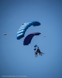
buglove: This is a perspective you dont often see. Im assuming you took this while in the air yourself. The shot does appear quite soft though and it would benefit from a tighter crop.
Ish: This is really nice and fit the theme well. The upward angle clearly emphasizes the height and majesty of (Big Ben?). The iron fence in the foregoing is a nice touch as well. My only nit here is that it would have been perfect if the branch wasnt encroaching on the clock face.
charpi: Im really not sure what to think. The straight on angle is good but the eye looks a little dead to me.
MCH-1138: Awesome shot with all the right parts in clear focus. This is a nice example of not looking down on a bird and reducing the feeling of flight and not looking up into its butt. Well done.
needfx: Im not surprised that you took the theme of Unusual Perspective and captured an image that truly went beyond what most people would even think of. This is a very cool shot needfx and Im having trouble even thinking of the logistics behind its creation. Sometime its easy to nit pick at great work because the tinyest thing stand out. So I was to nit, it would be that I wish the entire shoe was in the shot while still keeping the building in view that adds so much to the perspective. Well done.
OK
on to the very hard part that could have gone so many different ways:
Third place goes to:
JDDavis
Second place goes to:
needfx
The first place winner is: AlexH
Over to you Alex