Become a MacRumors Supporter for $50/year with no ads, ability to filter front page stories, and private forums.

corywoolf

macrumors 65816
Original poster
Jun 28, 2004
1,352
4
Disclaimer: I do not intend on selling anything with the MacRumors.com logo or slogan until I receive written permission. These are just mockups, this is purely for fun at this point in time.

Hey everyone,

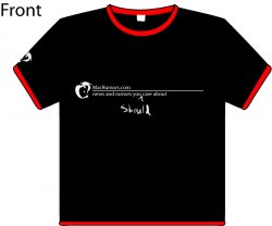
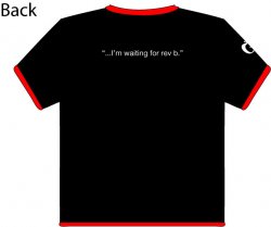
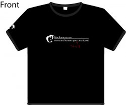
Just wanted to show you a t-shirt design I have worked on recently. Be honest, does it completely stink? I like it and I would wear it, but would anyone else? I was planning (hoping) to make about 20 t-shirts in my graphic arts class and sell them for like $8 + shipping. The t-shirts would make up about half the price because I wont be buying in bulk. So would anyone be interested? I really want to make a couple sweet shirts before the end of the semester and would like your input. If you design something that a lot of people like here, I will print that as well. Maybe I will have a deal, like buy two get one free? :p Is this just a retarded idea? :eek: Oh yeah, and they will be high quality, my instructor runs a printing business on the side and does all the athletes outfits (It will be silk screened).

thanks for any input...

-Cory
 

Attachments

  • mr_tshirt_front.jpg
    mr_tshirt_front.jpg
    26.3 KB · Views: 430
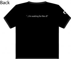
  • mr_tshirt_back.jpg
    mr_tshirt_back.jpg
    20.4 KB · Views: 197

CanadaRAM

macrumors G5
OK, well presumably your instructor has also taught you that before you use someone elses graphics or copyrighted material, you need to get their permission, preferably in writing.

Just on first glance, the front of the shirt look unbalanced to me. The logo's gonna be too far to the left (for the viewer) and will be bending around the body shape.

That makes the "Should" the dominant element -- which, out of context, doesn't do anything for me, graphically or texturally. I would go back for a rethink on this one.
 

virus1

macrumors 65816
Jun 24, 2004
1,191
0
LOST
CanadaRAM said:
OK, well presumably your instructor has also taught you that before you use someone elses graphics or copyrighted material, you need to get their permission, preferably in writing.

Just on first glance, the front of the shirt look unbalanced to me. The logo's gonna be too far to the left (for the viewer) and will be bending around the body shape.

That makes the "Should" the dominant element -- which, out of context, doesn't do anything for me, graphically or texturally. I would go back for a rethink on this one.
i doubt many people here have graphics instructors, and he isn't frikin selling it yet, and i doubt he would, and how do you know he doesn't have permsision?

it is a bit unbalanced, but i see what you were going for with the "one corner" type of t-shirt design. i would compact it more and center it a bit more to improve it.

just make the should smaller and possibly a different color. other than that, its a fine design.
 

corywoolf

macrumors 65816
Original poster
Jun 28, 2004
1,352
4
CanadaRAM said:
OK, well presumably your instructor has also taught you that before you use someone elses graphics or copyrighted material, you need to get their permission, preferably in writing.

Just on first glance, the front of the shirt look unbalanced to me.

Yeah was kind of thinking the same about the balance. I just wanted to get input. I had planned on PMing one of moderators to check everything out first. Yes he has told me, I didn't think it would be like a big deal to make 20 shirts, if you want all the profit (if any), be my guest. $80 is not really all that much, but I know what you mean, it isn't legal to profit off something you don't have permission to. I don't really want the shirt to be the conservative type, but at the same time I wanted it to be simple. Thanks for your input though. I might make a test shirt to see if it even looks good and then I will talk more with the owners of MR.

-Cory
 

corywoolf

macrumors 65816
Original poster
Jun 28, 2004
1,352
4
virus1 said:
i doubt many people here have graphics instructors, and he isn't frikin selling it yet, and i doubt he would, and how do you know he doesn't have permsision?

it is a bit unbalanced, but i see what you were going for with the "one corner" type of t-shirt design. i would compact it more and center it a bit more to improve it.

just make the should smaller and possibly a different color. other than that, its a fine design.

I actually do have a graphic instructor (not the instructor I mentioned). I tried it centered and didn't like it. But Ram is correct about the whole visibility issue. The "should" could be smaller, but I thought it fit well with it. If I take that away then it just looks like a conservative shirt for the most part. I could give you guys/gals the ai file and see what you can come up with?
 

cslewis

macrumors 6502a
Jul 23, 2004
812
0
40º27.8''N, 75º42.8''W
I'd eliminate the right edge of the bar far past the text, then center the whole thing. I think the apples on the sleeves might be overkill, too.

On that same note, I think dark gray instead of the black would be cool.

[EDIT] Make the 'should' red!
 

corywoolf

macrumors 65816
Original poster
Jun 28, 2004
1,352
4
mac_head101 said:
I'd eliminate the right edge of the bar far past the text, then center the whole thing. I think the apples on the sleeves might be overkill, too.

On that same note, I think dark gray instead of the black would be cool.

[EDIT] Make the 'should' red!

Thats how I had it originally (not gray shirt though) but it just looked like the same old stuff you get off cafepress. Well the design isn't even very original in the first place, so I think I might scrap it. I will think of something better soon.:rolleyes:
 

CanadaRAM

macrumors G5
virus1 said:
i doubt many people here have graphics instructors, and he isn't frikin selling it yet, and i doubt he would, and how do you know he doesn't have permsision?

Yow - where'd all that come from? The OP says:

"I was planning (hoping) to make about 20 t-shirts in my graphic arts class and sell them for like $8 + shipping.... my instructor runs a printing business on the side "

Get with the reading before you laydown the jam...
 

corywoolf

macrumors 65816
Original poster
Jun 28, 2004
1,352
4
CanadaRAM said:
Yow - where'd all that come from? The OP says:

"I was planning (hoping) to make about 20 t-shirts in my graphic arts class and sell them for like $8 + shipping.... my instructor runs a printing business on the side "

Get with the reading before you laydown the jam...

Notice the "(hoping)" part. I just didn't want to contact Arn and waste his time if it was a lame design. So in the future I will put a disclaimer at the beginning of any more MR related designs clearly stating that I don't have permission yet.

Koodauw said:
yeah, ringer t's are out.
oh, I thought it added a bit of a MR theme to it.
 

virus1

macrumors 65816
Jun 24, 2004
1,191
0
LOST
CanadaRAM said:
Yow - where'd all that come from? The OP says:

"I was planning (hoping) to make about 20 t-shirts in my graphic arts class and sell them for like $8 + shipping.... my instructor runs a printing business on the side "

Get with the reading before you laydown the jam...
your right.. my fault.
 

thedude110

macrumors 68020
Jun 13, 2005
2,478
2
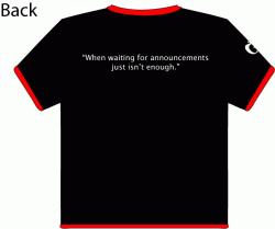
The back should be more inside jokish, something like:

"Arr. New PowerBooks on Tuesday, matey."

Or perhaps something in black text.
 

Chundles

macrumors G5
Jul 4, 2005
12,037
493
thedude110 said:
The back should be more inside jokish, something like:

"Arr. New PowerBooks on Tuesday, matey."

Or perhaps something in black text.

Your wish is my command.
 

Attachments

  • Tuesday T.jpg
    Tuesday T.jpg
    46.1 KB · Views: 130

jelloshotsrule

macrumors G3
Feb 7, 2002
9,596
4
serendipity
i still like ringers.

black and red might be a little too much contrast, but i'd have to see it in person

cory- keep in mind you will inevitably get many "great" ideas from people, and many of them will contradict each other. so make sure you take each with a grain of salt.
 

rockthecasbah

macrumors 68020
Apr 12, 2005
2,395
2
Moorestown, NJ
i like the "Rev. B" backing the best, that was great. Eh i might buy one (doubtful but who knows) maybe after some posts pics of them actually wearing the shirt ;)
 

corywoolf

macrumors 65816
Original poster
Jun 28, 2004
1,352
4
2 new versions...

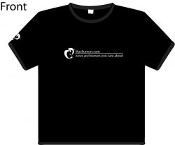
So I went back to the drawing board and changed things around a bit. Tell me what you think. There's 2 new versions of the front and 1 of the back.
 

Attachments

  • mr_tshirt_front2.jpg
    mr_tshirt_front2.jpg
    19.6 KB · Views: 172
  • mr_tshirt_front3.jpg
    mr_tshirt_front3.jpg
    18.9 KB · Views: 145
  • mr_tshirt_back2.jpg
    mr_tshirt_back2.jpg
    16.4 KB · Views: 103
Register on MacRumors! This sidebar will go away, and you'll see fewer ads.