Become a MacRumors Supporter for $50/year with no ads, ability to filter front page stories, and private forums.
Logo Critique Welcome
- Thread starter digitalrebelxt
- Start date
- Sort by reaction score
You are using an out of date browser. It may not display this or other websites correctly.
You should upgrade or use an alternative browser.
You should upgrade or use an alternative browser.
The font used in the text "Advisor's Group" makes it look like each letter is a different size. Try using a different font for that. I like the color scheme used in the first on with the "V" that is in the 4th one.
CoMpX said:I like the color scheme used in the first on with the "V" that is in the 4th one.
I agree. It keeps the focus on the name.
Don't like the ones with a V that looks like flames... combined with the dove that tasted too much like one of the more nasty Christian sects...
Like the one with just the ordinary V, do you have a version of that without the wings, just for comparison...?
Like the one with just the ordinary V, do you have a version of that without the wings, just for comparison...?
Mitthrawnuruodo said:Don't like the ones with a V that looks like flames... combined with the dove that tasted too much like one of the more nasty Christian sects...
Like the one with just the ordinary V, do you have a version of that without the wings, just for comparison...?
Oooh, me and the Mith agree.
L
Lau
Guest
I also agree with the Mith and the Gaz. 
If you did keep the flames/feathers bit, I think the last two are slightly clearer than the first two, as the first two look a bit more like a 'W' ('DOWE'). I like the compactness of the flamey bit in the first two, it's just where they cross over resembles a 'W'.
Overall though, simple and clean, good stuff.
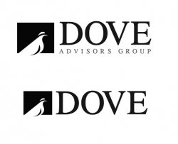
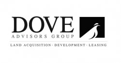
I like the square dove graphic.
I think using a graphic for the 'V' is overcooking it a bit.
A bit of kerning is in order.
Somehow I feel deep down in my bowels that the logo should be the same height as the word 'dove', it's such a nice clean graphic that I feel the 'stepped effect' sort of spoils the lines. But then I don't know how to deal with the line under the word 'dove'.
As for colours I'd just stick to black and white until the logo is sorted.
That's my $0.02 worth, which is probably really worth that ammount.
Attachments
One or the other
Very nice...
Although I would eliminate one of the design elements. It feels to much. Either dith the flared V, or the dove...in my opionion, this would simplify it and not be to much to look at
Very nice...
Although I would eliminate one of the design elements. It feels to much. Either dith the flared V, or the dove...in my opionion, this would simplify it and not be to much to look at
They all look pro so you would look good going with any of them.
But... I think I agree with Chico. It could help you to lose one of the elements. My opinion is that #5 is a good option, without the dove.
Also a comment on the dove... though it is appealing graphically, I'm not sure it adds anything to the identity, as it looks quite static and fixed to the bottom of the block it is in.
I would go with number 4 without the flames.
That would give a nice balance between graphics and text, and the color scheme is the best on that one.
Great work there!
irmongoose
That would give a nice balance between graphics and text, and the color scheme is the best on that one.
Great work there!
irmongoose
I'm in the "I like the 3rd one" camp, but generally I really don't think it matters as they all look extremely professional and so whichever one you go with is a safe bet!
Register on MacRumors! This sidebar will go away, and you'll see fewer ads.


