Hey,
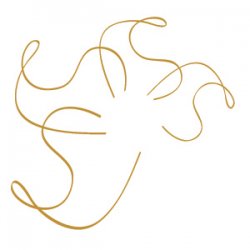
I'm a first year graphic design student and have been designing this logo as part of a portfolio website which I will aim to get done come summer break. Each of the four parts of the logo are my initials SJ. But also together as a flower or leaf as a common design symbol. I was a bit judgemental on using such a widely used picture subject to represent design, but I think it might work by adopting my name as part of the image in this way. I'm not too fussed about it being read as letters on its own, (although it would be cool) but it does need to be identified when I add my name alongside etc. in the menu.
I've been designing this on and off in my own time and while my skills are average in photoshop, im still learning the basics of illustrator. I was wondering how I could get the calligraphy brush I used on the pen tool to behave the same way on all four petals or initials? As you can see the first and biggest initial set widens the brush at the tip or where the petal folds, which is how it should look. Yet if I copy and rotate the same set, it alters the width adjustment of the brush. I want the varied width only to hint at three-dimensional qualities, much in the same way I've tried to make the petal look further away by decreasing both the size and stroke width. I know its picky but it looks kinda off, and designing for myself is always much harder.
Any general comments or criticism are welcome!
Cheers,
SamJ