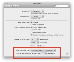
Next time you're at an apple store, go poke around in the Appearance system pref and select a different Font Smoothings. And remember that the changes do NOT take effect until you quit and re-open an application, so you need to quit whatever you're testing with, change the setting, save that, and re-open.
Play around and see what you think.
Here's a blog article from a while back discussing exactly this issue:
http://www.codinghorror.com/blog/archives/000884.html
...but I think it's really a matter of taste. See, for me, on their example screenshots, the safari one is EASIER to read, not blurrier, and the Windows one is harder to read and uglier, not easier.
As I understand it, the issue is that there are three ways to go about displaying text on a screen.
1) Pixel-accurate. This only works for fonts bitmapped at the exact pixel dimensions on a screen. It is of course "perfectly" crisp, since there is no partially colored pixels, but it's also somewhat jagged (and doesn't work for all but pre-expected font sizes). This is the old Windows XP default (ClearType off).
2) Antialiased with preference given to the pixel grid. This sacrifices a bit of the shape of the character so that it's better aligned with the grid of pixels onscreen, and therefore sharper. This is what Windows ClearType does.
3) Antialiased with preference given to the shape of characters. This sacrifices a bit of sharpness to keep characters looking, shape wise, more accurate. This is what the MacOS does at sizes above the no-anti-alias you set in System Preferences.
Thing is that people--particularly, it would seem, those who've used Windows for a long time--prefer #2. Graphics-type people, who have an attachment to the appearance of words even if it sacrifices a bit of readability, and generally those who've used Macs for a while, tend to prefer #3.
I use plenty of all of the above, and it's interesting; I VASTLY prefer #3, both because it's prettier AND because I find it easier to read--the darker letters are just easier for me to process for some reason. Maybe it has to do with my particular monitor settings, or my glasses or something.
Further, given the choice between #1 and #2 (specifically, ClearType on or off in Windows), I always choose #1--yes, it's jagged and ugly, but at least on the screens I use ClearType ends up looking sort of faint and significantly harder to read.
If you're in the #3 camp, which it sounds like you are, your best bet is to go into the Appearance system pref and select a different Font Smoothing style--probably Standard or Light rather than Medium or Strong, and set the "Turn off text smoothing for font sizes..." to the maximum value.


