Register FAQ/Rules Forum Spy Search Today's Posts Mark Forums Read

Welcome to the Mac Forums forums. Please read the FAQ if you have questions. Register to participate.

 
Go Back   Mac Forums > News and Article Discussion > MacRumors.com News Discussion
TouchArcade.com - iPhone Game Reviews and News

Reply
 
Thread Tools Search this Thread  
Old Jun 22, 2008, 03:47 PM   #1
MacRumors
macrumors bot
 
Join Date: Apr 2001
Adobe Photoshop CS4 Interface and Screenshots


Mac Photoshop CS4 screenshot, click for larger

Adobe seems to be hard at work at Adobe Creative Suite 4*. In May, they released public betas of CS4 versions of Dreamweaver, Fireworks, and Soundbooth. Existing CS3 owners are able to continue to use these applications beyond the initial 48 hour window.

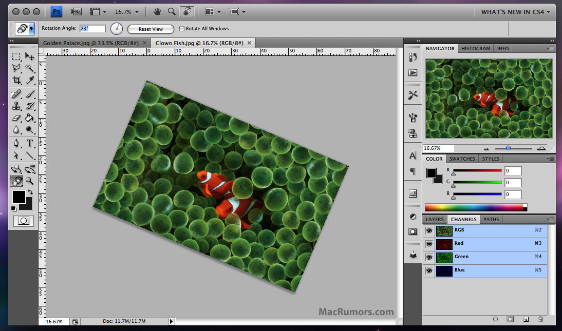
One of the most obvious changes in the new CS4 applications is the user interface, and this change will also be carried over into the next version of Adobe's Photoshop. This decision is described in detail by Adobe's John Nack. Nack describes how Adobe has been trying to make the interfaces on their apps more consistent and shows off a screenshot of the new Mac Photoshop "application frame". This application frame contains both user interface elements as well as documents themselves. Despite expressing his own initial resistance, Nack explains the advantages to the consolidated window:
Quote:
- It facilitates N-up (2-up, 3-up, etc.) document layouts that adapt as you adjust the interface. Think "live window tiling"--great for comparing, compositing, etc.
- It makes it easier to move the entire application and its contents, including from one monitor to another.
- It prevents documents from getting obscured by panels (palettes).
- It blocks out the contents of the desktop, minimizing visual clutter. (A number of Mac users have requested this option for many years. I've known quite a few people who open a small blank document, hit F to put it into full-screen mode, and then put it into the background to hide the desktop. Willingness to live with that kind of hack demonstrates some genuine desire for a real fix.)
For Mac users resistant to the change, Nack assures readers that the new interface is optional, and users can easily disable the consolidated view, or you can use choose to use elements of both methods.

There's been no public timeframe for the release of this next version of Adobe's Photoshop, but there were some contested claims of an October release target. The next version of Photoshop has been announced to remain a 32-bit application. 64-bit support is expected on the subsequent version for the Mac.

* Note that Adobe has objected to labeling this next version of Creative Suite as "Creative Suite 4" or "CS4", but for consistency's sake with the rest of the world, we are using that designation until Adobe officially announces otherwise.

Article Link

Last edited by arn : Jun 22, 2008 at 05:38 PM.
MacRumors is offline   Reply With Quote
Old Jun 22, 2008, 03:48 PM   #2
arn
macrumors god
 
arn's Avatar
 
Join Date: Apr 2001
Send a message via AIM to arn
I realize that some of this is a few weeks old but it got lost in the shuffle pre-WWDC.

arn
arn is offline   Reply With Quote
Old Jun 22, 2008, 03:51 PM   #3
pdpardue
macrumors member
 
Join Date: Apr 2005
Location: Sacramento, California
i absolutely hate that interface. seriously
pdpardue is offline   Reply With Quote
Old Jun 22, 2008, 03:53 PM   #4
decksnap
macrumors 68030
 
decksnap's Avatar
 
Join Date: Apr 2003
That is awful.
__________________
My cat's breath smells like catfood.
decksnap is offline   Reply With Quote
Old Jun 22, 2008, 03:54 PM   #5
Stridder44
macrumors 68040
 
Stridder44's Avatar
 
Join Date: Mar 2003
Location: California


Can we have that as the default UI for Snow Leopard please (I was only looking at the top bar). Actually, can we have anything other than the current OS X UI for Snow Leopard please, it's droning, plain, and boring.
__________________
The Un-Funny Truth About Scientology
(Warning: Graphic images)

MacBook Pro 15.4"/2.5 GHz/250GB/4GB RAM
iMac G4 17"/800 Mhz/80GB/512GB RAM
Stridder44 is offline   Reply With Quote
Old Jun 22, 2008, 03:55 PM   #6
chelsel
macrumors 6502
 
Join Date: May 2007
I like the new interface...

and moving the whole app from one monitor to another is great for multi-taskers with multiple monitors!!
chelsel is offline   Reply With Quote
Old Jun 22, 2008, 03:57 PM   #7
decksnap
macrumors 68030
 
decksnap's Avatar
 
Join Date: Apr 2003
Quote:
Originally Posted by chelsel View Post
and moving the whole app from one monitor to another is great for multi-taskers with multiple monitors!!
I was thinking the opposite. Don't most users with multiple monitors work on one screen and keep their palettes on the other? There are a lot of things wrong with this.
__________________
My cat's breath smells like catfood.
decksnap is offline   Reply With Quote
Old Jun 22, 2008, 03:59 PM   #8
DanielJvdBerg
macrumors regular
 
Join Date: Jun 2008
Location: The Netherlands.
I still hate the fact that it isn't 64-bit....
DanielJvdBerg is offline   Reply With Quote
Old Jun 22, 2008, 04:01 PM   #9
Stridder44
macrumors 68040
 
Stridder44's Avatar
 
Join Date: Mar 2003
Location: California
Quote:
Originally Posted by DanielJvdBerg View Post
I still hate the fact that it isn't 64-bit....
Yeah, just read that as well. I understand re-writing all that code takes time, but why wouldn't they get a 64-bit version out for OS X? I mean isn't Photoshop used mostly on Macs anyway?
__________________
The Un-Funny Truth About Scientology
(Warning: Graphic images)

MacBook Pro 15.4"/2.5 GHz/250GB/4GB RAM
iMac G4 17"/800 Mhz/80GB/512GB RAM
Stridder44 is offline   Reply With Quote
Old Jun 22, 2008, 04:04 PM   #10
randomlinh
macrumors newbie
 
Join Date: Oct 2006
I like the unified layout. I've always hated how on OS X every element seemed to be in it's own space in Photoshop. I'd hit the background too easily and switch apps by accident. I've always much preferred how the Windows version is.
randomlinh is offline   Reply With Quote
Old Jun 22, 2008, 04:05 PM   #11
DanielJvdBerg
macrumors regular
 
Join Date: Jun 2008
Location: The Netherlands.
Quote:
Originally Posted by Stridder44 View Post
Yeah, just read that as well. I understand re-writing all that code takes time, but why wouldn't they get a 64-bit version out for OS X? I mean isn't Photoshop used mostly on Macs anyway?
Exactly, from my view I see Adobe CS mostly used on Macs, it's just wrong to put your biggest platform behind the other.
DanielJvdBerg is offline   Reply With Quote
Old Jun 22, 2008, 04:08 PM   #12
pdpardue
macrumors member
 
Join Date: Apr 2005
Location: Sacramento, California
Quote:
Originally Posted by randomlinh View Post
I like the unified layout. I've always hated how on OS X every element seemed to be in it's own space in Photoshop. I'd hit the background too easily and switch apps by accident. I've always much preferred how the Windows version is.
if you're clicking on the background then you're probably going to end up clicking on other images in the 'application frame' anyway, there is no difference. I think the windows version is the MAIN reason I left windows for mac. It's ugly, JUST like this
pdpardue is offline   Reply With Quote
Old Jun 22, 2008, 04:08 PM   #13
Koola
macrumors member
 
Join Date: Feb 2008
Location: UK
err... I think I'll stick with CS3 and skip this fourth generation.
__________________
iMac AL 24" | PS3 replaced aTV
Koola is offline   Reply With Quote
Old Jun 22, 2008, 04:10 PM   #14
SugaredJuggler
macrumors newbie
 
Join Date: May 2008
CS4 and Multi Touch

Hey, does anyone know if CS4, or whatever adobe is planning on calling the next photoshop, will have the ability to use the new multi touch track pad on the macbook pros?
SugaredJuggler is offline   Reply With Quote
Old Jun 22, 2008, 04:11 PM   #15
DanielJvdBerg
macrumors regular
 
Join Date: Jun 2008
Location: The Netherlands.
Quote:
Originally Posted by SugaredJuggler View Post
Hey, does anyone know if CS4, or whatever adobe is planning on calling the next photoshop, will have the ability to use the new multi touch track pad on the macbook pros?
That would be really nice! Could raise productivity.
DanielJvdBerg is offline   Reply With Quote
Old Jun 22, 2008, 04:11 PM   #16
/dev/toaster
macrumors 65816
 
Join Date: Feb 2006
Location: San Francisco, CA
Ew, what is Adobe doing ?! That interface is awful. Why did they make changes to the traffic light icons ?!

I am hoping this is just a prototype interface.
/dev/toaster is offline   Reply With Quote
Old Jun 22, 2008, 04:12 PM   #17
fountaineer
macrumors member
 
Join Date: Jun 2008
photoshop cs4 interface..

I think it's great. I'm not an expert in photoshop and i always felt their interface is a bit difficult to get use to. Looks like the new one will have a few things that allows simpler navigation between images. Also the graphics card accelleration will help a lot(if implemented in cs 4).

..and if this option makes it into photoshop than it's all complete
adobe-hires-co-inventor-of-image-resizer-technology/
fountaineer is offline   Reply With Quote
Old Jun 22, 2008, 04:13 PM   #18
bdkennedy1
macrumors 6502
 
Join Date: Dec 2003
I LOVE that new interface. When I'm designing, my biggest complaint with working on a 30" monitor is the visual clutter. I have to sit there and search for controls while I'm trying to concentrate on design.

This is nice and clean and I don't have a million icon colors popping out at me.

I don't think the grey window controls are something Adobe fully changed themselves. Apple has been moving in this direction of removing the Red, Yellow and Green color and this is possibly a Snow Leopard change.

I can't wait for this to come out!
bdkennedy1 is offline   Reply With Quote
Old Jun 22, 2008, 04:13 PM   #19
Takeo
macrumors regular
 
Join Date: Nov 2004
Location: Halifax, NS, Canada
If you read the article... the consolidated view is optional. I for one will opt out. This is just not the Mac way. I have two monitors... one 24" for my document... another 24" for palettes, etc.
Takeo is offline   Reply With Quote
Old Jun 22, 2008, 04:13 PM   #20
kjs862
macrumors 6502a
 
kjs862's Avatar
 
Join Date: Jan 2004
Location: Long Island
Send a message via AIM to kjs862
Holding off to cs5
__________________
Power Mac G5 Dual 2.0Ghz (1 Gen), 6.5GB Ram, X800XT, Mac OS X (10.5.8)
kjs862 is offline   Reply With Quote
Old Jun 22, 2008, 04:16 PM   #21
pdpardue
macrumors member
 
Join Date: Apr 2005
Location: Sacramento, California
does any one else find it funny that the article states that adobe is so against calling it cs4, but the screen shot in the upper right corner reads "what's new in cs4"?
pdpardue is offline   Reply With Quote
Old Jun 22, 2008, 04:17 PM   #22
DanielJvdBerg
macrumors regular
 
Join Date: Jun 2008
Location: The Netherlands.
Quote:
Originally Posted by pdpardue View Post
does any one else find it funny that the article states that adobe is so against calling it cs4, but the screen shot in the upper right corner reads "what's new in cs4"?
Classic!
DanielJvdBerg is offline   Reply With Quote
Old Jun 22, 2008, 04:20 PM   #23
maxrobertson
macrumors 6502a
 
Join Date: Jun 2006
Location: Jakarta
That probably the ugliest interface I have ever seen. It even beats out Windows XP in WTF factor. I will never buy another Adobe product as long as I live unless they actually clean up their act. It's not MY job to get used to their terrible, ugly new interfaces just because they want them consistent on two platforms. It's THEIR job to make my graphic design work pleasant and -dare I say it- enjoyable. How about they focus on giving new, useful features instead of horrid, bizarre interfaces?

Quote:
I don't think the grey window controls are something Adobe fully changed themselves. Apple has been moving in this direction of removing the Red, Yellow and Green color and this is possibly a Snow Leopard change.
Good God are you wrong. Apple may be making some dubious decisions in the iTunes interface these days, but there is no way that they could ever come up with an abortion that ugly.
maxrobertson is offline   Reply With Quote
Old Jun 22, 2008, 04:22 PM   #24
InkMaster
macrumors 6502a
 
Join Date: Nov 2007
Location: Nagoya, Japan
Send a message via AIM to InkMaster Send a message via MSN to InkMaster Send a message via Yahoo to InkMaster
wow, this is as horrible as Leopards GUI... BRING BACK AQUA! Why are we going to back to the 90s w/ all these ass ugly flat grey... w/e the hell these all are
__________________
InkMaster is offline   Reply With Quote
Old Jun 22, 2008, 04:25 PM   #25
Stridder44
macrumors 68040
 
Stridder44's Avatar
 
Join Date: Mar 2003
Location: California
Quote:
Originally Posted by InkMaster View Post
wow, this is as horrible as Leopards GUI... BRING BACK AQUA! Why are we going to back to the 90s w/ all these ass ugly flat grey... w/e the hell these all are
Oh my God please don't. Leopard is alright, just boring. Aqua looks as bad as XP. They need to do something new and different with the UI (talking about Apple).
__________________
The Un-Funny Truth About Scientology
(Warning: Graphic images)

MacBook Pro 15.4"/2.5 GHz/250GB/4GB RAM
iMac G4 17"/800 Mhz/80GB/512GB RAM
Stridder44 is offline   Reply With Quote

Reply

Mac Forums > News and Article Discussion > MacRumors.com News Discussion

Thread Tools Search this Thread
Search this Thread:

Advanced Search
Display Modes

Posting Rules
You may not post new threads
You may not post replies
You may not post attachments
You may not edit your posts

vB code is On
Smilies are On
[IMG] code is On
HTML code is Off
Forum Jump


All times are GMT -5. The time now is 07:16 PM.

Mac News | Mac Rumors | iPhone Game Reviews | iPhone Apps

Powered by vBulletin® Version 3.6.10
Copyright ©2000 - 2009, Jelsoft Enterprises Ltd.
Copyright 2002-2009, MacRumors.com, LLC