Become a MacRumors Supporter for $50/year with no ads, ability to filter front page stories, and private forums.

What do you think of the new Pepsi logo

  • Love it

    Votes: 16 6.1%
  • Its Ok

    Votes: 38 14.4%
  • Indifferent

    Votes: 35 13.3%
  • Its quite bad

    Votes: 70 26.5%
  • Hate it

    Votes: 89 33.7%
  • What's pepsi

    Votes: 16 6.1%

  • Total voters
    264

dilbert4life

macrumors regular
Original poster
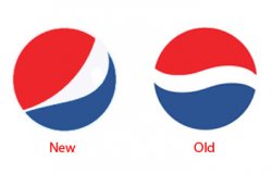
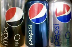
This morning, my friend asked me if I drink Pepsi. With much enthusiasm, I screamed "YES!!!" I love the stuff. Growing up, my dad drank Pepsi, and my Mom drank Coke. It was one of the only things that we agreed on. lol. Anyways, he then proceeded to hand me a can, and I said, "What is that? That is the most retarded thing I've ever seen!"

I hate the new logo. An article in CREATIVITY magazine did an interview of 5 designers and 4 of the 5 hated it.

What do you think of it?:apple:

(MacRumors god's, I would like to make this into a polled thread. Thanks.)
 

Attachments

  • pepsiasslogo copy.jpg
    pepsiasslogo copy.jpg
    47.5 KB · Views: 519

xUKHCx

Administrator emeritus
Jan 15, 2006
12,583
9
The Kop
(MacRumors god's, I would like to make this into a polled thread. Thanks.)

I have added a poll for you. FYI you can add polls to threads yourself should be an option below the new thread window.

If you want any options added/changed etc. PM me.
 

dilbert4life

macrumors regular
Original poster
I have added a poll for you. FYI you can add polls to threads yourself should be an option below the new thread window.

If you want any options added/changed etc. PM me.

Thanks for the info. Thanks for all the options in the poll. I'm not really all that good at making up answers for people. lol:apple:


Maybe it's just because I am so used to the old logo, but this new one just looks like someone drew it wrong
Yeah, I agree. It kind of looks like a butt crack.:apple:
 

0098386

Suspended
Jan 18, 2005
21,574
2,908
I had no idea they changed the logo and I think it's pretty rubbish, really. Nowhere near as memorable as the original.
 

MacBoobsPro

macrumors 603
Jan 10, 2006
5,114
6
The old one kind of looks like liquid as viewed through a window. The new one although similar doesn't say anything apart from someone can't draw the old one. :confused:

It's almost as bad as the London Olympic logo. The sad thing is some 'swish' :rolleyes: design agency will have been paid millions to 'design' it.
 

Abstract

macrumors Penryn
Dec 27, 2002
24,837
850
Location Location Location
Wirelessly posted (Mozilla/5.0 (SymbianOS/9.4; U; Series60/5.0 Nokia5800d-1/10.0.010; Profile/MIDP-2.1 Configuration/CLDC-1.1 ) AppleWebKit/413 (KHTML, like Gecko) Safari/413)

That looks like turd. It really does look like someone drew it wrong.
 

RamblinWreck

macrumors regular
Jul 4, 2008
182
0
Logo looks terrible. I guess they wanted the quality of their logo to match the quality of their soft drinks.
 

iParis

macrumors 68040
Jul 29, 2008
3,671
31
New Mexico
I like the new can, the newly designed word "pepsi" is cool. But that logo sucks.

About it representing a smile; I read that too. Check out the image below.

Well until you posted that pic, I had only seen regular Pepsi, not the Pepsi Max or Diet Pepsi.
 

MacBoobsPro

macrumors 603
Jan 10, 2006
5,114
6
Holy crap flaps batman. Combined with the new logotype it looks like some design student has done it. It's so Bau Haus it must be brilliant!
 

ezzie

macrumors 68020
Sep 7, 2006
2,208
0
Baltimore, MD
Really? I think the font looks as bad as the logo, if not worse.
when i saw the new design last week on the can, i noticed the font before anything else. i stopped walking, stared, and let out a hearty "WTF?"

hm why is the logo different on every of those 3 cans ? or is my vision playing any tricks on me ?
seems to me that changing such a basic logo according to which can it's on is a really crap idea. i'm baffled.
 

leekohler

macrumors G5
Dec 22, 2004
14,164
26
Chicago, Illinois
Maybe it's just because I am so used to the old logo, but this new one just looks like someone drew it wrong.

P-Worm

Agreed. It looks like a mistake. It no longer says "Pepsi". It says nothing. It's the same as if Apple decided to change their logo from an apple to an orange and still call themselves "Apple".
 
Register on MacRumors! This sidebar will go away, and you'll see fewer ads.