Become a MacRumors Supporter for $50/year with no ads, ability to filter front page stories, and private forums.

erz

macrumors newbie
Original poster
Feb 27, 2008
23
0
Hi there,

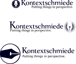
I have gone through the works of creating a logo for a venture of mine (well, not me alone) and I am only going to present iterations of what I think to be the strongest contender. However, I am in dire need of feedback and would welcome some advice from the fine community here in tuning my logo so that it does convey the meaning I intend it to carry.

The logotype is German and could roughly translate into "context works" or more literally "context forge". The logo will be used for a web publishing platform (in rather profane words: a multi-author blog) that tries to focus on contextualizing information rather than merely presenting the newest fad. It will look very much like an interactive magazine, but restructures news categories in a semantic hierarchy and hopefully distinguishes itself through the quality of the authors' posts. The claim is not set in stone, so I put a generic one there for you to visualize the whole thing.

So - do you find the underlying idea of the logo befitting? And if so, where do you think it requires tweaking?

Of course I have a personal favorite, but I would welcome your unbiased input. Thanks a lot! (Oh, and don't worry: I CAN take it, so fire away)
 

Attachments

  • logovariations.png
    logovariations.png
    115.3 KB · Views: 129

Hls811

macrumors 6502a
Apr 19, 2004
832
46
New Jersey
Hi there,

I have gone through the works of creating a logo for a venture of mine (well, not me alone) and I am only going to present iterations of what I think to be the strongest contender. However, I am in dire need of feedback and would welcome some advice from the fine community here in tuning my logo so that it does convey the meaning I intend it to carry.

The logotype is German and could roughly translate into "context works" or more literally "context forge". The logo will be used for a web publishing platform (in rather profane words: a multi-author blog) that tries to focus on contextualizing information rather than merely presenting the newest fad. It will look very much like an interactive magazine, but restructures news categories in a semantic hierarchy and hopefully distinguishes itself through the quality of the authors' posts. The claim is not set in stone, so I put a generic one there for you to visualize the whole thing.

So - do you find the underlying idea of the logo befitting? And if so, where do you think it requires tweaking?

Of course I have a personal favorite, but I would welcome your unbiased input. Thanks a lot! (Oh, and don't worry: I CAN take it, so fire away)

As Paulie said to Rocky.."Hit the one in the middle". :)

I like the middle as the white(r) logo isn't as overpowering and taking away from the text in the name and tag-line. I think the predominantly black logos draw the eye a little too much. Another option that might look nice is the middle logo with the top layout (logo to the left, Text on the right).
 

Designer Dale

macrumors 68040
Mar 25, 2009
3,950
100
Folding space
Wow. You are like way smarter than I am to manage something like this. I just look at things. Since this is German, I would like to see "Putting Things in Perspective" in German unless there is a reason for English. It would help visualize this. I get hung up on what I can read as opposed to what I can't. I envy Europeans. Living in such close proximity to other countries demands that one learn other languages.

I like the ratio of proportion between the logo and type in the first sample, but I like the "fuzzy pen" in the second. Maybe rotate the pen tip to imply motion.

Dale
 

ezekielrage_99

macrumors 68040
Oct 12, 2005
3,336
19
I like the middle logo but I would try variations with Adobe Carlson Pro, Didot and Bodoni font pack, IMHO I think Optima might be worth a try as well.
 

DesignerGenes

macrumors member
May 4, 2009
35
0
Omaha, NE
These are a good start IMO. The only thing that i am having trouble with is balance. The tagline seems to conflict with the icon. Have you considered centering the text? Maybe a sans font? The tag line seems to make it difficult to decipher the above text. I really like the second icon, it plays on the term "perspective".

Something along these lines? Just my suggestion...
 

Attachments

  • Untitled-1.png
    Untitled-1.png
    45.8 KB · Views: 82

jecapaga

macrumors 601
Jul 1, 2007
4,291
23
Southern California
These are a good start IMO. The only thing that i am having trouble with is balance. The tagline seems to conflict with the icon. Have you considered centering the text? Maybe a sans font? The tag line seems to make it difficult to decipher the above text. I really like the second icon, it plays on the term "perspective".

Something along these lines? Just my suggestion...

I agree. The middle one on the original has a subjective crotch look to it or perhaps that's just my dirty mind? Flipping it up like you've done fixes this problem.
 

erz

macrumors newbie
Original poster
Feb 27, 2008
23
0
Amending by your suggestion

OK, I have taken your advice to heart and made modifications.

Perhaps I need to explain my choices though. I did try optima and centering the pieces for me and you to see. I also changed the tagline as to take away distraction. I also did a bit more kerning (the text in Kontext was a bit off before and the i was dragging slightly). And I tilted the fuzzy pen that many preferred.

However, I would like to stay away from using a nonprolific font for the tagline. The fact of the matter is, the logo will be first and foremost used as the banner for the web page and should work a bit like the banner of a newspaper in that regard. Hence I would like to incorporate a font I use on the page into the tagline as not to have too many fonts present on the page. My choices there are limited to Lucida Grande or Hoefler Text (which are the default fonts on the page) and font-styling. Horizontal orientation (rather than centering) would also make it easier to place it at the top left of the page and less bulky.

The low-resolution nature of the web also makes me doubt the impact of the fuzzy image. It does not scale down as nicely as the heavier logos. I got to admit though, that it emanates a certain glow and uses negative space even more effectively than the other two to evoke a sense of context

I crafted the title font as a half-serif with a very human touch as to evoke a blend of newspaper headline with sans-serif web and to give the title a solid baseline. I am rather sure I would like to preserve that. I am less sure if, I can improve on that message. The capital K could move around and grow or shrink and even lose it's playfulness that breaks the sharp bottom line of the lower cap characters. Or perhaps I should tweak some of the charakters even further, but I don't know how at this point. (The all caps work wonders for the baseline, thanks btw. I actually use small caps for titles on the page so that makes it even better)

Then again, perhaps you disagree and tell me that the typeface does not work at all and how I should rethink things.

Thank you for your valuable input.
 

Attachments

  • LOGOVARIATIONS2.png
    LOGOVARIATIONS2.png
    133.4 KB · Views: 77

Hls811

macrumors 6502a
Apr 19, 2004
832
46
New Jersey
OK, I have taken your advice to heart and made modifications.

Perhaps I need to explain my choices though. I did try optima and centering the pieces for me and you to see. I also changed the tagline as to take away distraction. I also did a bit more kerning (the text in Kontext was a bit off before and the i was dragging slightly). And I tilted the fuzzy pen that many preferred.

However, I would like to stay away from using a nonprolific font for the tagline. The fact of the matter is, the logo will be first and foremost used as the banner for the web page and should work a bit like the banner of a newspaper in that regard. Hence I would like to incorporate a font I use on the page into the tagline as not to have too many fonts present on the page. My choices there are limited to Lucida Grande or Hoefler Text (which are the default fonts on the page) and font-styling. Horizontal orientation (rather than centering) would also make it easier to place it at the top left of the page and less bulky.

The low-resolution nature of the web also makes me doubt the impact of the fuzzy image. It does not scale down as nicely as the heavier logos. I got to admit though, that it emanates a certain glow and uses negative space even more effectively than the other two to evoke a sense of context

I crafted the title font as a half-serif with a very human touch as to evoke a blend of newspaper headline with sans-serif web and to give the title a solid baseline. I am rather sure I would like to preserve that. I am less sure if, I can improve on that message. The capital K could move around and grow or shrink and even lose it's playfulness that breaks the sharp bottom line of the lower cap characters. Or perhaps I should tweak some of the charakters even further, but I don't know how at this point. (The all caps work wonders for the baseline, thanks btw. I actually use small caps for titles on the page so that makes it even better)

Then again, perhaps you disagree and tell me that the typeface does not work at all and how I should rethink things.

Thank you for your valuable input.

I like the bottom one now..
 

erz

macrumors newbie
Original poster
Feb 27, 2008
23
0
Thank you for your kind words of appreciation.

However, I am hoping that some people will provide insight to balancing the logo and what they feel about the web safe fonts decision.

Also a huge blow - the DoesYourLogoLookPhallic(or like a crotch)-problem. Is that really an issue and for those who do feel that way; in what direction could I change the image to adress the problem?
 

NXTMIKE

macrumors 6502
Nov 11, 2008
386
0
Canada
the typeface you're using is looking like a pharmacy logo. If it's to be used for a multi-author blog (sorry if i misread anything), why not try a modern looking sans-serif font.

And you could try making the pen/circle replace the 'o'?
 

orangeillini14

macrumors regular
Jul 1, 2008
153
3
Your logo reminds me very much of the WordPress logo... not sure if you were familiar with it or not.

wp-logos.gif


Do you see how it does?
 

trisbanfi

macrumors newbie
Jun 1, 2009
1
0
I like the text-- but the pen image, as mentioned before, looks like a crotch-- even when at a slight angle. It only works upside down, IMO.

Tris

OK, I have taken your advice to heart and made modifications.

Perhaps I need to explain my choices though. I did try optima and centering the pieces for me and you to see. I also changed the tagline as to take away distraction. I also did a bit more kerning (the text in Kontext was a bit off before and the i was dragging slightly). And I tilted the fuzzy pen that many preferred.

However, I would like to stay away from using a nonprolific font for the tagline. The fact of the matter is, the logo will be first and foremost used as the banner for the web page and should work a bit like the banner of a newspaper in that regard. Hence I would like to incorporate a font I use on the page into the tagline as not to have too many fonts present on the page. My choices there are limited to Lucida Grande or Hoefler Text (which are the default fonts on the page) and font-styling. Horizontal orientation (rather than centering) would also make it easier to place it at the top left of the page and less bulky.

The low-resolution nature of the web also makes me doubt the impact of the fuzzy image. It does not scale down as nicely as the heavier logos. I got to admit though, that it emanates a certain glow and uses negative space even more effectively than the other two to evoke a sense of context

I crafted the title font as a half-serif with a very human touch as to evoke a blend of newspaper headline with sans-serif web and to give the title a solid baseline. I am rather sure I would like to preserve that. I am less sure if, I can improve on that message. The capital K could move around and grow or shrink and even lose it's playfulness that breaks the sharp bottom line of the lower cap characters. Or perhaps I should tweak some of the charakters even further, but I don't know how at this point. (The all caps work wonders for the baseline, thanks btw. I actually use small caps for titles on the page so that makes it even better)

Then again, perhaps you disagree and tell me that the typeface does not work at all and how I should rethink things.

Thank you for your valuable input.
 

Designer Dale

macrumors 68040
Mar 25, 2009
3,950
100
Folding space
I don't know the average age of the folks posting the YourLogoLooksLikeaCrotch thing, But it looks like a "real" ink pen to me. I'm 61 and used one in drafting.

Dale
 

AlexisV

macrumors 68000
Mar 12, 2007
1,714
264
Manchester, UK
To be fair, you probably think like that because you're so familiar with the subject. I didn't see it, buit now it's been pointed out, I don't see anything else!

There are variations on the nibs, so have a look for alternatives.

You really don't want a disaster like the horrendous London Olympics logo:

london2012.jpg


Not only is it vomit inducing, it looks like Lisa Simpson 'servicing' Bart.

Once you've seen it, that's all you notice.
 

erz

macrumors newbie
Original poster
Feb 27, 2008
23
0
Alright then.
I have redone the logo as to avoid showing up on DoesYourLogoLookPhallic and emphasizing both, the ink pen silhouette as well as the hammer.

Since no one even mentioned the hammer, even though the ink pen was actually only hinted at in the negative space, I wonder whether it got lost in the low quality of the attachment preview. Well, I had to redo the logo anyway.

I am likely to revisit the subject after more thorough response analysis (perhaps some more feedback will even be posted in this thread?) but for the time being the launch has already taken place and I might have to do retouches as time allows while we are still in the growing stage. For those of you who can read German and/or are interested in how the logo complements the site, please have a look at http://kontextschmiede.de

Thank you all,
erz

PS Our site runs on wordpress, so yes, I do know the similarity. I felt that a spherical shape represents the notion of "context" best, along with the negative space gimmick. The VW-logo also comes to mind when I think of spherical logos.

PPS Lisa Simpson? I find that a bit too far fetched.
 

Attachments

  • kontextlogo.png
    kontextlogo.png
    69.6 KB · Views: 84
Register on MacRumors! This sidebar will go away, and you'll see fewer ads.