Become a MacRumors Supporter for $50/year with no ads, ability to filter front page stories, and private forums.

LeeTom

macrumors 68000
Original poster
May 31, 2004
1,581
291
EDIT: See my update in post #6 below

This is driving me CRAZY.
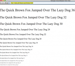
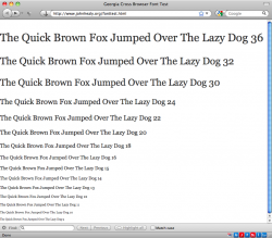
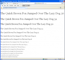
I am working on a website and want to have the main type style to be 11px Georgia (whether it's specified in ems, % or px I don't care, just around 11px).

The problem is that the design calls for some pretty tight spacing here and there, and 11px Georgia is WAY smaller on Macs than on PCs. All Mac browsers are showing it one size, and all PC browsers are showing it another, wider, size. I didn't want to have to resort to hacks, but it's looking that way. Note that Arial, Verdana, Times New Roman, and Helvetica are not having the same problem.

I've uploaded a simple font test page to my site that shows Georgia from 36px to 9px. Could some kind souls here please take screenshots of the page and attach them here with notes on OS and Browser versions?
http://www.johnhealy.org/fonttest.html

Thank you so much!
 
Last edited:

pianojoe

macrumors 6502
Jul 5, 2001
461
26
N 49.50121 E008.54558
Safari 5, MacBook Air, OS X 10.6.3

Safari 5, MacBook Air, OS X 10.6.3
 

Attachments

  • Bildschirmfoto 2010-06-11 um 14.05.18.png
    Bildschirmfoto 2010-06-11 um 14.05.18.png
    124.4 KB · Views: 257

SrWebDeveloper

macrumors 68000
Dec 7, 2007
1,871
3
Alexandria, VA, USA
Knowing you can't control (only detect) the end user's screen resolution nor how their browser scales:

Pixel (.px) sized fonts offer reliable control and consistent scaling. An 11px font size will always retain the same relative scale to a 16px font when displayed on the same device and active resolution. The em unit scales consistently as well and has the added advantage of allowing the end-user to adjust the text size through settings available on a particular user agent.

The W3C favors the EM unit because of said advantage, especially when accessibility is concerned. Doing so means set a base font size (parent) and set everything else (children) relative to that.

Developers who want to minimize scaling use PX instead, just remember what you can't control - and there is no fix or special coding to make all displays render font size equally 100% of the time.

-jim
 

LeeTom

macrumors 68000
Original poster
May 31, 2004
1,581
291
Jim - thanks for the note. I'm aware of the em/px differences, but in this case regardless of how I size fonts, Georgia in particular is much wider on PCs than Macs, whereas all other "browser" fonts are showing identical widths. Can you try my example above and confirm that Georgia is much wider on your PC platform vs your Mac platform? Then change the font-family ad watch the discrepancy vanish! It's super annoying.
 

LeeTom

macrumors 68000
Original poster
May 31, 2004
1,581
291
I am bumping this to see if anyone out there with Parallels (in coherence) or VMWare (in unity) on their Mac would be willing to load the link above and compare in two windows: a Mac browser and a PC browser.

Georgia, especially in 13px and 15px is MUCH wider on a PC, and I'd like someone to verify this.

The above link simply shows Georgia from 36px down to 9px, and the font width is driving me crazy.

Thanks.
 

Mal

macrumors 603
Jan 6, 2002
6,252
18
Orlando
I am bumping this to see if anyone out there with Parallels (in coherence) or VMWare (in unity) on their Mac would be willing to load the link above and compare in two windows: a Mac browser and a PC browser.

Georgia, especially in 13px and 15px is MUCH wider on a PC, and I'd like someone to verify this.

The above link simply shows Georgia from 36px down to 9px, and the font width is driving me crazy.

Thanks.

I don't think you're really paying attention here. We know it's wider. We're telling you there's nothing you can do about it. Either use a different font (which may have it's own issues) or design your site so it doesn't break if the font happens to render a bit wider (the best way to go).

jW
 

LeeTom

macrumors 68000
Original poster
May 31, 2004
1,581
291
To quote Walter "Has the whole world gone crazy?!"

Okay, I get that. The thing is, Verdana, Times New Roman, Arial and Helvetica all keep COMPLETELY identical widths at the same pixel settings. Hell, even Palatino Linotype looks identical! Why is Georgia different? I understand that if I were to specify in points I would run into the resolution issue (72 vs 96 etc), but WHY JUST GEORGIA?

Has anyone else run into this? I need precise layout for one page and have resorted to javascript OS detection to maintain precise control, but what a bummer! Can anyone explain why Georgia is so drastically different, especially at 13px and 15px specifically?
 

Dan Harkless

macrumors newbie
May 14, 2008
17
0
Irvine, California
Not significantly different for me

Hi, LeeTom. I compared the latest Firefox on OS X 10.6 against the latest IE on Windows XP under Parallels, and while Georgia is a bit wider on Windows, I'm not seeing the "MUCH wider" thing you are. Screenshots below.

I went into Font Book and I see I actually have two copies of Georgia installed. The one I believe is the active one is copyrighted 2006 and is in /Library/Fonts. I also have one in /Library/Fonts/Microsoft copyrighted 1996, but eyeballing their previews, the widths don't look very different (if at all).

BTW, I assume your avatar is not a photo of you?
 

Attachments

  • Mac.png
    Mac.png
    178.8 KB · Views: 168
  • Windows.png
    Windows.png
    75.9 KB · Views: 321

LeeTom

macrumors 68000
Original poster
May 31, 2004
1,581
291
Dan - Thanks so much for responding and posting those screenshots. Also, yes, that is not a picture of me.

You can see the problem clearly in the two images in your post, without even enlarging them. Look at how linearly the Mac side flows from 16px down to 9px. Then look at how jankily the Windows side flows.

The end result, seen more clearly on a real designed page, is that at certain sizes, if Windows is given a 1px cut in size across the board, Georgia will look identical to the Mac at all sizes. Pretty weird. It's not spacing, it's size, and I suspect it has to do with Windows or Mac OS X's version of font aliasing being slightly different. What a pain!
 
Last edited:

lucidmedia

macrumors 6502a
Oct 13, 2008
702
37
Wellington, New Zealand
I suspect it has to do with Windows or Mac OS X's version of font aliasing being slightly different. What a pain!

yes, I think the "jankiness" you are describing is directly attributable to the very different font rendering philosophies of the two operating systems.

Apple generally believes that the goal of the type rendering algorithm should be to preserve the design of the typeface as much as possible, even at the cost of a little bit of blurriness.

Microsoft generally believes that the shape of each letter should be hammered into pixel boundaries to prevent blur and improve readability, even at the cost of not being true to the typeface.

Of course, which rendering engine you prefer is dependent on which one you look at the most... PC users find the thin, tight aliasing on Windows better... Mac folks like the fuzzy, darker letters better. Scientifically, the Windows rendering engine is probably better for onscreen reading... but the simple answer is that we read best what we read most. I prefer the MacOs system.

My guess why Georgia is having this problem and not the other fonts?

Because the font wasn't designed particularly well?

Actually, its the opposite. Georgia was designed by Matthew Carter and hinted by Tom Rickner... two of the best in the business. The font was designed for clarity on a computer monitor at small sizes and is excessively hinted -- far more than most typefaces. Hinting is data built into the typeface that helps define how to transform the curves of the letters into the screen's square pixels at small sizes. Its a very tedious process.

Because there is more information about how the font should draw itself at different sizes, you see more variation from size to size...
 

design-is

macrumors 65816
Oct 17, 2007
1,219
1
London / U.K.
My guess why Georgia is having this problem and not the other fonts?


... Georgia was designed by Matthew Carter and hinted by Tom Rickner... two of the best in the business. The font was designed for clarity on a computer monitor at small sizes and is excessively hinted -- far more than most typefaces. Hinting is data built into the typeface that helps define how to transform the curves of the letters into the screen's square pixels at small sizes. Its a very tedious process.

Because there is more information about how the font should draw itself at different sizes, you see more variation from size to size...

I've come across similar issues in the past, but never really bothered questioning why. That's actually rather interesting — thanks for sharing!

/Doug
 
Last edited:

Dan Harkless

macrumors newbie
May 14, 2008
17
0
Irvine, California
You can see the problem clearly in the two images in your post, without even enlarging them. Look at how linearly the Mac side flows from 16px down to 9px. Then look at how jankily the Windows side flows.

Ah. Yes, I saw those relatively minor differences between the platforms, but didn't think that was what you were talking about, since cross-browser and cross-OS rendering differences of that scale are common. It sounded like you were talking about an order of magnitude difference or something just for the Georgia font. Anyhow, glad I was able to at least validate your finding.
 
Register on MacRumors! This sidebar will go away, and you'll see fewer ads.