Become a MacRumors Supporter for $50/year with no ads, ability to filter front page stories, and private forums.

timbos

macrumors member
Original poster
Jan 2, 2009
34
0
Hi,
I've been tasked with improving my company's website. If you've got a moment, please could you let me have your thoughts on what needs doing: I've got some ideas, but this site is a little like my baby, so I don't think that I'm able to be properly objective. :(

Here's the site:http://www.oxfordlasers.com

Is the message clear?
Does it make you want to get in touch (if you were in the market for any of our products -- I realise that you likely won't be)?


Thanks VERY much for any suggestions :D
 

design-is

macrumors 65816
Oct 17, 2007
1,219
1
London / U.K.
Hi timbos :)

Overall, it's not bad! A lot worse have been posted here for critique...

Saying that, I'd think about the following:
  • It feels tight, cramped and boxy. Loosen up the boxes a little with some more padding and margins. A bit of white space makes the world seem like a nicer place. Possibly introduce some rounded corners to more actively (and attractively) define areas.
  • The home page slider 'pause', 'forward' and 'back' buttons need a cursor change and possibly :hover state on mouse over so it looks like when you click them they will do something.
  • The home page slider moves a little too soon for my liking. Reading at a leisurely pace, I don't finish reading what's on one panel before it moves.
  • Home page footer / bottom section (under image, not copyright info) seems like an afterthought.
  • There is no :hover state on the left navigation.
  • Consider using :active states too.
  • In the sub-pages of the Knowledge-base, the box that appears under the left navigation is not the same width as the left navigation, but it's not significantly different to make me think it was on purpose. Same comment for the colour - the left nav is #F2F2F2 whereas the box below is #EEEEE.
  • When on the "Contact Us" & "Our Distributors" pages, "about" is highlighted in the main navigation.

That's all for now :)

Keep up the good work!

/Doug
 

Consultant

macrumors G5
Jun 27, 2007
13,314
34
All fonts are about the same size, nothing stands out.
Footer should not be the same size as main text.

H1 of Oxford Laser on every page won't really help your site's searchability

And yeah, not enough white space.
 

gorjan

macrumors 6502
May 16, 2009
356
0
CPH
I'm in NO way a pro so you'll only get my honest opinion.

You choice of font and font size makes me think "spam" or "fake". It doen't seem serious, and makes me think of those default sites you sometimes land on if you enter the wrong domain name.:eek:
 

Cabbit

macrumors 68020
Jan 30, 2006
2,128
1
Scotland
Bright white text is a bit harder for me to read maybe make it a very light shade of grey that is close to white.

The search this site text stands out to much and detracts from the design.

You could have instead of little flags a lightbox effect at the start asking what language the user speaks if that is important to you.

The controls for the slideshow don't give much in the way of usability.

The site layout is weird when it comes to running my screen reader over it:
> Language
> Search this site
> Oxford Lasers

It should tell me the title first and maybe a little blurb about what the site is about, and if you have language options it should tell me what these options are before it tells me to search the site.

Other than that the layout is a little boxy and the images don't seem to reflect the content, i would rather see a picture of the processes.
 

ManofMac-au

macrumors newbie
Mar 12, 2010
13
0
Add about an extra 40px padding between everything and might show some signs of looking much improved.

The general comments all mention it, dont be afraid of big areas between elements it makes it all scanable and infinitely more readable.

Id also be inclined, given how little info there is on the landpage to have the bottom paragraph sit on the left 1/3 and reduce the fancy scroll box thing to the right 2/3 (similar to interior pages). Make the footer darker than white - footers are tertiary to everything on the page. Fonts - do something about the fonts it's heavy and dark - lasers are light and fine yes ? Visually at odds with your core business.

It's a decent effort first up but spend a little more time designing it rather than building it, it's much easier to critique and modify designs than re work code.
 

CMT

macrumors regular
Aug 24, 2009
102
10
Two main tips I'd like to give you:

1.Wait until the DOM is ready to begin playing with it! If you're using jQuery, simply wrap your code between
Code:
$(function(){
   ...
});

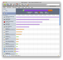
2.Reduce the size! Your site is ~1MB. Try playing with jpg compression, minifying files, and so.

Also, joining some CSSs will lower the HTTP requests to the server.
 

Attachments

  • Screen shot 2010-06-25 at 12.08.47.png
    Screen shot 2010-06-25 at 12.08.47.png
    197.2 KB · Views: 110

pelsar

macrumors regular
Apr 29, 2008
180
0
israel
redesign time

no...realistically its unreadable.

the home page has two major goals:
confirm that the user has arrived at the right place
and that there is more information to read about.....

hence the main message has to be clear...what you are selling and tell me within 2 seconds. The problem with your site is that the message is "moving" and i really dont want to wait that long

your text on the picts are not comfortable to read...as i read them i also thinking that "any minute its going to change'...hence i'm not concentrating.

If you insist on having text on your picts, keep the message simpler. Use the area beneath the picts for the real info:

one example is apples site:
major pict up front and four options below for further info-its a good template. (but dont make your pict the size apple does)

another example
http://www.flowsensemedical.com/
 

7031

macrumors 6502
Apr 6, 2007
479
0
England
Quite a nice site yeah, but as other people have said you probably should add some more padding. Also, I would suggest giving rounded corners to the menu buttons.

Also, in regards to the image on the front page, perhaps have a transparent grey background around the text, since I found it a bit of a pain to read to be perfectly honest.

Otherwise, it's quite damn nice.

Thanks,
Joel Nichols.
 

cyberdesignz

macrumors newbie
May 16, 2010
15
0
I like your Website , It Look like very Attractive & Professional to me ! Great Work but If you have something really New & Creative, Don't waste time, Go for it ..... :)
 

millerb7

macrumors 6502a
Jun 9, 2010
870
153
Website itself is nice.

SEO purposes.....

Any reason you left out <h1> and went right to <h2><h3>? Google loves <h1>.

Also, your title, VERY nicely done, even used a nice separator and was very to the point. Just as an FYI google does not use metatags for your PR, but your descriptions were nicely done.

You also don't have much "pure text" to help your PR... a lot of your text is in images or java script, neither of which are visible to the spiders.

Good site, poor SEO basically.
 
Register on MacRumors! This sidebar will go away, and you'll see fewer ads.