Become a MacRumors Supporter for $50/year with no ads, ability to filter front page stories, and private forums.

MacRumors

macrumors bot
Original poster
Apr 12, 2001
63,471
30,691


App developers Geoff Teehan and his team created this high resolution Photoshop file to help them when mocking up ideas for app designs. The file includes full-resolution elements of buttons, keyboards, and all the other user interface elements that are available to iOS developers.

Instead of keeping the file for themselves -- which would be understandable -- Teehan decided to share it with the larger development community. The team has previously other versions of the file, as well, including one for the iPhone 4S.

ipadmockup.jpg


In 2008 we released our first iOS PSD. We continue to do it, not only because we find useful, but because we think a lot of other designers do too. In fact, over the past four years they've been downloaded millions of times. It's become our little thank you to an industry that has given us so much. We're really proud to be releasing our latest version today. It's based on iOS 5.1 and includes hundreds of retina assets available natively on the platform. In addition to the GUI assets, you'll find perfectly scaled 'New' iPads to help you create the apps we'll come to love in the future.
The file is 35.71MB, designed for Photoshop CS6. The iPad GUI PSD (Retina Display) can be downloaded from Teehan+Lax's blog.

Article Link: App Developer Offers Handy High-Res PSD File of iPad GUI Elements for Mockups
 

BC2009

macrumors 68020
Jul 1, 2009
2,237
1,393
This is cool of these guys to share with other developers and potential competitors.
 

highdough

macrumors regular
Sep 10, 2008
192
64
A. Many developers smoke.
B. Many people smoke so putting 4:20 as a wink to smokers will you get you more 5 star votes.

Okay, so what does 4:20 have to do with smoking? And I'm assuming you're talking about weed, right? The fact that putting something that refers to weed gets you better ratings just tells me how pathetic these people are.
 

ProVideo

macrumors 6502
Jun 28, 2011
497
688

rednic

macrumors newbie
Jul 1, 2003
18
0
kanada
Don't worry about the 4:20

These guys are located in Toronto. Laws are much different up here. Possession is no longer enforced. It's not amsterdam but close.
 

gteehan

macrumors newbie
Jul 16, 2002
5
0
We started to put 4:20 in the time spot 4 years ago. There wasn't much thought put into it - I was simply creating one of the elements that required it, and it was the first "time" that popped into my head. It's since stuck. It's not meant to get any ratings or anything like that - was just a stupid, quick decision. Since then it has become one of the elements in the PSDs allow us to see who's used it (there are many - some obvious, others not so much).
 

Moonjumper

macrumors 68030
Jun 20, 2009
2,740
2,908
Lincoln, UK
What is it with app developers setting the time in screenshots and things like this to 4:20

I've not noticed the time before. Do many developers do this? Or is it just a lot of content from one developer?

Many companies stick with a theme, or have a particular reason.

In advertising some companies use number plates that look the same backwards so that they can flip the image for left and right hand drive markets.

Nissan like their racing cars to have the number 23 because in Japanese, 2 is Ni and 3 is San.

Often it is just a random number on a template that never needs updating.
 

Glenn.955

macrumors member
Apr 29, 2009
74
6
Melbourne Australia
Hey if that bugs you, look at HTC adverts and see if 10:08 becomes a running theme ;)

10:08 (and 42 seconds) was the time all Seiko watches displayed in their print and TV advertising. Someone spent a lot of money deciding it is the time that looked best on both analogue and digital watch faces.

http://www.seikowatches.com/ Check it out - they are still using it.

Also the watches with dates always said Wednesday the 2nd (I think from memory)...

Glenn.
 

kdarling

macrumors P6
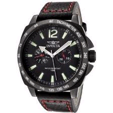
10:08 is a very popular choice for watch ads. Almost every one will use it or something very close.

10:08 on an analog clock face puts the hands in a nicely symmetrical "checkmark" position, without obscuring the company logo (usually at 12 or 6) or date/calendar displays or other dials (usually at 3,6, or 9).

watchface.png
 
Register on MacRumors! This sidebar will go away, and you'll see fewer ads.