Become a MacRumors Supporter for $50/year with no ads, ability to filter front page stories, and private forums.

grahamperrin

macrumors 601
Original poster
Jun 8, 2007
4,942
648
It's near, not at the head.

A heavy line forms a division within each post.

Some of what's to follow is spun off from much longer topics, where discussion may be difficult to track/digest around this time. So here's a separate topic with focus on something that might deserve special attention following the redesign; before things are set in stone.

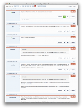
To begin, a little light humour. In the screenshot below, note the title of the topic (in the title bar) and my first paragraph at the foot of the shot:

screenshot 2015-06-15 at 08.01.34.png


The broad, pale blue free space above each green dividing line might be used in the suggested way.

Freedom.

If not the zone, then what thing(s) might be written into that free space?
 
  • Like
Reactions: AngerDanger

AngerDanger

Graphics
Staff member
Dec 9, 2008
5,452
29,003
I'd quite like it if the 'New' label moved to the left slightly and the post number took its previous position. Then the lurid (okay, it's not that lurid) green line and box could disappear.
 
  • Like
Reactions: grahamperrin

grahamperrin

macrumors 601
Original poster
Jun 8, 2007
4,942
648
Moved from https://forums.macrumors.com/posts/21454185 (liked by @steve333):

I don't like it. What I liked most about the old one is how everything was visually bounded together, like you knew where each individual post was. Putting a border around posts would be a huge step forward.

With the current redesign: the heaviest divisions – contrasting horizontal rules – exist between each post and its date. Creating such great divisions within posts probably goes against the flow, for readers who wish for things to flow.

Specific suggestions

The date above each heavy division would be better below the dividing line.

As post numbering is volatile, cease to show those numbers. A simple link icon should suffice; a hint that clicking the icon will present a permalink dialogue. If not a link icon, then a simple # character, alone.

The emphatic appearances of New, above the heavy division within each new post, could be moved to below that line. Imagine something like this, where a page/screen includes a mixture of read and unread posts:

Code:
_______________________________________________________________________
                                                                      #
… | Lorem ipsum dolor sit amet, consectetur adipisicing elit,
… | sed do eiusmod tempor incididunt ut labore et dolore magna
… | aliqua. Ut enim ad minim veniam, quis nostrud exercitation ullamco
   | laboris nisi ut aliquip ex ea commodo consequat. Duis aute irure
   | dolor in reprehenderit in voluptate velit esse cillum dolore eu
   | fugiat nulla pariatur. Excepteur sint occaecat cupidatat non
   | proident, sunt in culpa qui officia deserunt mollit anim id est
   | laborum.

_______________________________________________________________________
                                                                      #
… | Duis aute irure her concise reply cupidatat non proident.
… |
… |

_______________________________________________________________________
                                                                New   #
… | Ut enim ad minim veniam, quis his massive screenshot of a
… | desktop background:
… |
   | XXXXXXXXXXXXXXXXXXXXXXXXXXXXXXXXXXXXXXXXXXXXXXXXX
   | XXXXXXXXXXXXXXXXXXXXXXXXXXXXXXXXXXXXXXXXXXXXXXXXX
   | XXXXXXXXXXXXXXXXXXXXXXXXXXXXXXXXXXXXXXXXXXXXXXXXX
   | XXXXXXXXXXXXXXXXXXXXXXXXXXXXXXXXXXXXXXXXXXXXXXXXX
   | XXXXXXXXXXXXXXXXXXXXXXXXXXXXXXXXXXXXXXXXXXXXXXXXX
   | XXXXXXXXXXXXXXXXXXXXXXXXXXXXXXXXXXXXXXXXXXXXXXXXX
   | XXXXXXXXXXXXXXXXXXXXXXXXXXXXXXXXXXXXXXXXXXXXXXXXX
   | XXXXXXXXXXXXXXXXXXXXXXXXXXXXXXXXXXXXXXXXXXXXXXXXX
   | XXXXXXXXXXXXXXXXXXXXXXXXXXXXXXXXXXXXXXXXXXXXXXXXX
   | XXXXXXXXXXXXXXXXXXXXXXXXXXXXXXXXXXXXXXXXXXXXXXXXX
   | XXXXXXXXXXXXXXXXXXXXXXXXXXXXXXXXXXXXXXXXXXXXXXXXX
   | XXXXXXXXXXXXXXXXXXXXXXXXXXXXXXXXXXXXXXXXXXXXXXXXX

_______________________________________________________________________
                                                                New   #
… | Awesome desktop! Link?
… |
… |

_______________________________________________________________________
                                                                New   #
… | http://ididnthavethesensetoshareitearlier.com/
… | forward slash
… |

_______________________________________________________________________
                                                                New   #
… | Thanks! I like it!
… |
… |
 

grahamperrin

macrumors 601
Original poster
Jun 8, 2007
4,942
648
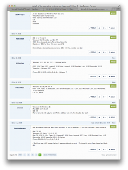
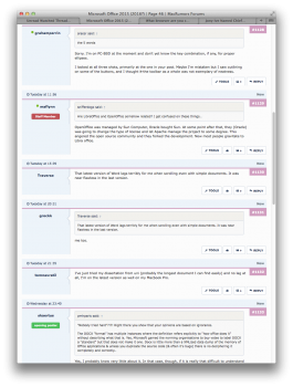
Screenshots at https://forums.macrumors.com/posts/21481986 and below may help readers to understand why I view the date, above the line, as a loner; misplaced.

To @arn @Audentio and others behind the scenes: for me, this is a milestone. My viewing preferences might be unusual but there is, essentially, an emphasis on order and chronology. (Compare with the disorder exemplified in shots at https://forums.macrumors.com/posts/21453677 – maybe standard XenForo behaviour.)

Glancing at what's below:
  • with a local workaround I probably can make post numbers, which are volatile, less obtrusive
  • I can not move the date, which is reliable, to be alongside the content
– milestone food for thought.

2015-06-20 12-52-12 screenshot.png 2015-06-20 13-02-41 screenshot.png 2015-06-20 13-02-23 screenshot.png 2015-06-20 12-59-41 screenshot.png
 
Register on MacRumors! This sidebar will go away, and you'll see fewer ads.