My gripes with the new look are
1) The folders are disgusting. They look like a horrible windows theme; the old folder honestly would have worked better.
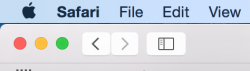
2) The toolbar buttons look out of place. They should have gotten rid of the outlines all together and just used the icons.
3) What is with the paper texture, such as the one used in the Notes application?
1) The folders are disgusting. They look like a horrible windows theme; the old folder honestly would have worked better.
2) The toolbar buttons look out of place. They should have gotten rid of the outlines all together and just used the icons.
3) What is with the paper texture, such as the one used in the Notes application?