Become a MacRumors Supporter for $50/year with no ads, ability to filter front page stories, and private forums.

SlCKB0Y

macrumors 68040
Feb 25, 2012
3,426
555
Sydney, Australia
Are you joking? Android lollipop was obviously inspired from iOS 7.

Coming from someone who has actually used both extensively they really do not look alike no matter how much you want to be negative about android.

Other than both iOS and android now being flatter (which was a trend clearly started by Microsoft, not Apple) there are not that many similarities.
 

casperes1996

macrumors 604
Jan 26, 2014
7,418
5,518
Horsens, Denmark
I never liked the iOS 7/8 fonts that replaced what we had in iOS 6-. It's not just the appearance I have a problem with. I want the font to be decently thick so I don't have to strain my eyes to read the time! This new font looks better and is easier to read.

You can make the text bold in accessibility.
 

alexanderasher

macrumors member
Mar 13, 2014
71
3
Okay real talk though what is the harm in offering us the choice?

No seriously why is it hard to put in the menu "DO YOU WANT TO USE THIS FONT OR THIS FONT"

Hell put in the one from 10.9 too.

And 10.9's UI.

Also iOS6's UI as an option for iOS9.

Just let us choose before you shove a design change down our throats.
 

redheeler

macrumors G3
Oct 17, 2014
8,419
8,841
Colorado, USA
Would it work to rename the Helvetica fonts to something else temporarily, then name your new font Helvetica, and restart the computer? It seems that would be simpler.

You would think so, but no. It involves a little more work as you would also have to modify the name of the font internally. This project apparently does that.

----------

It's also better to put the new fonts in "/Library/Fonts/" which will override those in "/System/Library/Fonts/".
 

Traverse

macrumors 604
Mar 11, 2013
7,688
4,400
Here
I'm clearly a bit late to this thread, but I've been using the font as the default on my Retina iMac since last November. My rMBP is still on the default Helvetica Neue, and I can honestly say that this looks a lot better. Glad that Apple is making the switch.

I can't tell from a lot of these posts if it's easier to read or not. My initial reaction is "meh," but it does look bolder than Helvetica which is nice.
 

redheeler

macrumors G3
Oct 17, 2014
8,419
8,841
Colorado, USA
I can't tell from a lot of these posts if it's easier to read or not. My initial reaction is "meh," but it does look bolder than Helvetica which is nice.

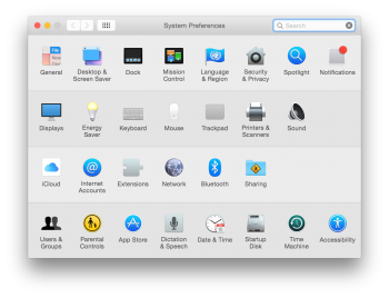
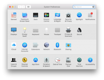
Decide for yourself. On the left is Helvetica Neue, on the right San Francisco.
 

Attachments

  • System Preferences.png
    System Preferences.png
    330.7 KB · Views: 3,373
  • System Preferences-San Francisco.png
    System Preferences-San Francisco.png
    339.7 KB · Views: 795

Traverse

macrumors 604
Mar 11, 2013
7,688
4,400
Here
Decide for yourself. On the left is Helvetica Neue, on the right San Francisco.

Thanks for the screenshots. It's definitely a subtle difference. I think I'd give a slight edge to Helvetica, but that may just be the familiarity factor. I think it will be easy to adjust to.

----------

And I'd like to add that I think it's a good strategic move for Apple to craft their own font variant as part of specializing their ecosystem.
 

AlecZ

macrumors 65816
Sep 11, 2014
1,173
123
Berkeley, CA
Okay real talk though what is the harm in offering us the choice?

No seriously why is it hard to put in the menu "DO YOU WANT TO USE THIS FONT OR THIS FONT"

Hell put in the one from 10.9 too.

And 10.9's UI.

Also iOS6's UI as an option for iOS9.

Just let us choose before you shove a design change down our throats.

Maybe this is fine, but giving more choices isn't always a good idea. Eventually, the OS becomes hard for Apple and third-party devs to support, and it becomes complicated for users too. Take it to the extreme, and you end up with Debian Linux.
 

kalsta

macrumors 68000
May 17, 2010
1,676
573
Australia
I guess I knew this was coming. Still disappointed.

I can understand why some people are saying 'big deal'. The differences between sans-serif typefaces like Lucida Grande, Helvetica Neue and San Francisco can seem subtle when you're comparing individual letters. But even subtle variations become more noticeable when you see a larger block of text. A change to the default OS system font is a pretty big deal because it's so ubiquitous. It changes the reading experience, and the overall feel and character of the OS… in subtle ways yes, but on a grand scale.

When I started seeing the first screenshots of the Apple Watch, I thought the typography lacked elegance. It looked clunky to me. And it still does. It has replaced the round curves of Lucida Grande and Helvetica Neue with straighter, slightly more rigid letter forms:

3038794-inline-i-1-apple-watch-shell-sf-display-regular.png


That doesn’t make it flow horizontally (the direction you read), so I disagree with the claim that it’s a marvel of readability. If anything, this kind of design makes the letters look more squashed together. What Apple has done, is compensate for this by increasing the default letter spacing. But overall it just looks inelegant and, I have to say, a little amateurish. (I appreciate that this is my subjective opinion.)

Apple’s decision to switch from Lucida Grande to Helvetica Neue in OS X was heavily criticised because Helvetica was never designed for reading on screen at small point sizes. In practice, I think it reads fine on today’s high-resolution devices, although sure, there might have been better choices. I just don’t think this new typeface is it.
 
  • Like
Reactions: grahamperrin

Rogifan

macrumors Penryn
Nov 14, 2011
24,124
31,156
Decide for yourself. On the left is Helvetica Neue, on the right San Francisco.

I guess this shows why I'm not a font snob. I can hardly tell the difference between the two. My guess is 99% of iOS/OS X users won't notice the difference but the ones that do will be very vocal in their hate.

----------

Okay real talk though what is the harm in offering us the choice?

No seriously why is it hard to put in the menu "DO YOU WANT TO USE THIS FONT OR THIS FONT"

Hell put in the one from 10.9 too.

And 10.9's UI.

Also iOS6's UI as an option for iOS9.

Just let us choose before you shove a design change down our throats.

No this would be a disaster. You want developers to have to support multiple UI styles? Because otherwise you'll have a mishmash of designs that will look worse than anything we have now. Also the last thing Apple software engineers/designers and 3rd party developers need to be doing is wasting time having to test multiple UI styles and different system fonts to make sure they work properly and look right in any circumstance just for a small number of people who want to fiddle around with themes.
 

milo

macrumors 604
Sep 23, 2003
6,891
522
Really looking forward to seeing times on my homescreen that look like

9: 41

12: 37

1: 00


Why would you expect that?


I think they should fix some issues instead of changing a font

It's not a question of "instead".


Rows and rows of icons. How boring...

Not sure why you think a new font would change that.

I think they should have named it something other than after a city.

I think people should stop worrying so much about the name. Especially since Apple will likely never talk about the name of the font in public, for this use it's almost more like an internal code name.
 

kmj2318

macrumors 68000
Aug 22, 2007
1,669
712
Naples, FL
You would think so, but no. It involves a little more work as you would also have to modify the name of the font internally. This project apparently does that.

----------

It's also better to put the new fonts in "/Library/Fonts/" which will override those in "/System/Library/Fonts/".

Have you been able to get this to work? I was running in to problems.

I was hoping to convert San Francisco Text to a system font. I think the person that use SF Display made a mistake. Text and Display differ in how much space is between the letters. Display has less space because it's meant to be used larger. Most of the text on the OS is small though, and the tight spacing looks bad.

I'd prefer to have every weight form bold to light be in text, and keep ultralight in display because ultralight is only ever used for very large sizes.
 

redheeler

macrumors G3
Oct 17, 2014
8,419
8,841
Colorado, USA
Have you been able to get this to work? I was running in to problems.

I was hoping to convert San Francisco Text to a system font. I think the person that use SF Display made a mistake. Text and Display differ in how much space is between the letters. Display has less space because it's meant to be used larger. Most of the text on the OS is small though, and the tight spacing looks bad.

I'd prefer to have every weight form bold to light be in text, and keep ultralight in display because ultralight is only ever used for very large sizes.

The original Github project (now defunct) included both. I can send you a PM with a link to the files.
 

Michael Goff

Suspended
Jul 5, 2012
13,329
7,421
Why would you expect that?


It's not a question of "instead".


Not sure why you think a new font would change that.


I think people should stop worrying so much about the name. Especially since Apple will likely never talk about the name of the font in public, for this use it's almost more like an internal code name.

Didn't you know that Apple is only capable of doing one thing at a time? So when the add emoji, they're just doing that. Or when they change a font, they're only doing that. >_>

That's what people at MacRumors are telling me anyway.
 

milo

macrumors 604
Sep 23, 2003
6,891
522
Didn't you know that Apple is only capable of doing one thing at a time? So when the add emoji, they're just doing that. Or when they change a font, they're only doing that. >_>

That's what people at MacRumors are telling me anyway.

And of course it's going to look exactly like a rumor site mockup, goofy time spacing and all.
 
Register on MacRumors! This sidebar will go away, and you'll see fewer ads.