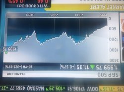
Sure. Here is a similar chart with a 7 year double top followed by a drop and subsequent breakout. Sorry.
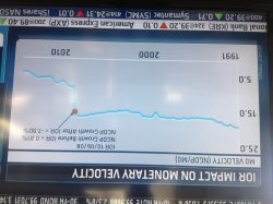
I am also attaching why our economy dropped through the floor since the Obama election. Obvious data.
Rocketman
Come on a chart that went up twice and then went up a third time even more. Do you think that chart was really predictive? And in any case, I'd follow a chart of the market as more predictive than a chart of a single stock. Too many bits of material new information push a stock one way or another over the course of two years. It isn't the past price that is "controlling" or "predicting" the future price. Now with the larger market it would take some real material new information to move things. So long term trends might be easier to spot there.
As for the other chart, all economic policy has been a mixed bag across the world since 2008. That is coincident with Obama's election. But his policies have probably been more successful than what Romney would have implemented (which would probably have been closer to the austerity policies that Europe pursued which leaves Europe in a stagflation situation). And certainly Obama's policies are superior to what the Republican party can muster up sufficient votes for (which at this point (admittedly to the frustration of their own leadership) is basically only tax cuts directed primarily at the "job creators").
Money velocity is most influenced by the Fed and those folks are somewhat independent of the Presidential branch. And the Fed was mainly focused on shoring up the banks and preventing another Lehman at least from 2008 to 2011. The Fed has been very successful there. I'm not sure they know how to stop though.