Become a MacRumors Supporter for $50/year with no ads, ability to filter front page stories, and private forums.

ktbubster

macrumors 6502a
Jan 20, 2007
794
1
US
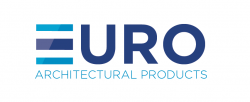
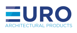
I like the bottom left one as well - it's obvious but perhaps for a good reason. I think it brings in the glass layers as the E better of course and makes the logo a much better dimension I think. Not too long.

Perhaps the "glare" or whatnot on the layer "E" angle should go along with the angle on the A below it. Somehow that's bugging me. I feel like it could go along with that, but it's just off enough to look odd. Not sure how that would cut it, but try adjusting it to the same angle and see how that goes?

Also - are the blocks of the "e" lined up with the top and bottom of the letters in the remainder of euro? they look a little low and high.

I think after playing around wtih that a bit more and fine tuning you could have something good.

The middle left is also ok - i agree about the top right, not a bad idea but didn't work in execution here it seems.
 

adamvk

macrumors 65816
Original poster
Oct 29, 2008
1,308
0
Phoenix, AZ
I like the bottom left one as well - it's obvious but perhaps for a good reason. I think it brings in the glass layers as the E better of course and makes the logo a much better dimension I think. Not too long.

Perhaps the "glare" or whatnot on the layer "E" angle should go along with the angle on the A below it. Somehow that's bugging me. I feel like it could go along with that, but it's just off enough to look odd. Not sure how that would cut it, but try adjusting it to the same angle and see how that goes?

Also - are the blocks of the "e" lined up with the top and bottom of the letters in the remainder of euro? they look a little low and high.

I think after playing around wtih that a bit more and fine tuning you could have something good.

The middle left is also ok - i agree about the top right, not a bad idea but didn't work in execution here it seems.

Yep, it's lined up. I did fix the angle of the reflection so it matches the A. Does look much better now. Thanks!
 

Attachments

  • Screen Shot 2012-07-24 at 12.47.35 AM.png
    Screen Shot 2012-07-24 at 12.47.35 AM.png
    19.8 KB · Views: 76

ezekielrage_99

macrumors 68040
Oct 12, 2005
3,336
19
Yep, it's lined up. I did fix the angle of the reflection so it matches the A. Does look much better now. Thanks!

That is a sweet and well executed concept, it was so good to see someone working through the process to engage ideas then develop it.

Nice :D
 

adamvk

macrumors 65816
Original poster
Oct 29, 2008
1,308
0
Phoenix, AZ
That is a sweet and well executed concept, it was so good to see someone working through the process to engage ideas then develop it.

Nice :D

Thanks!

Can you try once to continue the upper and lower color stripe over all characters ?
Somehow URO is too dominant this way.

Yea, I tried doing that, I felt it looked "cheesy." Do you think it's really too dominant?
 

fig

macrumors 6502a
Jun 13, 2012
916
84
Austin, TX
Yea, I tried doing that, I felt it looked "cheesy." Do you think it's really too dominant?

What about just making URO the lighter blue shade?

I'd also look at a bit heavier weight for Architectural Products and be sure to individually kern your letters there (at a glance HIT and OD stand out to me).

As a whole, really nice job taking feedback and evolving this logo, well done.
 

NXTMIKE

macrumors 6502
Nov 11, 2008
386
0
Canada
The only thing that looked odd was the "E" of the window not looking like an E. Maybe try this? (excuse my quick mock-up skills)
 

Attachments

  • Screen Shot 2012-07-24 at 12.49.22 PM.png
    Screen Shot 2012-07-24 at 12.49.22 PM.png
    22.1 KB · Views: 73

farmboy

macrumors 65816
Nov 26, 2003
1,296
478
Minnesota
Yea, I know left side on the bottom is very obvious, but I like it for some reason. Haha. Not sure why.

I agree with you. If you think about how the customers will refer to the company, they most likely would say, "Call Euro..." To me, that helps guide the logo design. I think you want to reference that, so the bottom left is very appropriate. Especially since "Architectural Products" is a bear to use in a logo, as you've discovered, so making it a minority partner is about right.

Have you rotated the E a little in EURO to see what that does? It would also make it a little less predictable. Upper right is OK too, but I would angle the glass slightly more.
 

adamvk

macrumors 65816
Original poster
Oct 29, 2008
1,308
0
Phoenix, AZ
The only thing that looked odd was the "E" of the window not looking like an E. Maybe try this? (excuse my quick mock-up skills)

I did not realize it was inverted. Thank you!

I agree with you. If you think about how the customers will refer to the company, they most likely would say, "Call Euro..." To me, that helps guide the logo design. I think you want to reference that, so the bottom left is very appropriate. Especially since "Architectural Products" is a bear to use in a logo, as you've discovered, so making it a minority partner is about right.

Have you rotated the E a little in EURO to see what that does? It would also make it a little less predictable. Upper right is OK too, but I would angle the glass slightly more.

Yea, exactly. A lot of people refer to it as Euro I know.

So yea, he really just wants to be done and go forward with the website, business cards, etc, so I'm going with the one below. Thank you all very much for your help! I'll try to post an update once everything else is done to show how it all came out.

A big change from before. :)
 

Attachments

  • EuroArchGlassfixed-06.png
    EuroArchGlassfixed-06.png
    6.4 KB · Views: 69
  • Screen Shot 2012-07-10 at 9.11.05 PM.png
    Screen Shot 2012-07-10 at 9.11.05 PM.png
    28.8 KB · Views: 160

dacreativeguy

macrumors 68020
Jan 27, 2007
2,032
223
I did not realize it was inverted. Thank you!


Yea, exactly. A lot of people refer to it as Euro I know.

So yea, he really just wants to be done and go forward with the website, business cards, etc, so I'm going with the one below. Thank you all very much for your help! I'll try to post an update once everything else is done to show how it all came out.

A big change from before. :)


I just came across this thread today and noticed that you have been attached to the 3 horizontal lines glyph since the beginning. Sometimes a designer gets too attached to an element and puts too much effort in rationalizing it and trying to make it work. You say it represents different layers of glass, but will customers really understand that? Have you asked any?

I'd keep working on it. The three horizontal lines don't read enough as an "E", so I'm betting his biz will become "URO" overnight with that logo. :(
 

darkplanets

macrumors 6502a
Nov 6, 2009
853
1
I just came across this thread today and noticed that you have been attached to the 3 horizontal lines glyph since the beginning. Sometimes a designer gets too attached to an element and puts too much effort in rationalizing it and trying to make it work. You say it represents different layers of glass, but will customers really understand that? Have you asked any?

I'd keep working on it. The three horizontal lines don't read enough as an "E", so I'm betting his biz will become "URO" overnight with that logo. :(

It was said before but if he drops the light blue plane in a little it would look plenty like an E while still conveying the concept.

I'm not a designer, however. Consider this your idiot consumer advice.
 

TyroneShoes2

macrumors regular
Aug 17, 2011
133
3
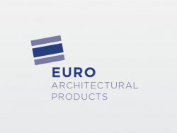
I still like this one the most (see attached). The "block" strongly conveys the feeling of a capital "E" without being too on the nose, and the angle conveys that the company is not so strait-laced as to be hampered by unnecessary convention, and aware enough to be open to free thinking, yet professional enough to know where the boundaries are and how to live within them tastefully.

Yet, it is still simple enough to be elegant, and much of that is due to the monochomaticism of just two similar shades of blue-grey, and to not giving in to the temptation to be 3D or overly ornate. Restraint in design is sexy. Intelligent men can argue against that, but in the end they will be wrong.

Also, the three arranged shapes inside the block convey order, and a harmony with the concept of architecture. Plus the font choices are killer; it sort of feels "Bauhaus" to me, if I were asked to stick an emotion to it. I don't know how a customer could want anything more.

Where I think the later attempts go wrong are that as soon as you change the angle to a 3D angle, it no longer says "E" to me, and it seems at cross-purposes to the flow of the lettering.

And adding the plastic reflection is too much. I am all about that plastic reflection more often than I would like to admit, but in this case it also takes away the statement that it refers to the letter "E". With the plastic glint it is now ambiguous in my mind whether it really refers to the letter "E"; it starts to look more cylindrical and whether or not it says "E" to me is now vague; I can no longer feel it. That raises the unnecessary question in my mind "is it supposed to be a stylized 'E' or does it now look more like an actual physical object and not a letter at all?" When it was flat and 2D there was no doubt in my mind that it referred to the letter E", and that is also more simple and elegant.

If you were to use these elements to build an animated tag on a TV commercial, then the glint would make sense; you could emphasize the reflection as you twirl or squeeze the "block" into final position (or even as you manipulate the three elements within the block into place independently), but once it all arrives there it should look just like it does here, with no glint.

Then you would have the best of both worlds; during the transition that builds the logo on screen, you can use a plastic reflection effect to plant the seed in the viewer's mind that this is all coming from real physical materials, but once the logo is built and static it still says "I am also now definitely a flat, stylized, printed letter "E". If I were the client, that would just knock me out.

Miles Davis said "less is more". He was right.
 

Attachments

  • Screen Shot 2012-07-11 at 5.23.png
    Screen Shot 2012-07-11 at 5.23.png
    13.8 KB · Views: 85
Last edited:

ktbubster

macrumors 6502a
Jan 20, 2007
794
1
US
I think you're really close here. Double check the alignment on all sides (do the words on the bottom begin and end aligned with the "euro" part? The S on product seems a but more right?) .... The swapping the colors wasa. Good call. I think this is the cleanest and best propertied one and emphasizing "euro" like a previous poster mentioned is good.

I disagree with the poster above here though, I agree with things he's saying just not for the logo he was talking bout. I think that one is unbalanced and makes it seem like the blocks and text are disconnected, almost that the blocks at randomlyly precariously balancing.... I'd say stick with your most recent direction. Seems solid and clean... Like glass! :)

I did not realize it was inverted. Thank you!


Yea, exactly. A lot of people refer to it as Euro I know.

So yea, he really just wants to be done and go forward with the website, business cards, etc, so I'm going with the one below. Thank you all very much for your help! I'll try to post an update once everything else is done to show how it all came out.

A big change from before. :)
 
Register on MacRumors! This sidebar will go away, and you'll see fewer ads.