Become a MacRumors Supporter for $50/year with no ads, ability to filter front page stories, and private forums.
critique this logo/box/package
- Thread starter oldschool
- Start date
- Sort by reaction score
You are using an out of date browser. It may not display this or other websites correctly.
You should upgrade or use an alternative browser.
You should upgrade or use an alternative browser.
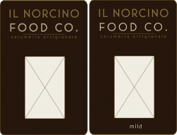
I think that the line between the writing on top.. should go all the way across and stay centerd between the words above and the words below. its important to keep a constant margin and alignment. also maybe have the corners of the edges a little less rounded. itll give it a cleaner and sharper look.
something about the top text is unbalanced in my view, it just looks wrong.
Maybe insert the right hand side of the second line a little so the text starts at the same position (opposite obviously) as the text ends, ignore the full stop.
Maybe insert the right hand side of the second line a little so the text starts at the same position (opposite obviously) as the text ends, ignore the full stop.
The horizontal stroke within the text is pulling "IL NORCINO" and "FOODS" apart visually. I suspect this is unintentional.
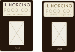
I think I would create a separate, more prominent banner for "Italian Sausage" and "Mild". This is the information people need to easily see.
I would place the word "Mild" in a color keyed banner.
ie: blue with white text for mild, red with white text for spicy, etc...
Personally, I find the overall design lacking in visual hooks.
It looks as much like a VCR manual as a package for sausage, and I find it to be somewhat industrial/retro.
GL
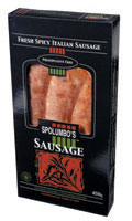
I think it's a good concept, I kind of like the simplicity and retro look. I do think it is missing something though. Perhaps the colours of the Italian flag or some sort of icon logo. It needs something a little more visual. Here is an example I just found on the net for a similiar product. Note the visuals and colour - would definitely stand out on a shelf and also indicate what the product is, without really reading it.
Attachments
As the eye never sees a punctuation as a border to the margin, the top does look very unbalanced. Your´re trying to force justify the top but the punctuation of "co." makes it wrong. InDesign offers help with optical margin adjustment that hangs punctuations outside the margin (like typesetters does/did).
As the eye never sees a punctuation as a border to the margin, the top does look very unbalanced. Your´re trying to force justify the top but the punctuation of "co." makes it wrong. InDesign offers help with optical margin adjustment that hangs punctuations outside the margin (like typesetters does/did).
i think the punctuation looks OK... as long as the I and F are left-aligned, i think it looks balanced. i would even out the line spacing (leading) between each line of type, and the rule.
it definitely needs a bright color... maybe a border around the die cut?
everybody had some great suggestions. i do think it needs a visual "splash" like many suggested...i just can't figure out what it could be.
and those spolumbo's sausages are from the next province over...
keep in mind these are a first draft...and i wanted to know if anyone thinks i'm heading in the right direction.
thanks everybody...keep your suggestions coming.
and those spolumbo's sausages are from the next province over...
keep in mind these are a first draft...and i wanted to know if anyone thinks i'm heading in the right direction.
thanks everybody...keep your suggestions coming.
Personally, I like the direction. Just maybe needs something visual for the centre area. Hope you don't mind, but I quickly threw this together as an idea for some form of a visual element.
Click the attached.
I'd have put the "mild" in the elliptical area above the window, cleans the rest of the package up and its a logical place to put in relation to the rest of the image.
Personally, I like the direction. Just maybe needs something visual for the centre area. Hope you don't mind, but I quickly threw this together as an idea for some form of a visual element.
Click the attached.
that looks spectacular. i can see what you mean about the visual element...it completely makes sense. i love the continuous line and framed area for a product descriptor.
everybody here loves it...now they're asking if YOU are available for design work...or websites.
I'd have put the "mild" in the elliptical area above the window, cleans the rest of the package up and its a logical place to put in relation to the rest of the image.
there's to be a descriptor for "italian sausage" as well...would you put this on the bottom below the cutout?
thanks for the suggestion...i think it's a good one.
that looks spectacular. i can see what you mean about the visual element...it completely makes sense. i love the continuous line and framed area for a product descriptor.
everybody here loves it...now they're asking if YOU are available for design work...or websites.
yeah, that's what I do - freelance design. It does help to enhance the product and make it pop. I'm still looking forward to trying some of those risotto balls once they are launched

yeah, that's what I do - freelance design. It does help to enhance the product and make it pop. I'm still looking forward to trying some of those risotto balls once they are launched
i was serious about the riceballs too. although I haven't got the box done yet because of this new development with the new name.
if you PM me your address i'll gladly send you some and some of the other products as well.
the current website for the store is http://www.moccia.ca. it's not completely finished yet...
but for wholesale we're using the new name.
I've never been a fan of tracking out type to fill space. I rarely track out past 20% in InDesign. Watch out for the margins. Perhaps introduce some other visual interest into the design but keep it minimal and clean.
I think you can say italian sausage without a flag or the red, white and green. Seems knee jerk. Fine italian luggage and vehicles scream italian made by the workmanship, fine materials, attention to detail and passion for design not being plastered with a flag.
Look at some italian handbag, luggage designers, clothiers and perfumers websites.
The brand is handmade quality not italian patriotism. Its made in canada right?
I've never been a fan of tracking out type to fill space. I rarely track out past 20% in InDesign. Watch out for the margins. Perhaps introduce some other visual interest into the design but keep it minimal and clean.
I think you can say italian sausage without a flag or the red, white and green. Seems knee jerk. Fine italian luggage and vehicles scream italian made by the workmanship, fine materials, attention to detail and passion for design not being plastered with a flag.
Look at some italian handbag, luggage designers, clothiers and perfumers websites.
The brand is handmade quality not italian patriotism. Its made in canada right?
The quick mock I did was just to give an idea of how a visual element can enhance the packaging. On that note, I would have to disagree with you in researching luggage, handbags, clothiers and perfumers websites. The product is food, so if anything, I think looking at competitors or other food packaging designs would make the most sense for inspiration. This will give an idea of what's out there and what the cutomers are familiar with in terms of packaging for italian meat products etc.
http://www.carando.com/products/retail.asp
http://www.fioruccifoods.com/
Curved or rounded letters and punctuation require different spacing as oppossed to straight letters. In this case, the "I" in "IL..." can line up straight above the "F" in "FOOD...", but the "." at the end of "...CO." shouldn't be lined up directly below the "O" in "NORCINO". The curves involved create an empty space that throws it off balance. Same goes with the space between letters - straight letters can sit next to each other just fine, but combined with "O", "S", "J", etc., you have to adjust for the space.
I'm not crazy about black on food packaging. I love black guitars, black cars, black labs, but I can't think of anything appetizing that is that color. What about a dark brown or something generally warmer?
I'm not crazy about black on food packaging. I love black guitars, black cars, black labs, but I can't think of anything appetizing that is that color. What about a dark brown or something generally warmer?
Register on MacRumors! This sidebar will go away, and you'll see fewer ads.