So, as a relative newbee to Macs, I often check out the Pro "Tips" pages on apple.com. There is a new tip posted every week, and I've learnt a few cool little tricks from these pages. ")
Usually there are screenshots indicating a step you have to take, and I've never really noticed anything out-of-the-ordinary until a few weeks ago...
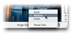
Look at the three screenshots across the bottom, and start with the middle one. The colours on the photo in the background appear fine, but that is definitely not the Aqua blue on the menu...
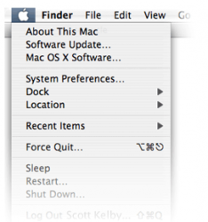
Similarly with the screenshot, far right... the Apple button is not Aqua blue, but a darker grey / blue.
Granted, these are small observations that may be explained by a number of things... but what do you guys think??
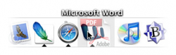
I include the screenshot, far left out of interest really... what application is represented by the 'B' icon (next to the iTunes icon); I just can't place it.
Thanks, and look forward to hearing your thoughts.
Usually there are screenshots indicating a step you have to take, and I've never really noticed anything out-of-the-ordinary until a few weeks ago...
Look at the three screenshots across the bottom, and start with the middle one. The colours on the photo in the background appear fine, but that is definitely not the Aqua blue on the menu...
Similarly with the screenshot, far right... the Apple button is not Aqua blue, but a darker grey / blue.
Granted, these are small observations that may be explained by a number of things... but what do you guys think??
I include the screenshot, far left out of interest really... what application is represented by the 'B' icon (next to the iTunes icon); I just can't place it.
Thanks, and look forward to hearing your thoughts.