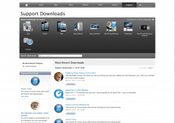
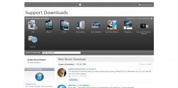
The apple support downloads page old (left) vs new (right), take note of the headers at the top of the page.
Attachments
Last edited:
I quite like the one on the left. Not all gradients/shades etc. are evil.I'm on the exact page right now and the header looks the same as the first picture.

If you want some form of evidence that Apple is going for a 'flat' design. Open up the weather app on iOS 6.
That's not new. I've seen it a few times in the past few years.


Good thing I didn't say it was new.
Slowly Apple have dropped the gloss, made the borders thinner.
And currently we have:
A sharper font.
Now of course no one really knows what Ive has in store and the subtle change in the weather app may mean nothing, but this could serve as a hint of the type 'flat' interface iOS will shift to.
If you look at the OSX, it's design changes were subtle and gradual. Nothing like Windows 7 to Windows 8. Could iOS follow suit? Possibly!
Not sure why you are quoting me and telling me all of this when I was replying to OP.