Become a MacRumors Supporter for $50/year with no ads, ability to filter front page stories, and private forums.
Favorite Font (direct rip from least fav) :)
- Thread starter Peyton
- Start date
- Sort by reaction score
You are using an out of date browser. It may not display this or other websites correctly.
You should upgrade or use an alternative browser.
You should upgrade or use an alternative browser.
I use the font fit for the job... although time and time again, I do come back to Adobe Caslon, Stone Serif, Frutiger, Franklin Gothic, Bembo, Helvetica Neue, Gill Sans, Optima... solid workhorses.
i guess my favorite is myriad pro semi-bold semi-extended, but like a couple others have said: whatever works for the situation.
and for web i ususally use verdana or garamond(obviously with alternates listed)
and for web i ususally use verdana or garamond(obviously with alternates listed)
Blue Velvet said:I use the font fit for the job... although time and time again, I do come back to Adobe Caslon, Stone Serif, Frutiger, Franklin Gothic, Bembo, Helvetica Neue, Gill Sans, Optima... solid workhorses.
Other than Franklin Gothic and Stone Serif, those are pretty much staples for me too.
I'm usually attracted to the various (with some exceptions) Garamonds out there. Garamond Narrow and Premier pro come to mind. But I absolutely love Stempel Garamond (Bold Oldstyle).
For Japanese, without question I go with Hiragino Mincho Pro (W3).
Edit: Must add Bodoni to the mix. =)
From an old thread... ")
To which I'll also add Futura.
I'll also add Lucida Grande to that too, as mentioned by Mike Teezie in that thread.
I'm very much a fan of clean sans-serifs, such as Helvetica, Univers (55 and 65), Avant Garde and Akzidenz Grotesk...
To which I'll also add Futura.
When it comes to serifs, well Bembo is probably my favourite, clean and elegant, and nicely weighted, especially at smaller point sizes.
I'll also add Lucida Grande to that too, as mentioned by Mike Teezie in that thread.
I didn't even know I needed a favorite font, so now I'm feeling inadequate...
Most font decisions for me (as an engineer/scientist) come down to 'what do I use in this technical presentation?'. As a result, I end up usually using Helvetica or Gill Sans, always sans serifs since I think they project better onto a screen.
Any suggestions for my next presentation that I may want to try out?
Cheers.
I'm a fan of clean, crisp sans fonts. In design work I tend towards Futura (which I usually double space to lighten the weight), Myriad or Helvetica Neue Ultralight (which I also tend to double space).
marissaaa said:I love Georgia.
I second that. Using VoodooPad has gotten me completely addicted to Georgia, especially Georgia 13 (can't do pt sizes the forum? sad.)
So male? Try some Snell Roundhouse or Edwardian Script to return some balance to your typography choices.
For most of my assignments I really liked ... *cowers* Papyrus. For lab reports I usually use either Baskerfield Old Face or Garamond. For scripting I use HansHand, for tight spaces I use Gill Sans Light.
I hadn't used Skia before, it looks like a good alternative to the Papyrus I've been using ...
I hadn't used Skia before, it looks like a good alternative to the Papyrus I've been using ...
One of the fonts that i just used in a recent design was made by House Industries. Its font family name is called Chalet. My design was kind of a retro 70s design, the goal of the design was to try and come up with a new marketing campaign for Faygo (Pop, Soda, Cola, whatever you call it). I think the font worked well with what i came up with.
Attachments
Times New Roman, simply because I am a student and this is the preferred font, thus I am used to it. Apart from that it's not that bad, easy on the eyes.
I'm a big fan of Futura, and I also like a pixel font called FFF Harmony, which looks really nice and clear at an 8 pt size
I've been on a huge Myriad and Bembo kick. (I really dig the swoopy tail in the letter 'R'). And honestly, MrsEaves has been growing on me. But my favorite has to be using a super-thick black weight next to a very-thin light weight.
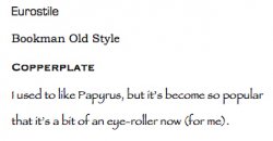
I like the fill half of Rosewood, but it's becoming so overused.
I like the fill half of Rosewood, but it's becoming so overused.
haha... woops. Indeed it is. I must have been in a violent mood earlier. Unlike _some_ people, I did not get to take a good nap today.
Register on MacRumors! This sidebar will go away, and you'll see fewer ads.