Become a MacRumors Supporter for $50/year with no ads, ability to filter front page stories, and private forums.

johnbro23

macrumors 6502a
Original poster
Apr 12, 2004
770
0
Pittsburgh, PA
After probably pissing off some of you with my indeciciveness and stupid questions, I have finally gotten my site up and running. :)

Taking some of your advice, I have changed many many things. I added an html version of the site. I changed a lot of the text. I chose a simple name.

Well, check it out and give me suggestions/criticisms/comments!
http://www.brozickdesign.com/
 

20rogersc

macrumors 65816
Jun 28, 2005
1,144
0
Brighton, UK
I'm sorry but the splash page is ugly! You need something simple that will make people want to go onto thw actual site. I don't like the "enterFLASHsite"/"enterBASICsite", why not just something like the kooks with a logo (to show what the website is) and then simple rollovers.

And clean up your logo, it doesn't make you look like a designer!? Why use the earth!? I don't think the design suits a 'designer' either. Try and make the menus a bit different/more exciting.

However I do like the portfolio sectoin, although why have you included each website 3 times!?

Sorry is this is a bit harsh . . .

::20ROGERSC::
 

CanadaRAM

macrumors G5
"Enter site"

Why?
The website has so far given me no information What is there, Who you are or Why I would be interested in entering.


The site is asking me for three decisions -- choose Flash site, choose Basic site, or download some software to modify MY computer so I can... what? By implication, view something Flash. I don't have any basis to make my decision on.

Analogy:

You about to walk into a hardware store. An employee stops you before you can go in the door and says "Charge Card or Acme Hardware Finance Plan?... Huh?.... Huh?" and won't let you in before you make a decision. You don't even know if they carry what you want, yet, let alone whether you are going to decide to purchase.

The other choice that you can make is to turn around and leave. Like the website. Gone.
 

Attachments

  • brozik.gif
    brozik.gif
    6.7 KB · Views: 97

someguy

macrumors 68020
Dec 4, 2005
2,351
21
Still here.
First of all, Brozick Design > The Kooks, by far, in terms of looks.

Second, I don't think most here will approve unless it looks like something Apple designed. I said most.

Finally, I think it looks great. I happen to like the splash page especially. The only thing I would change is the "BrozickDESIGN" text at the bottom. I don't particularly care for the way it looks 3Dish. Perhaps stick with the same color text, without the three-dimensional effect to it. And get rid of the globe. :eek:

EDIT: I also wanted to comment on something I just spotted. "When he's not designing web sites, he's probably out chillin' with some friends" is NOT professional in the least. It ties you, in the potential client's mind, to the image of an immature teenager as opposed to the strapping young adult we're all know you are. Might want to change/scrap that part.

Just my two cents. :)
 

decksnap

macrumors 68040
Apr 11, 2003
3,075
84
someguy said:
First of all, Brozick Design > The Kooks, by far, in terms of looks.

Respectively disagree. In every way possible.

someguy said:
Second, I don't think most here will approve unless it looks like something Apple designed.

It's funny that you say that. In his other thread about this site, I was commenting that he WAS ripping off Apple (in small ways), and that he shouldn't. He then went on to say that it's OK to do that because the general public won't know any better.

I have to say that the logo is really rough. Needs work.

Also, you still have a watermark on your (your? or some stock image guys?) face. Why do I get the feeling that isn't you?
 

someguy

macrumors 68020
Dec 4, 2005
2,351
21
Still here.
decksnap said:
Respectively disagree. In every way possible.
You're allowed. :)

decksnap said:
It's funny that you say that. In his other thread about this site, I was commenting that he WAS ripping off Apple (in small ways), and that he shouldn't. He then went on to say that it's OK to do that because the general public won't know any better.
While I agree that the style resembles that of Apple, I've come to see a lot of design ideas with that same characteristic, most commonly from Apple user's themselves. Perhaps once you feel you've found the greatest design idea, nothing else will do.

That said, there are a few aspects that have little or no resemblance to Apple's design. That alone, IMO, can become quite a task when creating a design using Apple software...
 

Coolnat2004

macrumors 6502
Jan 12, 2005
479
4
Personally, I don't like the logo. The "basic" site is pretty rough: why can't most of it look just like the flash version?

On your services page, you didn't really come out and say exactly what you do. That's not a huge problem, I guess..

You misspelled Canon, however I don't really think a client would care what you use. I know that my clients don't even know what I use, and if they did, they probably wouldn't recognize it.
 

frankblundt

macrumors 65816
Sep 19, 2005
1,271
0
South of the border
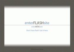
Like CanadaRam said, the home/splash page is unhelpful and frankly uninspiring.

I didn't look at the Flash site (and neither will Google), but the Basic site (which is kind of an insulting title) is, well, bad.

You really need to get a copy of Edward Tufte's "Envisioning Information" (his "the Cognitive Style of Powerpoint" wouldn't go amiss either). Read it and you'll understand why you need to lose the big fat borders around everything, open up the section buttons and develop a text heirarchy, so that people can comfortably find and read what you have to say.

I don't know (from your site) where you're based or how long you've been in business.

You say you've wowed countless clients, but your portfolio and reviews only show three. Are you lying to me, insane, or too lazy or embarrassed to post other examples of your work?

You say you're 50% cheaper than most designers - what does that mean and why is that? Is it because you're not very good or because you're not a rip-off merchant like the others? I'd like to know. Are you a one man band or a team of people? Are you a web tech or a designer or a marketing expert, or trying to be all three?

You want my money but you're not giving me enough answers to the basic questions I have as a client, or inspiring me with sufficient levels of trust to even get me as far as picking up the phone.

You're obviously talented when it comes to Flash and the hyperactive end of web design, but for my money, if you can't design a "basic" site I wouldn't trust you with it. If you just want to do Flash stuff, then don't waste my time tempting and disappointing me with bad non-Flash design, just drop it altogether.

This is overly harsh (tired, stressed and grumpy - sorry), but the fundamentals of who your potential customers are, what they want to know, what you want them to do, and how to get them to do it just from browsing through your site are important, and this part of your site appears to be either missing or deeply confused about them.

Your Portfolio examples are on the other hand much cooler (if a little manic for my taste) and easier to use than your own site, so the talent is obviously there. Do unto yourself what you have done unto others.

[edit] Actually, if your competition's sites are all like these guys', you're home and hosed. All is forgiven.
 

Oryan

macrumors 6502a
Apr 1, 2005
595
0
Lincoln, NE
You should preload your rollover images.

rolloverimage = new Image();
rolloverimage.src = "path/to/image.jpg";
 

20rogersc

macrumors 65816
Jun 28, 2005
1,144
0
Brighton, UK
frankblundt said:
[edit] Actually, if your competition's sites are all like these guys', you're home and hosed. All is forgiven.
I'd call him a pro after looking at that site.

. . . Oh and by the way I was just comparing the simplicity of the Kooks splash page rather than the whole site . . .

::20ROGERSC::
 

johnbro23

macrumors 6502a
Original poster
Apr 12, 2004
770
0
Pittsburgh, PA
I updated the logo, since it was one of the most disliked aspects of the site. Is it too simple now?

Thanks for all the comments, they're very helpful.
 

regre7

macrumors 6502
Apr 18, 2006
292
0
Atlanta, GA
Umm.... I thought it was pretty cool. *ducks behind desk*

Then again, I'm not a web designer. The most work I've ever done was a basic flash site for a local poker tournament. The standings were too hard to update manually.
 

frankblundt

macrumors 65816
Sep 19, 2005
1,271
0
South of the border
Much better. Now put it on your splash page, with at least some description of what you and the site are about. It will help your Google ranking and give visitors at least some idea as to why they should invest their valuable time and energy in making that second click.
 

michaelrjohnson

macrumors 68020
Aug 9, 2000
2,180
5
53132
You've chosen to break up content into 5 pages (including splash) but I think it could be done in far less and become a more powerful expression of your design. Each page doesn't have enough content to be worth it's weight in Flash.

My impression of your site, if I were a client, would be one of the following:
- Why do I have to wait to see the content? (You've only got a few seconds to grab someone's attention)
- There's a lot of pages, but so little content on each, that I'm not sure he knows how to organize information

--------------

Keep it up, you're going to end up with a great solution, in the end.
 
Register on MacRumors! This sidebar will go away, and you'll see fewer ads.