Become a MacRumors Supporter for $50/year with no ads, ability to filter front page stories, and private forums.

dogbone

macrumors 68020
Original poster
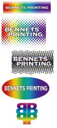
This will be part of a logo for a Printer. The final design will not be very modern, ie it will have a spectrum incorporated within it. And the type will probably be outlined sitting within the spectrum. (although this could change as it develops)

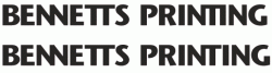
I have narrowed it down to these fonts. I'm still not sure whether to go for U and LC or all caps.

At the moment I'm leaning towards nos. 7 + 4, I'm a bit unsure about 1 + 2/3 (are they too 70's) and I'd appreciate any input anyone wishes to make.
 

Attachments

  • type.gif
    type.gif
    31.3 KB · Views: 158

vectormasked

macrumors member
Sep 3, 2006
77
0
Somewhere in Canada
It is very very very hard to say without actually seeing all the colours and elements you will have in the logo. You can't just pick a typeface and hope it will work with some sort of graphic element. That simply isn't how logos are done.

Anyway, I'd try looking for other typefaces coz these ones don't seem very good or professional, nor very appropiate for a Printer. But if I had to chose one of these ones I'd go for #8 coz it is stronger and seems more solid.
 

dogbone

macrumors 68020
Original poster
OK Thanks for the replies so far.

@vectormasked, yes you are of course correct. With regards to the font, I'm just going to have to make do with what I have. Unfortunately the only pro fonts I have are what came with the CS. Otherwise I just make do with free fonts.

The original brief is pretty corny but that is what the client wants. It was a spectrum fading out top and bottom with the comany name in the middle outlined in black. I am trying to introduce some sort of printing element into it via printing dots. I spent quite some time trying to place individual dots one at a time in illy but it ended up a bit of a mess. These sample I have posted are only some initial rough workings.

But the client is adamant that he wants a colourful logo. He doesn't mind the dot screen idea as per the top sample.

Anyway, I'm wanting to decide on the font so I can concentrate on the design now. He is pretty flexible and any of the shortlisted fonts would be OK for him. It is important that there isn't anything too thin, which is why Georgia serif font is the only true serif font in the mix.

Although I haven't been asked I'm going to try to come up with a design element as well using the B and P, of which the first go is at the bottom. Maybe if I can put the colours in the element, I could then leave the type on its own.
 

Attachments

  • mockup2.jpg
    mockup2.jpg
    178.6 KB · Views: 77

dogbone

macrumors 68020
Original poster
OK here's some initial kerning experiments with no. 8. I'm sort of warming to this font.

Any comments appreciated. (I know I need to clean up the N's)

EDIT.

OK I've chosen 8, Stone Sans. I'll be starting a new thread about the logo soon.
 

Attachments

  • bennetts-word.gif
    bennetts-word.gif
    5.4 KB · Views: 93
Register on MacRumors! This sidebar will go away, and you'll see fewer ads.