Become a MacRumors Supporter for $50/year with no ads, ability to filter front page stories, and private forums.
How can I make this site less boring?
- Thread starter andy89
- Start date
- Sort by reaction score
You are using an out of date browser. It may not display this or other websites correctly.
You should upgrade or use an alternative browser.
You should upgrade or use an alternative browser.
I was thinking about that the other day.
cheers, keep 'em coming..
*runs off to play with fonts*
EDIT: Why is there so many crap fonts?
cheers, keep 'em coming..
*runs off to play with fonts*
EDIT: Why is there so many crap fonts?
wow butters, the site in your sig looks pretty sweet.
thanks for the suggestions
EDIT: Just finished changing all the link text to black and making it underline on mouseover.
Looks alot better in my opinion
thanks for the suggestions
EDIT: Just finished changing all the link text to black and making it underline on mouseover.
Looks alot better in my opinion
cwedl said:May be have thumbnail images that open up into bigger ones. save on load time.
I am planing on doing this soon. I havn't been to happy with some of the pictures though.
And thanks for the artwork, I might fit it in there and see how it looks.
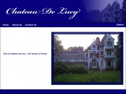
I don't know if I'm the only one that noticed it, but in the gallery section, the links to "House - inside" and "Garden" do not work. They are unclickable.
andy89 said:thats because I havn't finished those parts yet
Oh, ok. To avoid confusion among visitors, maybe put a "Coming Soon" notice next to those links?
Firstly indent the text - it doesn't look right inline with the frame border.
Secondly more information, there's no story there except the "look, it's a house". Make that sentance the heading for the front page, and put the stuff on the 'About Us' page as the content for it - stick some emotion into there, why you are undertaking such a massive challenge as opposed to just stating that you are.
On the "About Us" page I'd have two passport-type photos and write who you are, your interests relevant to the project etc - look at the iWeb templates for ideas on what to put there.
Remove the front gallery page and instead have it go straight to pictures with headings instead of the navigation bar on the left - at one stage I can see three different navigation bars on one page. When you click on a picture make it appear in a new window, smaller, not taking them away from the original page like it does now (and the pictures are too big even for my 20" display - 1200x1060)
Finally swap around the gallery and contact us page, and either have the contact us page aligned to the right of the top nav bar or remove it entirely and include the info on the about us page.
Basically at the moment it's too big for the content it has - reduce the page count.
AppleMatt
AppleMatt said:Firstly indent the text - it doesn't look right inline with the frame border.
Secondly more information, there's no story there except the "look, it's a house". Make that sentance the heading for the front page, and put the stuff on the 'About Us' page as the content for it - stick some emotion into there, why you are undertaking such a massive challenge as opposed to just stating that you are.
On the "About Us" page I'd have two passport-type photos and write who you are, your interests relevant to the project etc - look at the iWeb templates for ideas on what to put there.
Remove the front gallery page and instead have it go straight to pictures with headings instead of the navigation bar on the left - at one stage I can see three different navigation bars on one page. When you click on a picture make it appear in a new window, smaller, not taking them away from the original page like it does now (and the pictures are too big even for my 20" display - 1200x1060)
Finally swap around the gallery and contact us page, and either have the contact us page aligned to the right of the top nav bar or remove it entirely and include the info on the about us page.
Basically at the moment it's too big for the content it has - reduce the page count.
AppleMatt
Changing the layout according to you recommendations - for fun!
Attachments
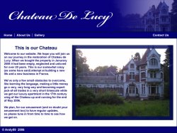
for the time being i've gone back to the old design.
thanks for the help cwedl.
I'll ask my family and see what they think, I think it looks quite smart.
And applematt, I know there are a few problems.
1st of all its not finished
2nd of all the nav bars are offset because there were pics next to the link, and if you drag all over the screen you will see hidden text where bits have been hidden for now
phew!
EDIT: and cwedl, the font im using is edwardian script itc
andy89 said:for the time being i've gone back to the old design.
thanks for the help cwedl.
I'll ask my family and see what they think, I think it looks quite smart.
And applematt, I know there are a few problems.
1st of all its not finished
2nd of all the nav bars are offset because there were pics next to the link, and if you drag all over the screen you will see hidden text where bits have been hidden for now
phew!
EDIT: and cwedl, the font im using is edwardian script itc
Thats okay Andy89
If you do want to use any of my ideas I have links for both of them.
header - Link
body+header - Link
That way you can change the colour (my fav colour is blue if you haven't noticed!), make multible pages move stuff around etc.
p.s. I didn't have edwardian script installed on my Windows PC, probably do on my mac though
.regards
cwedl
andy89 said:cheers, do you do web design or computer graphics or what?
Just curious.
Nothing like that, just going into IT after doing a geology degree. - going to do my MCSE's very soon and will be on helpdesk until I have enough knowledge and experience to become a consultant.
If you are talking about the website at http://www.crankyworld.com (i.e. you following the links)- I didn't design this, but I am coding it (I know the front page is weird but it will be fixed next week)
I do enjoy making websites as a hobby though, and will be trained up in photoshop and other graphics stuff like that soon.
andy89 said:i was on help desk once...
anyways, i suggest you dump frontpage
I'm using dreamweaver for that project, I have never have liked frontpage.
Didn't you like working on the help desk?
ok...
first. the font. maybe make it verdana or georgia. no serif fonts.
two. its all yellow. make the part of the table where the content is a different color. maybe white.
you dont need two sets of navigation links for such a small page. the one at top is fine.
basically get some contrast on the page, some other colors, white for the content should be good. maybe add some padding to the content so it is not completely left aligned.
sorry if this is unclear i can show you tomorrow if you like.
cwedl said:I'm using dreamweaver for that project, I have never have liked frontpage.
Didn't you like working on the help desk?
yeah, i liked help desk alot. But they made me redundant (I was making their other staff look bad
)
Register on MacRumors! This sidebar will go away, and you'll see fewer ads.