Become a MacRumors Supporter for $50/year with no ads, ability to filter front page stories, and private forums.

jlnr

macrumors regular
Sep 27, 2010
197
95
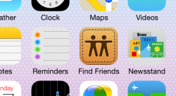
Hopefully this isn't too ot, but as I'm using iOS 7, I noticed Find my Friends has the same old lame leather icon & user interface.. I hope this gets updated shortly. I was most looking fwd to this app redesign..

I wonder if they hold the FMF App Store update back to release it at the same time as iOS 7. It shouldn't be too hard to disable all these textures and make it look like a stock app.

Hey, at least the stitching saves the icon from bleeding into the default background! :p
 

Attachments

  • bleeeeeed.PNG
    bleeeeeed.PNG
    207.4 KB · Views: 97
Last edited:

Rogifan

macrumors Penryn
Nov 14, 2011
24,124
31,156
Where is the button on iOS 7?

I see no button there. Just text. So you're telling me all text is potentially clickable now?

Design fail.

-SC

Colored text is clickable. Not to hard to understand. But I guess "design fail" is the new "Steve wouldn't have"...
 

WatchTheThrone

macrumors regular
Aug 2, 2011
239
137
I don't understand people.
iOS 6 comes out and everybody is b.itching about how it's the same and it needs to change.
iOS 7 gets announced and people complain that it's too different.
Make up your f'n minds!!!!

I like iOS 7 and glad apple is doing something different with iOS.
 

ConCat

macrumors 6502a
I don't understand people.
iOS 6 comes out and everybody is b.itching about how it's the same and it needs to change.
iOS 7 gets announced and people complain that it's too different.
Make up your f'n minds!!!!

I like iOS 7 and glad apple is doing something different with iOS.

Nobody is complaining it's too different; They are complaining that it's horribly done. Colored text being tapable is NOT intuitive, no matter how you try to look at it. No, just because hyperlinks are colored still doesn't make it intuitive. Buttons are intuitive. Buttons scream "push me". Colored text does not. Common sense says this is poor design. I don't see how anyone can refute my points.
 

timborama

macrumors 6502a
Oct 12, 2011
695
1,469
He should be demoted for discracing iOS with pastel colors, loss of eye candy, ran together text, no defined buttons or depth, completely wasting our retina screens! He should then be fired for copying MS!
Agreed!
 

Zaqfalcon

macrumors 6502
Mar 22, 2010
361
138
Not really:

IMHO, the iOS 7-HI is much clearer, compared to other OS-versions.


Looking at this got me to wondering how long it will be before the innate symbolic meaning of these icons is no longer recognised and the symbols are simply understood as representing the computing function they achieve.

A circle with a stick coming from the bottom represents a magnifying glass and therefore searching; but who uses a magnifying glass any more? Who's trashcan still looks that way and the bookmark symbol in particular now has little in common with the cardboard or leather object used to identify a notable page in one of those dusty old paper things.

It appears to me that the stylising of iOS7 is going that next step in asserting the contemporary symbolic realtionships between icons' forms and functions.
 

C DM

macrumors Sandy Bridge
Oct 17, 2011
51,390
19,458
Colored text is clickable. Not to hard to understand. But I guess "design fail" is the new "Steve wouldn't have"...
I see lots of colored text of all kinds in different apps and sites so I'll need to guess what is a button now and what's clickable?

A button is a button, and text, colored or not, isn't a button--it can be label for a button, but it shouldn't be a button itself as that simply doesn't make sense.
 

alFR

macrumors 68030
Aug 10, 2006
2,834
1,069
If iOS7 is the future of OSX, we are in serious trouble.

Putting the marketing team in charge of UI design...well there's not much more to say.

Incorrect - he got their input on the icons, not on the rest of the UI.

For all those who feel the pastel-coloured sky is falling, several well-connected Apple commenters (e.g. Jim Dalrymple) have confirmed that iOS 7 is far from finished: they simply wrapped up what they had complete by the time of WWDC so they could get a developer build out. There isn't even an iPad developer build yet, for heaven's sake. You can guarantee that the final product will be different to what we see today, probably both in look and feel and function.
 
Last edited:

Rogifan

macrumors Penryn
Nov 14, 2011
24,124
31,156
I see lots of colored text of all kinds in different apps and sites so I'll need to guess what is a button now and what's clickable?

A button is a button, and text, colored or not, isn't a button--it can be label for a button, but it shouldn't be a button itself as that simply doesn't make sense.

Fine have them put a gray border around it so you know it's a button. From the videos I watched it seemed pretty simple to know what to click. But I'm not using the software. If people using the software are providing feedback that its hard to know what is clickable and what's not I would imagine that's not difficult to fix.
 

KALLT

macrumors 603
Sep 23, 2008
5,361
3,378
I know it's a pisstake but I actually really like that.

It just hurts my eyes to be honest.

----------

Fine have them put a gray border around it so you know it's a button. From the videos I watched it seemed pretty simple to know what to click. But I'm not using the software. If people using the software are providing feedback that its hard to know what is clickable and what's not I would imagine that's not difficult to fix.

Well of course in context it makes sense, like the word 'Send' in Messages. That's pretty obvious. I think some people are more concerned, and rightly so, that Ive has broken some of the fundamental philosophies of OS design that defined Apple, namely form and function being on an equal level to make it obvious even for inexperienced users what to do. Hence well-designed UI elements and icons. And in that sense making a button, because that is what it is, look like a hyperlink is really not the best design decision. It is quite obvious that this decision was taken purely from an aesthetic point of view, and that is in my opinion a wrong one.
 
Register on MacRumors! This sidebar will go away, and you'll see fewer ads.